10 design tips to increase website conversions
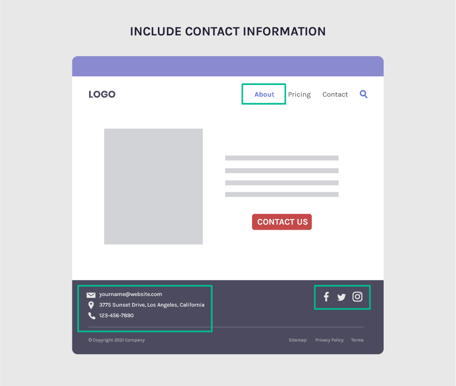
1) Increase trust simply by including contact information
64% of users want to see contact information on a business’s website.
And this makes sense... People want to know who they're dealing with, where they're from, they're name and what they look like.
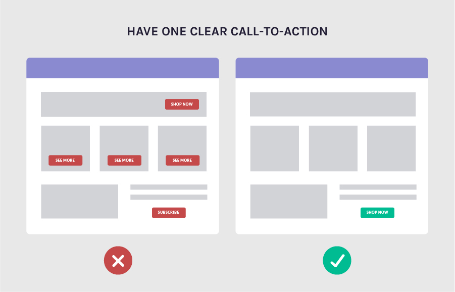
2) Have one clear call-to-action
Having one CTA will make it clear to your visitors what the next step is.
Just remember how confusing & stressful it is to shop for toothpaste...
Dozens of options!
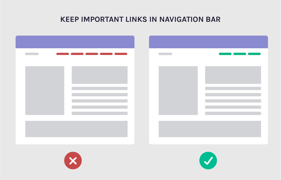
3) Keep only important links in the navigation bar
Only keep the most important links in your Nav bar.
Having unnecessarily links drives potential clicks away from the good stuff.
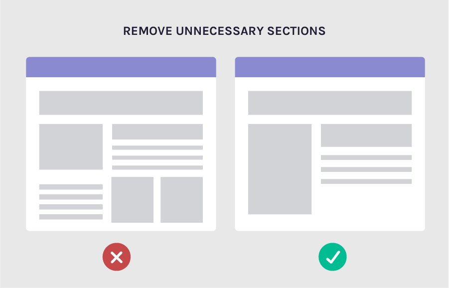
4) Remove unnecessary sections - less is more
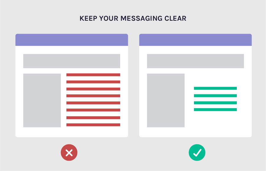
5) Keep your messaging clear
Having shorter paragraphs makes your content more readable.
And you'll be focusing on your most important points.
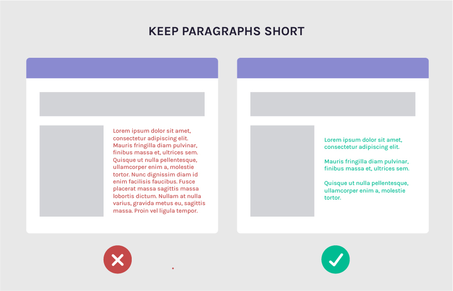
6) Keep paragraphs short
Break your content in to paragraphs.
It's easier to read and a lot less intimidating!
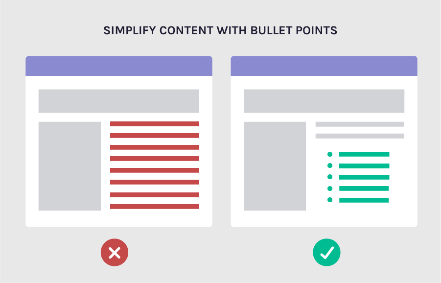
7) Simplify content with bullet points
With 70% of people paying attention to bulleted lists, you'll want to try and use bullet points whenever possible
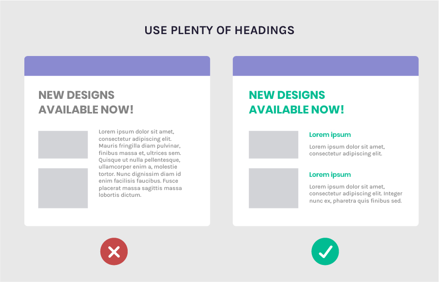
8) Use plenty of headings
With most users skim reading your content, you'll want to include plenty of headings to give them an overview of what the section is about.
9) Highlight key terms
Nothing beats the good old highlighter!

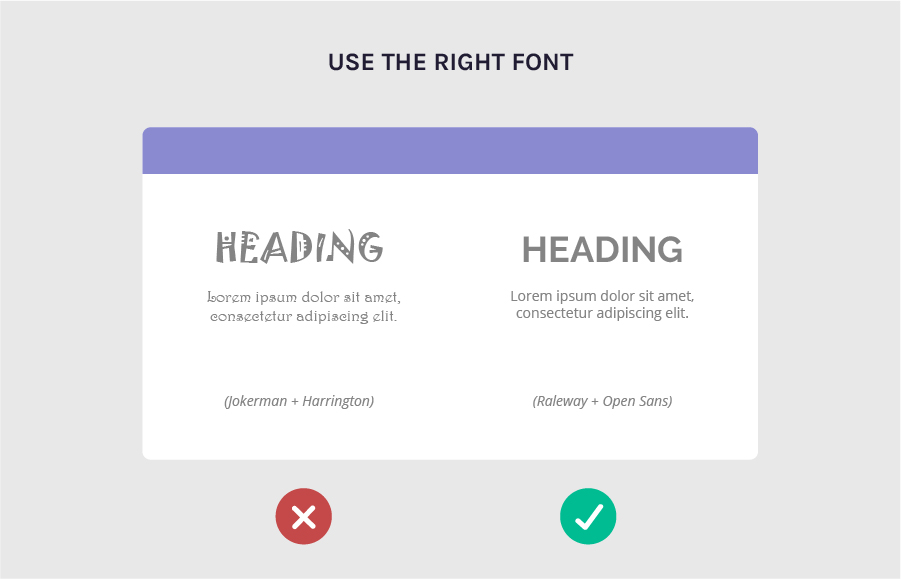
10) Use the right font
There are good and bad fonts to use.
Here's a quick article on some fonts that you could use.
And that's all folks!!
If you found this helpful do share the love on this twitter thread.
Also for more practical design tips to help you grow your business, check out the Growth by Design page!

Thank you for these cards! Easy to understand with examples
My pleasure Natalie!
Very cool the website reminds me of https://marketingexamples.com/
haha yeah! Marketingexamples is awesome