A cool inspiration to (really) improve your signup page
Just found out that ChatGPT updated its signup page.
It used to be very minimalist.
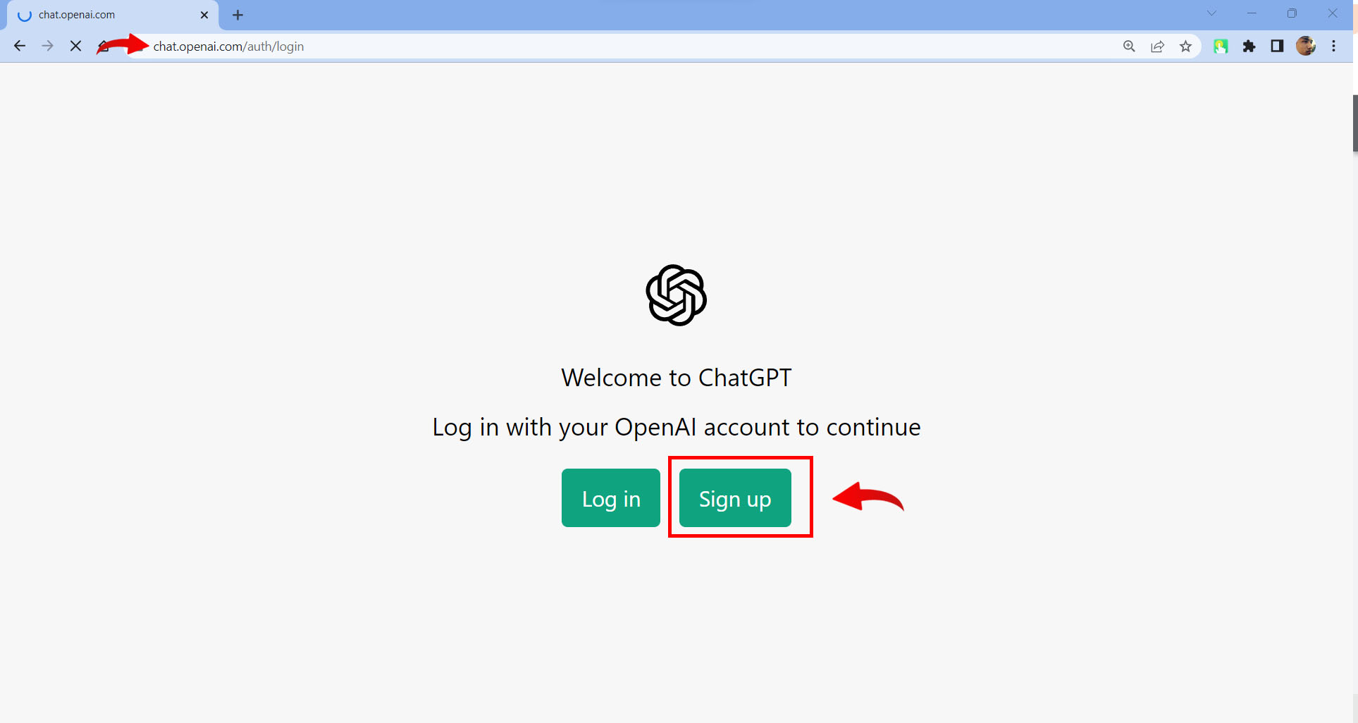
It now looks like this.
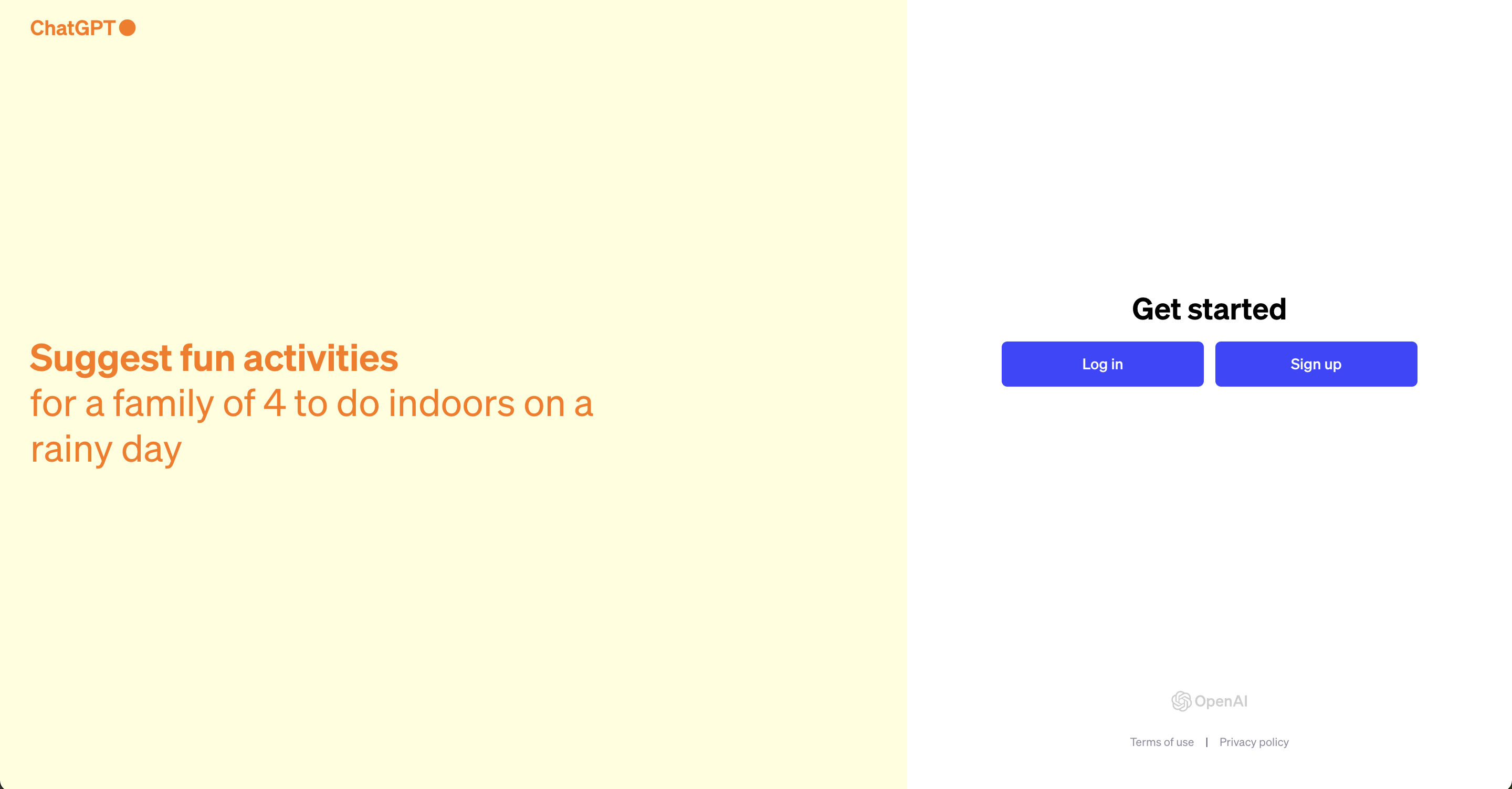
Why is it better?
- Benefit oriented headline
- Stronger brand
- It stays simple
- It adds trust
Why you should spend some time improving your signup page too?
It's a quick improvement that can easily lead to more signups (supposingly better signup rate, the data will tell on their side) and you can easily replicate.
If you liked this, I share every day stuff like this @Thegrowthlobby to help founders improve their growth funnel (AARRR).
