Designing for Emotional Responses
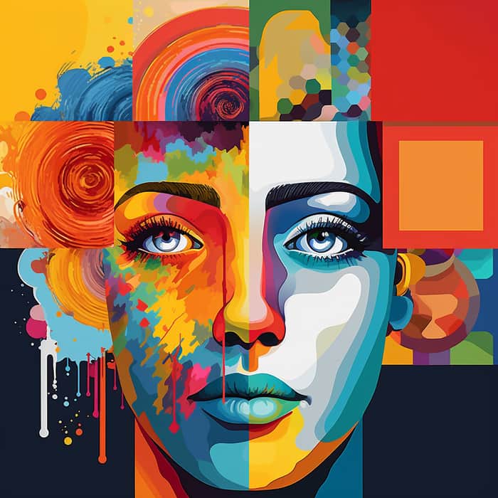
As designers, it's our job to paint a design canvas that evokes emotions, captures attention, and leaves a lasting impression on users. All of this can be achieved simply by playing with the right colors. Understanding color psychology allows you to use colors like a master artist, painting rich emotions onto the canvas of your designs.
Each color has its own magic!
1️⃣ Red: The Fiery Passionate Powerhouse 🔴❤️
Ah, red! The color effortlessly grabs attention and ignites the flames of passion. It exudes energy, courage, and urgency. Red can be the perfect choice for creating a sense of urgency or evoking excitement. Use it to amplify call-to-action buttons or highlight important elements in your designs.
2️⃣ Blue: The Calming Ocean of Trust and Reliability 🔵💙
Blue represents tranquility. It evokes a sense of trust, reliability, and serenity. Incorporating blue hues in your designs can help create a feeling of security and trustworthiness, making it an excellent choice for corporate branding or healthcare-related designs.
3️⃣ Yellow: The Lively Sunshine of Optimism 🟡💛
Yellow is the epitome of sunshine and happiness! This vibrant color represents optimism, joy, and creativity. Use yellow to inject lively energy into your designs, especially when conveying a sense of playfulness or positivity.
4️⃣ Green: The Refreshing Harmony of Nature 🟢💚
Green, the color of nature and growth, instantly brings a sense of balance and harmony. Incorporating green in your designs can create a soothing and refreshing atmosphere, making it perfect for wellness-related brands or eco-conscious projects.
5️⃣ Purple: The Mysterious Elegance of Creativity 🟣💜
Purple represents creativity, luxury, and spirituality. It has a certain allure that captivates the imagination. By infusing your designs with purple accents, you can convey a sense of elegance and prestige, making it an excellent choice for high-end brands or artistic endeavors.
