Do front-end engineers need to have design skills?
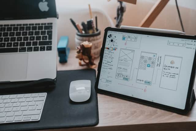
🤔 Do front-end engineers need to have design skills?
Every now and then, this topic pops up, especially with junior developers looking to expand their skills set.
The front-end engineer's main job is to implement the user interface, and the design usually created by a UI/UX design professional. What do you think?
💁♀️ I don't think it's necessary. It's like asking if a construction worker / painter / carpenter needs to have interior design skills.
BUT...
🥁 That's not to say there's no value-add to bring to the table. A front-end engineer with an eye for aesthetics and understanding of good UX principles can spot design flaws during implementation and offer constructive criticism to fix or enhance the design and help the company avoid costly mistakes that affect product adoption and usage. Some of the best front-end devs I've ever worked with love to add a bit of flair to the UI that isn't in the design, like adding animations to make pressing a button delightful, or adding transitions to make state changes obvious. No company will turn down a front-end engineer with design skills because it's a rare and highly valuable combination.
Resources to learn UI/UX for a front-end dev
What are some good resources for a front-end developer to learn about UI / UX design then?
📗 Atlassian Style Guide : Great for learning how to design good B2B applications
📗 IBM's Carbon Design System: Another good reference for B2B applications
📗 Material Design Style Guide: Great for learning how to design mobile applications
📗 Smashing Magazine : Great articles on web design and front-end development. Lots of interesting topics about UX and accessibility too
📗 Mobbin: Pinterest for web and mobile design
Best practices that all front-end devs should know
And here's some great articles on very specific topics that I think all front-end devs should know:
👉 Spacing: Every junior dev that have ever sit with me for a review will know that spacing is the first thing I nitpick on all the time. "This is too crowded. The text is too close to the icons. Increase the padding here. Why is there so much blank space here?" I recommend reading "Applying whitespace in design" by Lim Yuan Qing, UXCollective and "Spacing guide for designers" by Oriol Banus, UXPlanet.
👉 Text alignment: Don't center align long blocks of text, PLEASE. I recommend reading "Text Alignment Best Practices", by Buninux, Prototypr
👉 Toggles vs. Checkboxes: For some reason, junior devs love to replace boring checkboxes with toggle switches. Learn which ones to use when and why, read "Checkbox vs Toggle Switch: 7 Use-Cases of Forms Design by UXWorld"
What else? I could go on, but I would love to hear recommendations from the community as well. 📣
Credits: Cover photo by Alvaro Reyes on Unsplash
