Improving things one day at a time for my products site!💪
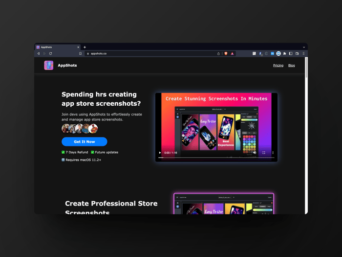
Since launching my product AppShots last month, I've been working on building and improving my products site to better showcase its features and problems its solving. Today wanted to share a few things I learned from improving the site over this last month👇
You can see here the very first version of the site,
Nothing special, very basic site with a simple hero section but it misses the point of hero section which is getting the attention of the user with a clear problem statement. The video's there but nothing that make the user excited to keep scrolling.
So, since last month I've been improving the site with every feedback I got and by looking over the analytics to how users were converting.
This updates I made are just result of many iterations I did over the last month. The site now has a clear problem statement in the hero section which shows the primary objective of the app and gives some visual aid with an demo on the right. Also, a nice little stack of devs avatars using the app for more trust🙌
Then it's followed by proper display of features and the problems the app's trying to solve and help users with. I think showcasing this sections were important as it puts out the app's offerings in front of the users one by one.
Earlier it was a grid of cards with an image, title, description but that didn't helped in conveying the visitor of the apps features. So I believe adding this new sections which clearly states each of the problems individually along with some visual aid helps visitors makes the decision.
Also, earning visitors trust is crucial so I've ramping up my testimonials section where I showcase some tweets and devs profiles using the app. This assures visitors that the product is something trusted by others also.
Next up, I improvised on the pricing section. Earlier i had many pricing options including 1-month offer, lifetime deal, monthly and annual subscription. But based on some feedback, it was hella confusing to lot of people. So now I made the decision to have only first three offerings with clear message.
Latest site demo,
I'm yet to see any conversions based on this new ui updates but I believe this are now much better than what I had earlier, and can make it easy for visitors to make the decision.
You can checkout the current site here.
Do you've any things you learned over iterating your products site for better showcase and conversions? Share your learnings below so we all can learn from you also.
Hope this post helped you get few insights on how you can also improve ur sites ui for better visibility on ur product.
Thanx for reading and have a great day builders!💙💪
