Just shipped the core dashboard for NanoURL. Here’s why I obsessed over the tiny UX details. 🚀
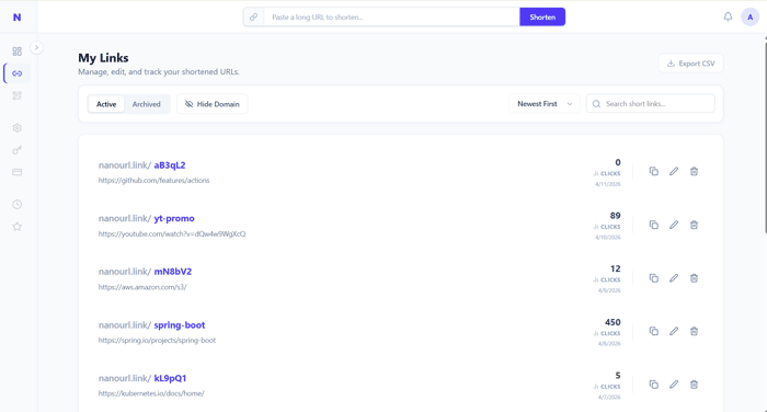
Hey everyone! Continuing my #BuildInPublic journey with NanoURL (my SaaS URL shortener). This week, I finally finished the "My Links" management page.
It’s easy to think of a dashboard as just a <table> dumping data from a database, but once users start creating hundreds of links, that gets messy fast. I wanted this to feel like a premium, enterprise-grade tool right out of the gate.
Here are a few technical and UX decisions I made along the way:
Soft vs. Hard Deletes: I built a custom modal that forces users to choose between "Archiving" (Soft Delete) and "Permanent Deletion". Archiving keeps their historical click analytics intact, while a hard delete frees up their active link quota.
The "Domain Toggle" UX tweak: A list of 50 links that all start with nanourl.link/xyz is awful to read. I added a simple UI toggle to hide the domain prefix so users can just scan their actual slugs. It’s a tiny feature, but it cleans up the UI immensely.
Framer Motion Magic: Deleting an item from a list usually results in a harsh, sudden snap. I wrapped the list in <AnimatePresence> with layout="position". Now, when a link is archived, it fades out and the remaining links smoothly slide up to fill the gap.
Server-Side Everything: I skipped the "load it all into React state" trap. Pagination, sorting (by date or click count), and searching are fully server-side via Spring Boot, meaning the dashboard will still load in milliseconds even when a user has 10,000 links.
The biggest takeaway: Polishing the "boring" CRUD pages is what separates a weekend side-project from a trusted SaaS tool.
Click Here : https://nanourl.link/
What’s your favorite "tiny UX detail" you’ve added to your own dashboards? Would love to hear them! 👇
