Landing page refactoring with seed users
I launched MonthCamp last week.
In my effort to make this product, I was hoping to get a lot of feedback from users. But it seems the response was very low. I am disappointed by this lack of interest in my work.
Fortunately, I still got some seed users.
The most feedback problem is that my landing page is not easy to understand. They don't know what I'm trying to build.
I took 2 days to communicate to those seed users. Then, the below land page cames out.
Current:

Previous:
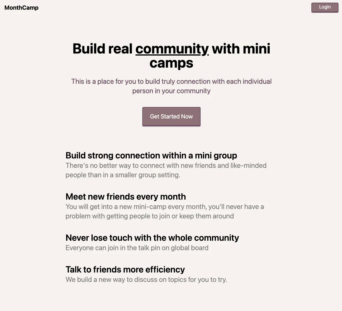
What do you guys think about this land page?

I think the header animation/GIF is already a step in the right direction. However, I think a short explanatory video of how a community operates will make a difference.
Also, when I click on "Get Started Now," I get to a list of communities, and when I click on one, I get to the same page, but with a different copy. That isn't very clear. I would have thought it would show me the community or at the next step of the process.
It also took me a while to figure out the icon on the top of the screen, which brought me to the globe page. Which, if I would guess, is the main page of a community?
I like the UI. It's clean! But I think you can improve upon the UX and, in particular, the onboarding.
Feel free to reach out if you have any further questions or want to bounce some ideas of me, happy to help!
Thank you for taking the time to give me such detailed feedback! You're right, my UX design is terrible. I need to redesign it and will get back to you after that.
Hi, Twan, I just refactoring the whole UX of MonthCamp.
Hope you have time to help me look at. Your advice is precious to me.
I was planning on sending you a DM via Twitter, so it would be easier to start a convo about my feedback, but your DM's are closed. 😢
The UX is a step forward in the right direction! When clicking through the pages, here are two things I thought of:
Hopefully, this helps! Let me know if you have any questions.
Great points ! It's hard for me to come up with these without your input.
It seems I need to think about the user's perspective more. I will work on it this week.
Thanks again for your help.
BTW, I just opened my Twitter DM, sorry for the inconvenience.