Logo feedback/help
Hey Everybody!!!
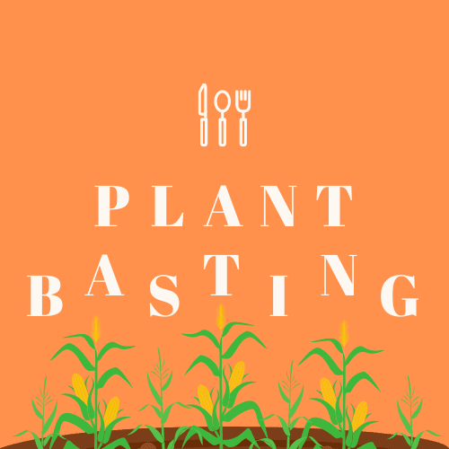
My co-founder and I made a logo today, but we're not sure what color to pick for the background.
Would love any feedback on the design!!
If you have a second, pick your favorite color in the poll below.
Check out @PlantBasting on twitter to see which one we end up picking and if you have any questions about plant based eating we're always here for you!

Hello @scttohara,
I'm a graphic designer specialized in logo design so don't be afraid if my message looks intense! I would choose the orange version because it brings dynamism and strength to the picture.
What I like the most in your logo are the dancing letters: it conveys the idea of growth in a vivid and organic way and I think it's a beautiful idea. I also like very much the simplicity of the design (the icon, the font), it gives a sense of modernity, efficiency and accessibility.
Nonetheless, there are a couple ways to make it better: • Why not try a symbol that would combine corn and fork? It would give more efficiency and originality to your logo.
• In order to be more legible and visible, you could reduce the letter-spacing and the size of the font.
I hope I am helping you! Dont' hesitate to ask me if you need more feedback.
Thanks so much for the specific and constructive feedback! The change you suggested with the letters may be worth a try, as we found something about them to be a little “off” without knowing exactly what the fix should be. With the help of everyone’s opinions, we are currently in the process of putting together a new, more simplistic, and hopefully more straightforward logo. Combining two unlike visual elements (in a better way than this) will definitely play a role to develop a more original looking design.
Sounds good! Don't hesitate to share your new logo for feedback again! I'm just thinking: to combine two unlike visual elements in a fitting way you can apply the typographic rules of contrast in mixing typefaces. Ellen Lupton "Thinking With Type" can be a great help for you: http://thinkingwithtype.com/letter/#mixing-typefaces
Oh that’s an awesome idea! Thanks for the type face link as well! It was honestly eye opening.
Hi Scott,
I think going for purple would be the most original. But I would definitely explore different types of that color as I'm not the biggest fan of your current choices. Also I would go for 'less is more'. A logo is always very clean and should work in all scales. I would definitely lose the plants at the bottom and if you really want to keep them, you can use them for banner images like on Twitter.
Here are some examples of nice color combinations:
Thanks!! Really appreciate the feedback and the links, since we’ve been struggling with color combos. Didn’t know about dribble until today so thank you for the eye opener!
I agree that this may work better as a Twitter banner/landing page concept rather than a logo. We just got excited and went overboard with the design.
We are drafting up a new logo that I hope to share in the next couple days once we make finishing touches!
Is the logo the utensils? If so, the orange has the best contrast. If this whole thing is your "logo" I'm curious where you intend to put this.
Anyhow, check out some logos in your space: https://dribbble.com/search/veggies logo
Thanks for the feedback and link!!
Nah, the utensils were just a generic element from canva, so we don’t necessary want to use it by itself, but I see what you’re saying.
Honestly this was a first attempt at a logo on canva, so I think we went a little too far in trying to create something unique with the “canvas” we had.
We’re going back to the drawing board for something simpler.
Hello Scott,
Just some food for thought when you're designing logos and using pastel colours, look for a 'darker' colour to better present contrast.
![logo]: https://i.imgur.com/ITd69SB.png "Logo Green"
![logo]: https://imgur.com/FyrXNwz.png "Logo Orange"
Hey @Zch thanks for the feedback. That makes a ton of sense!!
Also, thank you for the image. I'm a visual learner so examples are always super helpful!
I'm also a visual learner and learn by doing. Figma is a free and fun design tool for vectors, illustrations and other stuff. You can also prototype designs and what not. It's what I use.
Lots of YouTube videos you could learn from as well, just start with basics and work your way up in your spare time. It's what I did and overtime, learnt it almost inside and out when I got confident and began exploring!
I actually just found out about Figma the other day and started messing around with it.
That's awesome, thanks for the tips! I didn't even think about checking youtube for Figma related stuff (for no good reason), but definitely will now!
Orange is the most eye catching, but I agree with other commenters that there's room for improvement still. The yellow and green of the corn clash pretty aggressively with the orange.
Thanks for the feedback! Yeah I agree with that for sure. We have a pretty different logo concept now after all the helpful feedback. I’ll hopefully share soon.
I like the light purple bigtime. Good luck!
Thanks!
Love the idea.
Do you think this logo will translate well in the various forms a logo has to work in (even down to a favicon)?
Thanks! And honestly this was our first run with Canva. Based on trying to get it to scale down for a Twitter banner, we probably will have to come up with something else for a scalable logo.
White on light purple is bad for readability. Also, there is a lot going on, I recommend cutting elements.
Really appreciate the feedback. Do you mind mentioning which elements you found most distracting/unnecessary?
Is the corn part of your logo?
A logo is simply a visual name, no need to complicate it. Your visual mark is a knife, spoon, and fork... your logo doesn't need to explain what you do or industry. Does nike's logo tell you it sells athletic ware? Does Apple's logo have anything to do computers and tech? Nope. The logo serves as a visual name, nothing more or less. I'd recommend whittling it down to one unique visual ... either do something interesting to the letters or use one icon-like item for a visual mark.
This comment was deleted 5 years ago
The honest feedback about both the icon and font type is appreciated. The icon definitely does lack the originality needed for it to be in our final logo, so we are going back to the drawing board in that regard for sure. We want to avoid running into issues, but as we almost immediately started to run into some with resizing, it’s clear that there’s room for improvement.
This comment was deleted 3 years ago
Appreciate the feedback! Definitely going to come up with something more simple for the next iteration.
This comment was deleted 4 years ago
Thank you for the honesty!!