New landing page: Looking for constructive feedback.
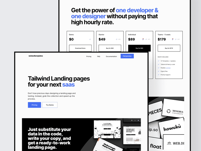
Hello everyone!
So, I finally redesigned and built our website and I would love to know what you think?
Is live here:
If you are going to give good feedback, which I would appreciate it would be good if you act as customer would, so the feedback has sense:
For example:
- Try to find a template.
you can see all the redesigns here, is a figma file:
https://www.figma.com/file/HB5YQu9HX7GMv60aqHWbqx/newbatch?node-id=695%3A61
Thank you so much everyone, and have a great day!
/mike

Looks Nice Michael! Here's my feedback at first glance:
Anyway, overall I thought it was clean and focused, nice work!
Oh, the mobile padding. Thank you for that, completely forgot... thank you so for calling that out...
I can slower the letters absolutely.
So yo mean the fixed navigation is not so needed? Is it maybe because is not too long the site?
I could definitely mention the Figma files too. thanks for that Chris.
thank you for the feedback, really appreciate!
I mean that I think I'd prefer a navigation that is fixed to the top of the viewport so that when I scroll it doesn't disappear. I know the page isn't super long, but it's still a bit annoying going back, plus user will lose visibility of your 'full preview' CTA :)
I completely though I left ti fixed. Thank you once again.I ll fix that today thank you!
No problem :)
Hey Michael! Could you please explain why the "Try Demo" button leads to the pricing page instead of https://wicked-templates.gumroad.com/l/wicked-demos? In that case, "Pricing" and "Try Demo" buttons do the same job.
Because that's where you download them from.
I mean what's the purpose of the additional step creating for the user? If the user wants to try a demo, he should go to the pricing page and hit download the demo. Maybe it's better to direct the user right to the download demo page?
well, so the customer see what's included.
Looks good!
I really enjoyed it 🙂
Thank you! Yogev
Can you add more color to your examples? At first glance it feels like I can only create black and white landing pages.
More colour, where, you want me to make templates with more colours?
The thing is that we create them, then you add the colors that you choos, but if you want more colorful templates I have experience with this today.
We have
Yes, templates that have color as opposed to it being b/w
you know, I had in the back of my head that maybe potential user didn't want to use more colorful, because they won't dare to use it...but I will have to be myself and create better stuff.
Thank you for that feedback, really appreciate.
Hi Michael, your website looks really nice. Well done.
Here was my "customer journey", hope it helps:
After reading home page: I'm not very familiar with templates in general, and I'm using Gatsby+Bootstrap so I'm probably not be your target customer (at least right now), but I was kind of confused by the product. What is a "template"? Is it just html/css boilerplate? Because when I think "template" I think about templating languages like handlebars or moustache – something where you input data/content and get a webpage as the output.
Trying the demo: This is a probably something you can't control since it's on gumroad, but I tried to get the demo on your gumroad link and I clicked "I want this!" like 10 times but nothing happened. Almost gave up until I realized I had to type in "0" in the field first. It looks like there is already a 0 there (I see now it says "0+"). There should have been some sort of feedback saying "please enter a price" upon clicking the button.
After downloading the files: I saw in your README.md how to use the templates and that the file generation is done using Gulp. Now it makes sense to me. Maybe something to mention on the website on the home page/description? I went back to FAQs and didn't see any mention of Gulp. Also, your home page says your templates work with Next.js which is interesting to me because I am just starting to learn Next. But I don't see anywhere in the README or your website how to actually use your templates with Next. Maybe I missed it, or maybe that's obvious to a Next expert, but it's not to me.
Anyway, that was my experience trying out your website/product. Your templates look expertly designed – really nice work there.
Hope this feedback helps!
just added this this morning and will be updating when needed.,
https://www.wickedtemplates.com/documentation
Better?
Yes, much better! BTW you misspelled "Deplopying". Although I feel "deplopying" should be a real word lol 😁
oh maan, thank you again. i keep rushing and creating typos...thanks a lot!
👍
First of all , thnak you for this!
Let me answer.
Well a they are called templates because we give you all you need but you will have to use your own copy. And yes, you are right, this are made with handlebars.
This is an issue I haven't been able to get out of it. Even the modals are not scrolling...sometimes, tested Paddle but I do not like the experience as a customer. Almost moved to Lemon Squeeze and they are really good, but some stuff is missing.
If we move now, we would also loose a lot of data that we use here wickedtemplates.com/open....
Yeah, I was late working last night on it and I haven't got the chance to work on it. I am going to add the READme on the faq or docs.
On our landing page it says that "Our bestsellers templates are also available with Next.js because we know you love performance. " it means that they are available not that you can integrate them. In this case there is two templates made with Next.js that come with the Bundle.
I will see how to mention that on the landing page, good point.☝🏼
Thank you for this and for your input Steven so much need.
Happy to help. Keep up the good work!
You are awesome :-)
Hey Michael, I love it! Just my two cents:
👉 I don't think the background blur of the sticky navbar matches the style of the rest of the site. (Everything is so high contrast and sharp)
👉 The icons in the upper right pricing-section-items (e.g. next) are a bit too tiny.
Good luck with your product. It looks stunning! 👋
me neither, I deployed like, an hour ago....it looks tacky, right? Ill remove tht :-)
Ok, I agree with that, I was afraid they were too getting too in the middle.
also, thank you for that!!
Hi Michael!
Awesome work! Love the "backspace" effect on the h1 text -- it's something I'm going to implement in my video editor as well 😁(it's been on my mind for months).
Curious, was it hard to implement?
A bit of a nitpick, but that is clearly my personal preference: I'm not fond of fixed corners (on the pricing page)
Hi John, I think there are libraries to make that "backspace" animation. I have done it using "animejs". If you want to know more, reach me on twitter, I can DM you the code :).
@gperales Thanks! I'll take a look - I'm curious to see what features they have😁
Hey John! I haven't implemented that part of the site you can ask @gperales he can guide better.
Fixed corners?!
I mean, each pricing block has a border (a rectangle, with fixed corners) :)
ah yeah, it's meant to be, is the style of the website.
yup, i got it😁
Hi!
The site looks nice, but the button under “We are small but we already have customers from all around the globe” is illegible.
And as a customer I would like to see some of your previous clients' cases.
Do you mean the "see our expo" ? I can have a look It might be the font is not the right one, thank you!
Yes, I mean this button. The font colour and background match, so it's almost unreal to read the text (at least at my Mac)
I see it complete fine...is there a way you have a screenshot to see how you see it?
https://we.tl/t-P5wljteEfY
here it is
now, that's weird. the buttons are actually blue! Thank you for the image :)
don't know why it happens
This comment was deleted 4 years ago
Hi Primer!
Thank you for your input, I appreciate that.
I am going to try your but like this: **Don't lose precious days designing and building a landing page. Grab our Bundle and you're good to go. **
Thank you for taking your time Primer, really appreciate it!
This comment was deleted 4 years ago
Sounds good too :-)
Have a nice on Mick :-)