[Poll] Which logo did you like? Please vote 🙏
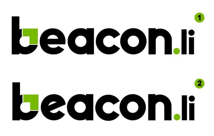
Hi all,
A simple poll - which of these logo did you like? Please vote.
What is beacon.li:
It's a no-code product that helps SaaS companies to instantly integrate universal actions, content search widget (command palette like Mac's spotlight) to simplify user onboarding, easy in-app navigation, AI summarised support answers, improve product feature adoption & more.

I just joined so apparently I can't participate in the poll...
So I'll say, I think #1 is better. I'm honestly not sure what the green quirk of the "b" is all about, but in order for that to stand out, I think the "e" should not also be quirky.
So IMO, #1's "e" looks more natural — like it fits with the rest of the word better.
Thanks for sharing your views. We actually went with #1 and have it updated on our website: beacon.li
Very nice design did you do it yourself?
Thanks, we have an internal graphic designer who did this.