ROAST: 3 landing pages - which one's the best?
We’ve had the same landing page for almost the whole year since we launched RatePunk. It had all the necessary functions and wasn’t our main priority at that moment. However, we have now started implementing new columns and thought to test some new designs simultaneously.
Here’s the original one, also known as our homepage:
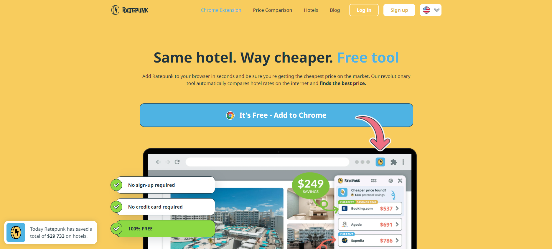
And here are 2 versions that we’re testing out at the moment:
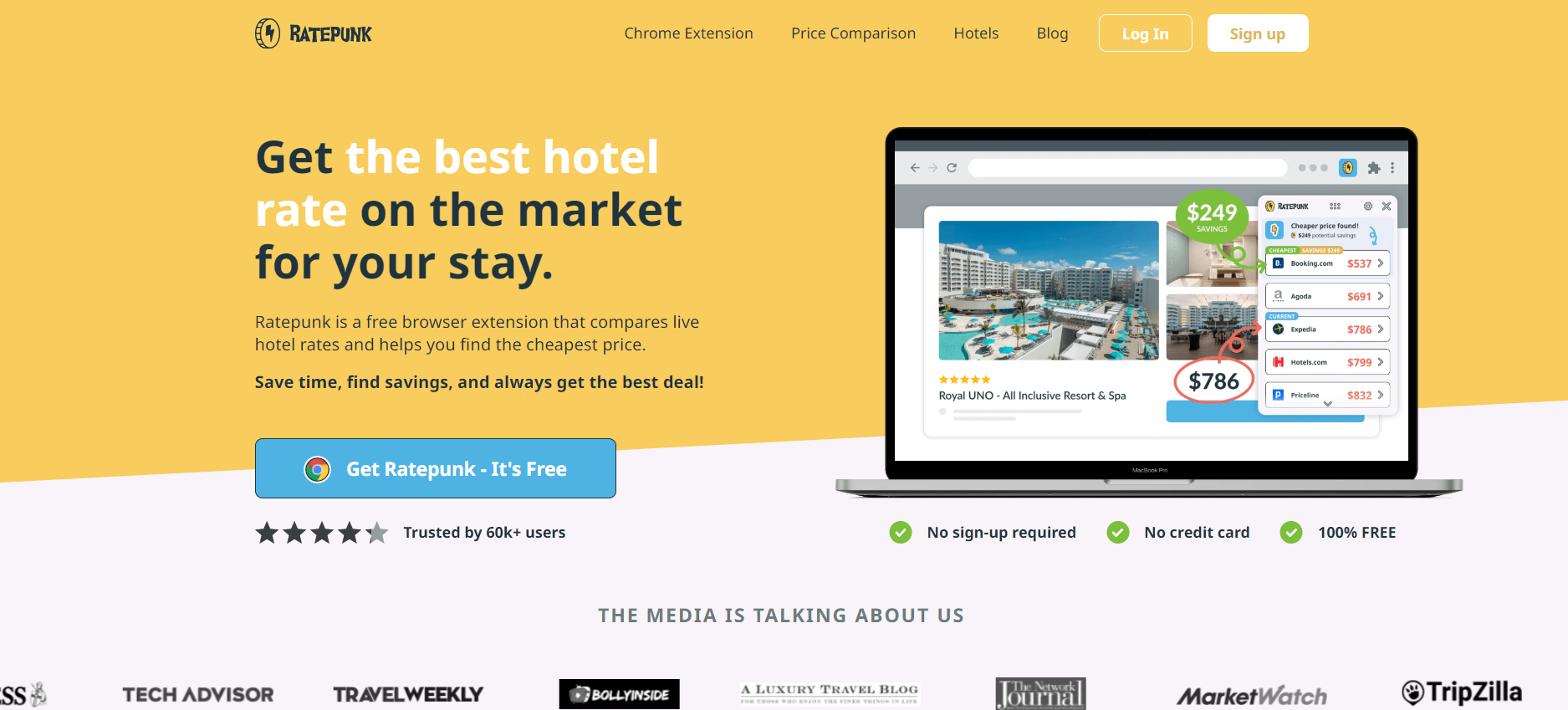
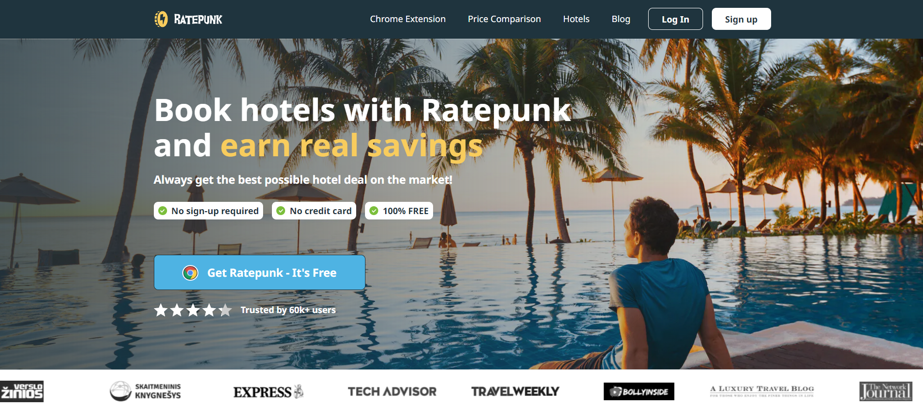
According to data that we’ve gathered so far, 2nd variant is proving to perform best:

What’s your opinion - which one looks the most attractive to you? What should/could be improved? Leave a link to your landing page in the comments if you also want feedback - I will surely share my insights as thanks!

Howdy @Justin_Alb
Wow, it looks like RatePunk has found a lot of success up to this point! 40k+ installs is a powerful testimony to its use.
I see a number of details that could affect the conversions of each of these experiments. I will create a video review for you if I can find time today.
Variant 2 (with the photo) is clearly the winner of these 3. Variant 2 is at 97% probability compared to the other two.
Question: What metric is being measured to determine the winner?
TESTING 🧪
There are 2 types of testing—Pages and Variants.
Page Testing. Page testing is what you are doing here. Where each page is drastically different than others, measuring for significant effect works here and can help quickly narrow down which design you should use before making smaller changes.
Variant Testing. Variant testing is for measuring smaller changes on a single design. So, you may variant test 2 different Headlines, 2 different buttons, or 2 different background images.
This may sound like splitting hairs semantically but is a good way to think about how to structure testing cycles.
SPECULATION 🤔
I can speculate based on intuition on what works and doesn't work for these designs. Here are a few thoughts:
Images work better than color backgrounds for vacations. Set the mood for what people want to see. Make them think "that's me" or "I want to be there".
Yellow is not a great color. It is often off-putting to many people. If a brand uses yellow it needs to be used minimally to make something pop. Variant 2 does this well by only using yellow for a text highlight. Sections with a yellow background are... meh.
The text color contrast is super weak. The dark text on the yellow background is not strong enough. The blue text on the yellow background is not readable. The white text highlight on Variant 1 is not readable.
Variant 2 does the best as a Hero section. These are the elements you always need:
• Headline
• Subtext
• CTA button
• Star Rating
• Counter objections
• Image
I can think of a couple of dozen other considerations but will leave it at that before this (not) short comment gets too long.
Thanks,
Hi Caleb! Thank you so much for all these insights & the detailed explanation.
Answering your question: although it would most likely be best to track the number of installs, we're tracking redirects to Chrome/Safari stores.
All of this is very helpful, I'll definitely take it into account.
I would stay with the original one or maybe variant 1 cause you see the media badges at the first look
But the media badges are quite visible on the 2nd one, too, no? But that's a good point, I understand it's an essential part now. Thanks!
I really like the original one!
Why do you think 2 is performing better?
Got it! Thanks!
According to our developers' data & algorithms, it has the highest possibility of beating the original. But there's no huge difference between all for now, there are not enough numbers just yet.
keep us posted. interested to see the results