Roast my landing page?
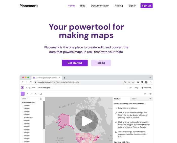
https://www.placemark.io/
Freshly redesigned, but for the better? You tell me. My product, Placemark, is somewhat niche but I think I could do more to market it well. What seems good or bad to you about this marketing page / site? Thanks! 🤗

I like the design. I think the CTA button matches too much with your color scheme. Not a deal breaker, but it doesn't "pop" perhaps as much as something with a little more contrast.
Thanks - great point, I'll experiment with a CTA that stands out more with a gradient and a color that isn't used elsewhere on the site.
I like the clean look, not cluttered.
Hi @tmcw, looks like a sophisticated tool.
My question is - who is your target audience? Is it for enterprises who use GIS Tool?
It's hard to say, the most vocal users have been from everywhere from county GIS departments to finance to farming. Most are folks who would use GIS, but need something simpler or want something that's collaborative and web-based.
This comment was deleted 4 years ago
Great feedback, thanks! I've applied all of this the best I can and pushed an update, using some elements from a Webflow template to try and make it look better/faster.
This comment was deleted 4 years ago