Roast my site and I will roast yours!
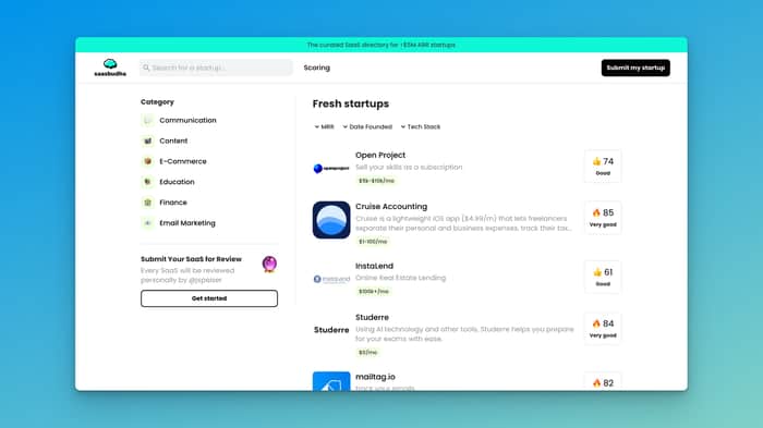
I am building saasbudha.com for an angel investor and will launch it in the coming weeks!
Saasbudha is a SaaS directory where founders can list their SaaS and get it reviewed by angel investors.
I am looking to optimize the site and would love to get your feedback!
Feel free to post your site here too and I will give you feedback too.

Looking forward to your roast on Loggify
Thank you! This is awesome. I will address them all.
We have prepared feedback on Loggify for you here: https://app.instacap.co/qZejNsZckYZrlij6Eeqk26pIse52/OCBC3rZgyZg-F8xxWmtgB
Thanks mate. I addressed them. Was helpful :)
Looks pretty good actually! Very clean and simple.
One thing that's feeling a bit off, is the score. I'm not sure why but in my opinion it's not fitting the site well. Maybe make it smaller?
Good job tho!
Thank you! You are right. It looks a bit off to me too. Will try to make it smaller.
The landing page of Tolt looks amazing! Do you want to submit Tolt to Saasbudha? We will have a lot of SaaS founders visiting the site and it can be a good source of traffic for you.
Thanks!
I would definitely want to submit Tolt to Saasbudha, but maybe it's better to do that in around 2 weeks when we launch.
We give multiple rounds of reviews as you iterate. If you are looking for feedback today, you can submit it. You can resubmit once you have made changes to get another round of feedback.
good job @ed_li!
Why only saas?
Also I would add onboarding for investor.
My product is styletyx.com
we help to buy branded clothes cheaply and save time.
I have some questions for community:
To be honestly: The page looked broken at first.
I thought some CSS file did not load properly.
The lazy load of the lower tiles is probably the biggest flaw here.
Colors are bland and contrast is bad.
On wide screen (4K) the tiles are very rectangular and products are not centered. So I only see legs of jeans or shoelaces. THis needs a fix.
Especially on pictures it's best practive to keep one aspect ration everywhere.
I don't undrstand what the value preposition is. It's just another clothes shop for me. If that's it, you need to foucs on UX, as this space is super competitive and needs excellence.
If you have some other value, you should point this out clearer
Thank you @fabcgn very much for your feedback, absolutely agree with all of your points.
We'll do our best to fix it asap.
as regards "shop for me" - it's our main pain. We are not an e-com store, we are service like a booking, skyscanner etc. How would you present it?
I am not really into this market, but if you are more like a search engine for products, I think the only way to be successful is to be among the best in SEO.
Perfect implementation of schema.org tags, full integration into google shopping, ...
Or go niche and build an exclusive shopping club with great deals and top products. But this curation is hard in such a wide market
Thanks for your feedback.
Agreed with @fabcgn assessment here. I think the key is the value proposition. Is it scouting for the best clothing deals (like Trivago for hotels and Skyscanner for air tickets)? You may want to communicate this visually - for example, Trivago lists the logos of all the sites they compare prices for.
@ed_li Yes, you are right, we are like Trivago, Booking, Skyscanner. We are concierge service in the fashion market.
what can we do so that the user immediately understands what is being proposed, what we are? what would you do?