Roast my website 🫣
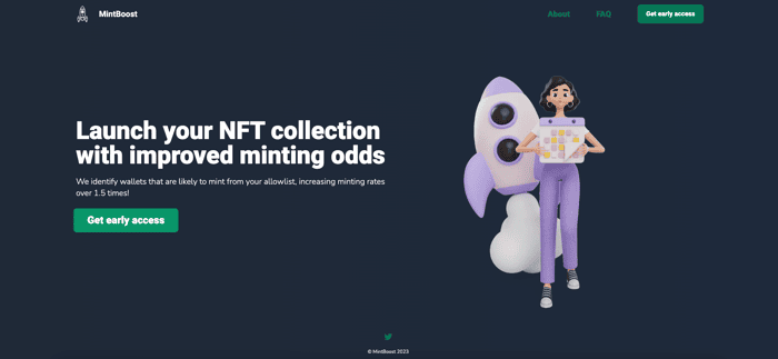
Hi fellow hackers!
Recently I started working on Mintboost.ai, a service that helps NFT projects optimize their allowlist by filtering out wallets that are unlikely to convert.
I just made a marketing website and would love to get some feedback on:
- The general design
- whether the value proposition is clear
- Quality of copy (English is not my first language)
Any other tips and tricks are also much appreciated. I also wrote a little introduction here:
https://www.indiehackers.com/product/mintboost/why-i-built-mintboost--NLKkOoqjJV9NDz8XCeF
Have a great day! 🫶

This is barely a landing page, there is literally one line of text. You should skip those About and FAQ pages and put this content to the front page, and use those About and FAQ links as anchor links.
What I can say from the front page material is that the pitch sounds very engineering oriented. It's not bad, but I don't think it's great, either.
The color scheme is a bit dull. For example, the top navigation menu links are dark green, with the CTA button also green. That kind of repetition is a bit dull. The same exact thing is with the graphic with the tiny yet thicc rocket ship and the lady, both of which are in the exact same shade of purple. Again, if one would be a bit different color, just like if the text links would be different color to the CTA button, that would make everything look a bit better.
There is currently no indication what does "early access" mean or why I should click that. Does early access include some kind of early adapter discount? If not, why should I basically beta test this thing for you? What's in it for me? Also, speaking of price, very few people are going to click your CTA when you don't say anything about the price. If this is free, say it. If this is not free, say that and be frank about the pricing. People will pay for things, if they find them valuable. But they don't like surprise pricing.
"We're a team of NFT enthusiasts" - If so, why are you not showing your faces and names? Right now, you are not a team of anything, you are a random website that doesn't say anything who you are or why I should trust you.
"We're excited to help you boost your minting success and join you on your journey in web3!" - Cool. And what gives you the expertise to help me? What NFT projects have you launched and how did they perform? Show me the proof. Words are cheap.
Everything in https://mintboost.ai/examples just seems made up.
Hi Jouni,
Thanks for the thorough feedback. You make many great points and I tried to work on most of them (incorporated the about, faq and form on the home page, changed the color scheme and made it more clear what we offer at what price). Still thinking on how to incorporate your last 2 points (team & expertise) with grace.
In general I feel like the page already improved a lot from the first version, so I’m happy about that.
I’ll continue to work on it as much still needs to be done. Feel free to share any other thoughts as your initial comments were very helpful.
Big thanks!
Hey mate! I like the idea, I made a quick Loom to answer your questions:
https://www.loom.com/share/5a0c1ea5e54b47d6be8a5f97a683fde9
Let me know what you think!
Hi Omar,
Thanks for the great feedback. It was very cool to receive it with Loom. It was the first time I used it and it was great to get your feedback like that!
I think you made some great remarks and worked yesterday on updating the layout.
I’v added some extra padding, restructured the website to a single page, changed the colors and worked on the copy.
I think the website already feels much better now and that it’s easier for visitors to know what we do.
I’m sure there is still much to improve on, so feel free to share any other thoughts as it really helps me!
Thanks!