tail|select 1.0.0 Released: Vanilla JavaScript Library for Stylish and Functional (Multi) Select Fields
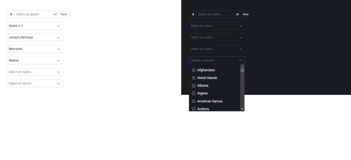
The tail.select library is making a comeback, now rewritten in pure, vanilla JavaScript. Say goodbye to complex dependencies and welcome a simple yet powerful tool for enhancing your HTML <select> fields. Version 1.0.0 is here, and it brings a host of features to streamline and beautify your website's (multi) select fields.
What's New?
Vanilla JS, Plain JS, ES6, Modern Browsers: Embrace simplicity with a library that works seamlessly with vanilla JavaScript, plain JS, and is fully compatible with ES6 in modern browsers.
Features
Beautiful (Multiple) Select Field: Elevate the aesthetic appeal of your HTML <select> fields effortlessly.
Awesome Search Function: Enhance user experience with an intuitive search bar that makes finding options a breeze.
Move Selected Options Wherever You Want: Tailor your UI by moving selected options to the desired location.
Over 30 Options & 5 Themes: Customize to your heart's content with a wide array of options and themes, ensuring a perfect fit for your website's design.
Extendable and Translatable Environment: tail.select provides an extendable and translatable environment, allowing for flexibility in your projects.
Hackable with 3 Callbacks & 3 Events: Dive into the library's core functionalities with callbacks and events, making tail.select a versatile tool.
Notable Options
The library comes with an initial set of options, allowing you to fine-tune tail.select according to your project's requirements:
multiTags: Enable or disable tags based on your preference.
multiCounter: Keep track of selected options with the multiCounter feature.
theme: Choose between the 'light' or 'dark' themes to seamlessly integrate with your website's design.
classNames: Add custom classes to tailor the appearance to your liking.
strings: Customize the user interface by modifying strings like "All," "None," "Select an option...," and "Type in to search..."
Search, Descriptions, Tags, Themes, Custom Classes, and Translation
Search: A search field is included in the custom dropdown by default, enhancing the discoverability of options.
Descriptions: Display custom descriptions by adding a data-description attribute to your <select> field <option> elements.
Tags: Enable tags for a more organized and visually appealing selection experience.
Themes: Choose between light and dark themes to match your website's overall aesthetic.
Custom Classes: Add custom classes using the classNames parameter for a tailored appearance.
Translation: Translated strings can now be added directly into the caller function, offering greater control over the language used in the UI.
