UX mistake #11: Poorly Written Text
Text is the most important tool in interface design. UX writing becomes a dedicated profession more and more. People might not read every sentence in your UI, especially when your interface is easy to understand, but they always scan words.
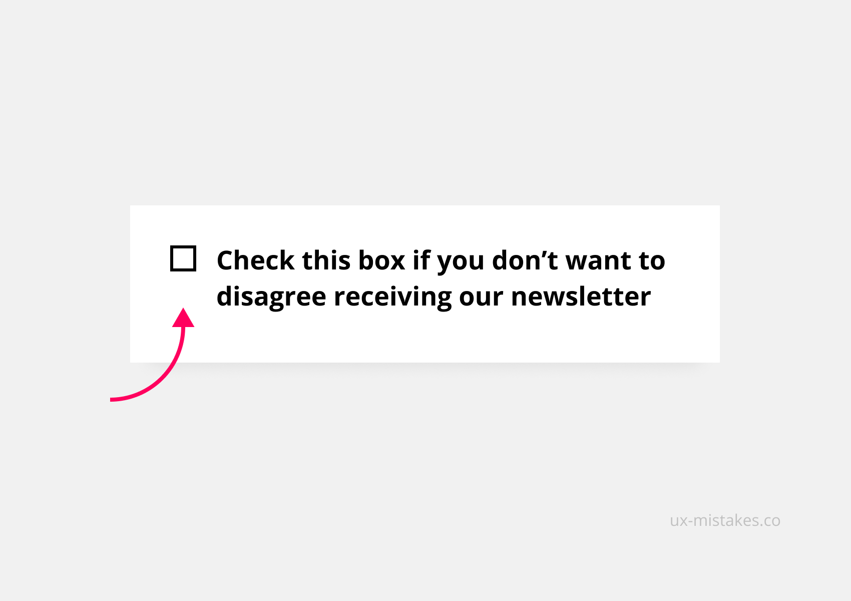
The example below is extreme, it overdraws a phenomenon that we see in many apps; the ambition to make copy consistent and as technically accurate as possible. This often leads to text that is hard to understand.
Take this action
Improve your text by following these 8 UX writing rules
- Simplicity over accuracy
- Simplicity over consistency
- Keep it short (and use tooltips)
- Write in the present tense
- What before how (object first)
- Avoid jargon
- Avoid double negatives
- Use numerals (2 instead of two)
Was this helpful? Something to add? Give it an upvote.

Solid advice 😎 Thnx
Your UX mistakes series is awesome. 👍
Thanks a lot, Maeva!
Love it. Concise, and easy to apply. Subscribed for more email goodies!
@jonaskamber Thanks for sharing this tip! I'm curious, what did you use to build your newsletter? The design looks stunning!
I use Mailchimp to design the newsletter, but I wouldn't really recommend it, because the Mailchimp UI is so super slow.
Yeah having trouble with mailchimp myself :(