Web Development Business
Hi everyone,
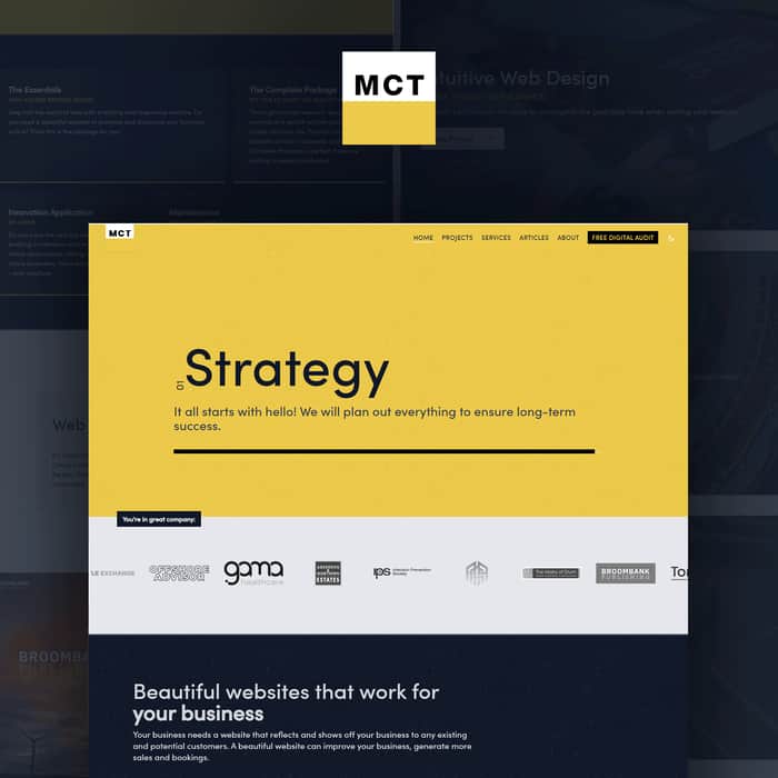
I've recently redesigned and redeveloped our website. Can you please let me know your thoughts and if you feel there is anything missing!
https://mctweb.co.uk
I'm open to feedback on content, design, layout, anything you think could be improved. Do you think the the hero cycle is helpful or not?
Thank you very much for looking - please let me know in the comments if I can help you in return / follow your twitter / etc.
For any devs out there interested, this was my first project using Nuxt3.
- Fraser

Looks nice. Only thing I noticed is that the menu icon is black on black backgrounds (mobile) which makes it hard to see sometimes. Maybe change colour to a light one when scrolling over dark blocks?
That's a great point. I've changed the colour now so that it is visible on all of the available backgrounds. 👍
It's great and looks so good.
Thanks very much :)
Looks nice, maybe everything is a bit too big/spread out, so it's harder to read on a bigger (27") monitor.
Thanks for the comment. Was there any bit in particular? I've got a large monitor but don't have any issues, but yours is a bit larger!
PS: DM me if you are interested in a collaboration, you could offer/package my product into your web development services to your clients.
Use a simpler favicon as the text "MCT" is not visible. I suggest reducing the height of the yellow line and increasing the font size.
In the desktop view, the button "LET'S CHAT ABOUT YOUR WEBSITE" should ideally be contained in the hero section for maximum clicks, otherwise it might be skipped while scrolling.
And in dark mode, make to button contrast with the background using lighter colors
The loading bar in the hero section is not used optimally. It could be used to show the four steps: Strategy, Creative, Development, Content one by one rather than filling up for each step.
It is a good website, the above are my suggestions.
If you would like me to contact me, drop a hi at webdev.jerom@gmail.com. I'm new on twitter: https://twitter.com/thejeromtom
Thanks Jeromtom. I've followed you on twitter. I appreciate you taking the time to look over the site and give your feedback. All great points. I've edited the site for number 1 and number 2. I'll discuss with my team about point number 3. I think there is room to improve it, as you mentioned. Watch this space!
An astounding design with dark mode as accessibility. Being a VueJs developer, I really like your wise decision to choose both Nuxt and tailwind to boom UI and UX.
I am open to project either collaborative or freelance work. You can find me here https://twitter.com/alvaisy
Thanks for your comments! I was a bit wary of tailwind to start with, but it is fantastic. We use it for everything! ( well, sometimes we use Windicss, and Unocss ). I've followed you :)
I like UnoCss, actually uno attribute feature. I use uno as a utility CSS with every project either Quasar, Vuetify, or Primevue but uno is necessary. Thanks for following me, I think I have found you on LinkedIn.
Nice webpage I realy love it. I love Nuxt but I haven't use Nuxt 3. I am running a hosting company can you check my company? Here is the url: https://www.qazihost.shop/
Thanks for the review. Yes we love nuxt. Of course I'll take a look. :)
Nice webpage. I love Nuxt but I haven't use Nuxt 3. Curious, you talk about "no Wordpress". What about Webflow? And do your customers are curious about how you do it? If it's jamstack , Wordpress or whatever? I had customers that want something, but others they really don't care.
I also had others that even I don't suggest Wordpress, neither like it, I understand that as a CMS that the customer can use is sometimes a necessary bad solution.
For example, Nuxt with cms can be challenging to people to use or have the same edit options that Wordpress has.
What you think?
Thanks very much. Yes I love Nuxt and use it for most things!
I've been tempted by webflow, but ultimately haven't really seen a need for it. Our main issue with wordpress, wix, squarespace etc. is that the client has control over the visual aspects of the site. Over time the aesthetics start breaking down. Dodgy spacing gets introduced; weird font sizes; new layouts; and any other option that ruins the design and visual hierarchy. The site degrades and eventually looks amateur. However we like clients being able to update their site. We usually use our own firebase cms, netlify cms, strapi, contentful or some other headless cms. We can give 'block' options, where the client can choose a section and fill in the info with pictures and text without the option to change the actual design. This is actually easier for the user, and most are delighted that it is much easier than they have used before. The downside is that it can complicate the development process, but we feel it gives the best results.
There are plenty developers that make other directions work as well though!
The website has a very good responsive time but you can still improve it by using more compressed images. Some are too heavy.
You can get a report by running Google Lighthouse in the web tools panel.
Appreciate the review! Yes the images are not optimised at the moment. We are waiting for @nuxt/image support for nuxt3 so that this can be done during the build step.
The form takes up way too much of the hero section. Make "email" and "phone number" on one line, and shrink the size of the messages box (make it extendable, which I think is standardized on chrome, so there isn't extra coding requited)
Logo blends in with hero section. Either change logo bottom color, or change hero section.
Why is your home page so bare? Include your services on your home page.
Include your projects on your home page too. Just make the boxes smaller and tiled, so ppl can see more projects with less scrolling.
"articles" should be named "blog". That seems to be the standard.
That's all.
Btw, feel free to follow me here: https://twitter.com/TheRealEtch
Currently working on: https://evoke-app.com/ and releasing a stable diffusion API soon.
If you're interested, we have a discord as well: https://discord.gg/nSz79HFJqq
Thanks very much for your time and for the feedback. I've followed you on twitter.
There seems to be an issue with the GTM tracking code I had in the url. The form is at the bottom of the homepage. Would you be so kind to take another look, as I really value your feedback.
I used chrome
If it's supposed to be at the bottom, then there may be serious stuff broken, because I can only see a form on the homepage, so I guess only the bottom is showing.
The bug has been squashed. Thanks again !
Yes I see the issue, the google tag params created a glitch. I'm just fixing it now. Thanks for pointing it out!
You should be able to see this properly here: https://mctweb.co.uk
Much better now. I see the testimonials section, why are the testimonials aligned to the left with a whole bunch of whitespace to the right? Makes it look off center
And your logo still blends in with your header section.
Thanks Richard. I've added a border to the logo and also centre aligned the testimonials instead. Cheers for your feedback 👍
Hey!
Overall - i like it. Love the colors.
But what maybe i would change from UI and UX, would be:
I would appreciate if you could fill out this form (1-2min).
https://my.forms.app/form/63b32dd30b036f184ba74f1f
Thanks edev. I've completed the form. I have realised that there was an issue with the link I posted. Would you mind taking another look?
Hi Fraser,
That’s a really good-looking site and an impressive project portfolio. I like the design and the style of your content writing.
I noticed you’re based in Aberdeen (I’m not far down the road in Edinburgh), and so although it’s a bit of a chore, you probably need to add some of the basic legal requirements for a business operating a UK website. I can see you have a privacy policy, but you may also need things like a cookie consent method, full contact details, terms and conditions, VAT number, etc.
The requirements will vary depending on whether you are operating as a sole trader (which I think you are), or as a limited company, and whether you sell to individuals or only to businesses.
Some requirements relate specifically to sole traders not trading using their own personal name (such as “MCT Web”).
As well as being a requirement, it’s good practice to add some of the items anyway, because it will help prospective clients feel more confident about doing business with you.
You can see some of the main UK legal requirements summarised here:
https://www.routetoweb.co.uk/legal-requirements/
https://www.nibusinessinfo.co.uk/content/business-websites-legal-requirements
https://www.byrosanna.co.uk/blog/is-your-website-legal
If you intend to market your business in the EU, there will be other regulations you need to observe, like the German “Impressum” requirement.
I’m not a lawyer, and this is not legal advice, so if you are in any doubt about what needs to be done, consult one.
Hope this helps.
Thanks for your in depth message! I've always enjoyed visiting Edinburgh - usually a great night out! Yes I agree that there are a few bits missing. I was aware of a few issues, but not of others, so I appreciate you pointing me in the correct direction.
I'm taking steps in the next few days to get these sorted out.
All the best :)