When a calculator returns five correct numbers, visual hierarchy becomes product logic
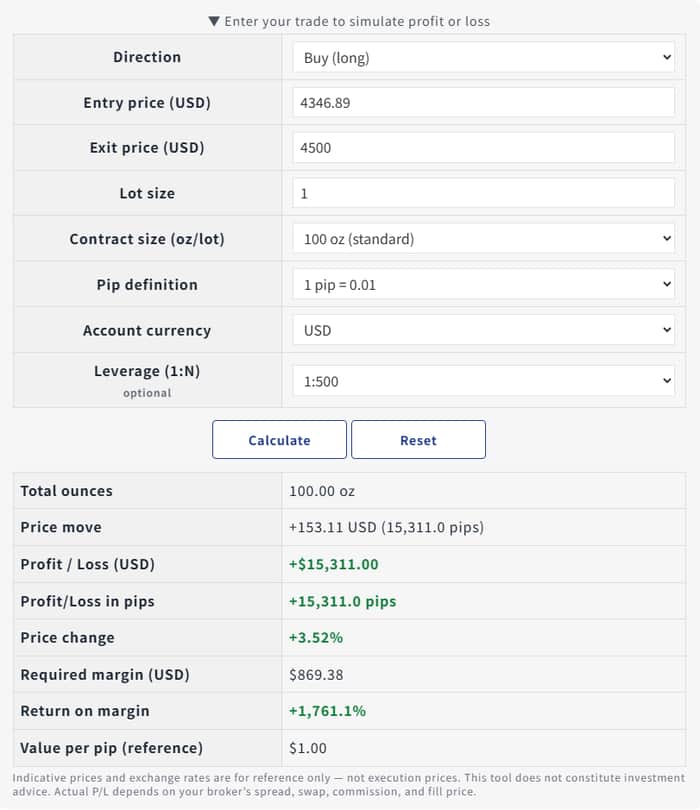
I was reviewing the output of a small XAUUSD profit-and-loss calculator today.
For a single scenario, it can return the price move, pips, P/L in the account currency, required margin, and return on margin. The arithmetic is straightforward. The design question is not.
Every one of those outputs can be useful, but not for the same job:
- Price move and pips describe the distance.
- P/L describes the account-level consequence.
- Required margin describes whether the position fits the available capital.
- Return on margin can be useful context, but it is particularly easy to overemphasize.
Putting all five numbers on a screen is easy. Giving them equal visual weight quietly asks the user to decide what matters most. Making P/L the dominant number has the opposite problem: it can turn a planning tool into a large-number display.
The design direction I am testing is a primary pair: P/L and required margin. They answer two separate questions that should be read together:
- What would this price move mean for the account?
- What does this position require from the account?
The other outputs remain visible as reference context rather than competing headlines.
It is a small UI choice, but it changes the mental model the tool creates. A calculator is not neutral once it decides which correct result gets the visual emphasis.
For anyone building pricing, forecasting, health, logistics, or other multi-output tools: how do you decide which number leads the interface?
