Where should the approval gate sit in an AI course workflow?
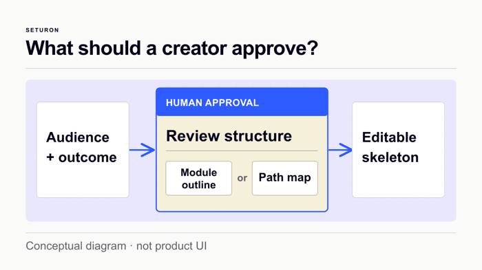
I'm building Course Atelier in Seturon, and the hardest design choice hasn't been what the model should write. It's when it should be allowed to start writing.
A prompt can produce a polished course outline quickly. But that outline can hide decisions nobody has checked: who the learner is, what they should be able to do, and where different learners need different paths.
The workflow we're testing puts a pause before lesson generation. Mira's guided discovery captures the audience and intended outcome. The creator then reviews a proposed course structure and explicitly confirms it. Only after that does Structural Sprint generate an editable course skeleton.
Seturon is an adaptive learning platform, so the structure matters beyond a list of lessons. An opening diagnostic and decision points should determine which learning path a learner follows. We're still validating the complete production flow and what creators can reliably inspect; I wouldn't claim better learning outcomes or saved time from this build.
My current product question is what to show at the approval step. A module outline is easy to read, but may hide a wrong route. A full path map is more revealing, but can overwhelm someone creating their first course.
If you've built an AI workflow with a human approval gate, what did people actually need to see before they trusted the next step?

Before the outline-vs-path-map question: does anything downstream verify that the structure you approved is the structure that got built?
My own version, same shape. I wrote a rulebook for an assistant whose whole job was to not claim checks it had not run. The preamble described the verifier that would catch it: lines without a source tag do not pass. A reviewer with no context pointed out that the verifier did not exist. My first paragraph was doing exactly what rule five forbade, and the assistant would have inherited "this is enforced" as a fact about its environment.
That sentence was not hard to read. Short, confident, legible. Showing more of it would not have helped: the defect sat outside the artifact. It described machinery nobody had checked.
Your gate sits before generation, so everything on that screen is a prediction of what the generator will do. James_UtilitySEO called the branching line a reviewable claim, and it is. But at this gate it is a claim about routing that has not happened yet, and reviewing a claim is not the same as checking it. That gap stays open whichever view you ship. workstream's post-approval preview of the first lesson is the closest thing here, but it catches tone and difficulty, not whether the skeleton matches what was approved.
So the call available today, without settling outline vs full map: store the approved structure as an artifact, then diff the generated skeleton against it and show the creator where it departed. sitewhisper and invoicesnap suggested logging what gets edited at the gate: the generator's assumptions that were wrong going in. This is the other direction: what it did after the creator stopped looking. Either view then becomes auditable, instead of having to be right in advance.
And what caught my sentence was a reviewer with no stake in it. I could not. I wrote it.
I’d place the primary approval gate after the AI has produced the course structure and before it generates the lessons, with a lighter final review before publish. That keeps teachers from spending time reviewing polished copy built on a wrong audience, sequence, or learning objective. Show the proposed changes as an editable outline with a clear “regenerate this section” action, plus version history and undo so approval never feels irreversible. I’d also let teachers approve the structure while keeping lesson-level overrides available, because control at the right granularity is what builds trust.
"The test isn't whether creators like the map, it's whether they catch a consequential mistake before approving" is the sentence I'd steal outright — I've been evaluating my own confirmation screens on legibility (can someone read this in two seconds) when the actual bar should be error-detection (does someone catch a wrong slot, a wrong recipient, before confirming). Those aren't the same test, and I don't think I've been running the right one.
StefanStefanos's seeded-mistake methodology is the concrete version of that I'm going to steal too — deliberately injecting a few known-wrong structures and measuring catch rate, rather than asking people if they like the view. I'd been planning to test my confirmation screens by asking "is this clear," which only tells you about readability, not whether the screen actually does its job of catching the case where something's wrong.
Ran into this from the other side - I build an analytics assistant that talks to a warehouse, where reads are open and anything that writes asks once per session. The surprise: the summary is the wrong thing to gate. People approve a clean module outline in about two seconds however carefully you render it; what makes them stop is a diff against what already exists plus a count ("3 of 12 lessons moved, 1 dropped"). Two things I'd keep: gate the risky minority and let the rest pass silently (a gate that fires on every step becomes click-through training), and log time-to-approve - once that drops under a few seconds the gate is decoration.
That distinction between summary and diff is useful. For course generation, the equivalent diff might be: outcome changed, modules added, removed, or reordered, learner route changed, prerequisite introduced. I’d also separate fast approvals that are correct from fast approvals that are merely habitual. Have you found a threshold where time-to-approve becomes a warning rather than evidence of clarity?
The gate placement question hides a subtler one: the agent can mutate what gets approved and what actually executes. Three failure modes we keep seeing in agent red-team scans:
Rule of thumb: the gate sits on the exact bytes that leave the machine, and nothing the agent does after approval can change those bytes. Happy to share the probe set we use for action-binding and MCP-trust failures if useful — the micro scan is free: https://llmrt-companion.manhliemcn4euwlu.workers.dev/agent-scan
The action-binding point is exactly why I would not treat approval as a boolean. For this workflow the record should bind audience and outcome, structure version, route logic, and source set; any post-approval fetch or material mutation invalidates it. I’d be interested in the probe set, especially cases that distinguish harmless enrichment from approval-voiding changes. Is it documented publicly without requiring a scan of a live system?
The approval gate problem is trust calibration. Show too little and people approve on faith. Show too much and they rubber-stamp because cognitive overload feels the same as confidence.
What worked in our SEO auditing tool was showing the decisions, not just the output. When we scan a site against 100+ ranking factors, dumping the full list causes analysis paralysis. Instead we surface the 3-5 highest-impact issues with a one-line explanation of what each one costs. The user acts on what matters and can expand the full list if they want to verify.
For your course builder, the equivalent might be showing the branching decisions rather than the full path map. "Learner who fails the opening diagnostic goes here instead of here" is a reviewable claim. A complete tree of every lesson and path is just an artifact that looks thorough.
The gate should surface choices, not completeness.
Decisions rather than completeness is a useful framing. I think each surfaced branch also needs its consequence and evidence: who is routed differently, what they skip or receive, and which diagnostic answer caused it. Otherwise the 3–5 decisions can still look clear while hiding a no-op branch. In your SEO workflow, did users need the expected impact only, or also the evidence behind why an issue ranked in the top five?
I’d test the gate by measuring rework rather than preference: compare how often creators revise the outline after seeing a path preview, and where errors are caught. That would show whether the richer view earns its cognitive cost—are you planning a sequential usability test?
That's the test I want to run, but we haven't run it yet. I'd give creators the same brief with a few seeded structural errors, then compare an outline-only gate with an outline plus 2–3 representative learner routes. I'd track consequential errors caught before generation, time to approve, and rework after the first lesson preview—not just which screen they prefer. Sequential sessions could also show whether a second view helps because it's better or simply because the creator has learned the course. Does that cover the rework signal you had in mind?
Yes — that covers the rework signal. If it’s cheap, add one more metric: % of lessons that needed a second regenerate after they were marked approved. Outline + routes usually wins on rework; outline-only usually wins on speed. Run both on the same 3 briefs so the brief itself isn’t the variable.
Yes—second-regenerate rate is useful because it distinguishes first-pass polish from structural stability. I’d define it narrowly: a second regenerate caused by a structural correction after approval, not tone or wording. Same three briefs, counterbalanced order, and we should probably compare false confidence too: structures approved quickly that still trigger later rework. Thanks—that gives me a cleaner test plan.
I’d put the gate immediately before the expensive, hard-to-review step, and show evidence rather than a polished wall of generated text. In an AI website workflow, the useful review artifact is: intended audience/outcome, the scope or sources used, 2–3 representative outputs, and an explicit “couldn’t verify” list. Let the human edit the premise, constraints, or source scope before generation; don’t make them line-edit every sentence. I’d also log what gets corrected at the gate—those recurring corrections are the best candidates for product defaults and tests.
I’d make the gate answer one concrete question: “Would I ship this structure to a learner?” A compact outline plus 2–3 representative paths seems easier to scan than a full map; I’d keep the full map one click deeper for people debugging edge cases. I’d also log edits at the gate, since repeated changes will tell you which assumptions the generator is getting wrong.
I’d treat the approval as a compact contract rather than forcing a choice between two views. Show the audience, promised outcome, and the few decision points where the learner path branches, with the full path map available on demand. I’d also test the view with a deliberate “wrong assumption” scenario—change the audience or goal and see whether the structure changes—so creators can judge the gate without wading through the entire course.
The full path map vs module outline tension you're describing is really a trust calibration problem.
The person approving doesn't actually need to understand everything. They need to see enough to catch the wrong thing. What that means in practice: show them the branching logic at the decision points, not the full path. One or two forks with the conditions that trigger them. That's the bit that's most likely to be wrong and most costly to fix later.
For first-time course creators specifically, I'd lean toward the minimal view by default with a "show me more" option. The full path map shouldn't disappear — it should be accessible for the people who want it. But defaulting to it will cause decision paralysis in the majority who don't yet have the mental model to evaluate what they're looking at.
The thing people actually need to see before trusting the next step is usually not more information. It's a specific question: "Is this the right audience and outcome?" If that's answered yes, everything downstream feels reviewable rather than overwhelming.
I’d show the smallest artifact that lets a creator catch a wrong assumption: audience, intended outcome, and the module or path map with one representative learning objective. A full outline can invite premature editing, while a bare yes-or-no hides why the structure was chosen. You could also let the creator approve the structure but flag uncertainties for the model to resolve during skeleton generation.
I’d make the approval artifact a compact “course contract”: audience, promised outcome, 3–5 modules, and one example of the diagnostic branching. That keeps the decision concrete without asking creators to parse a full path map. After approval, show a preview of the first generated lesson so they can catch tone or difficulty issues before the rest is written.
I’d show traces rather than the full map.
Give the creator three or four representative learner profiles, then show each diagnostic answer, the route it triggers, what gets skipped, and the outcome that path is meant to reach. That makes a wrong branch or meaningless diagnostic visible without asking someone to understand the whole graph.
I’d also surface exceptions separately: answers that change nothing, paths with no next step, duplicated routes, and outcomes with no assessment. The full map can remain available for advanced inspection.
To test the approval view, I’d deliberately seed a few structural mistakes and measure which version helps creators catch them before generation. That gives you error-detection evidence rather than preference feedback.
The approval step is the real product decision. Have creators caught different structural problems with the path map versus the simpler module outline?
Not yet — I don't have enough creator feedback to claim that one view catches more errors than the other. My working hypothesis is that a module outline exposes missing topics and awkward sequencing, while a path map exposes routing mistakes: a diagnostic answer that changes nothing, a learner sent down the wrong branch, or a path with no clear next step.
I'm leaning toward a readable outline with a small route preview for each learner profile, rather than the full map by default. The test isn't whether creators like the map; it's whether they catch a consequential mistake before approving lesson generation. Have you found a smaller view that does that job?
The consequential-mistake test is the part I’d be most interested in digging into. If you’re open to it, what’s the best email to reach you on?
Happy to discuss the test design. I couldn't find a private-message option on Indie Hackers. You can DM me on X at @naraHeTc (linked from my IH profile), and I'll send you my Seturon work email there. If X DMs don't work for you, let me know here and we'll find another route.
I don’t use X. You can reach me at hello@beryxa.com — send me a note there and I’ll reply.