Would you buy? - Data Visualisations with excel
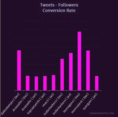
Wanted to gauge an interest in an info product I thought of making - How to visualise data with Microsoft Excel.
We will go through:
- Data Preparation
- Chart Types & choosing an appropriate ones for your project
- Chart customisation to match your branding
I attached sample results. And I wanted to know if this is something you'll cash out on, now.

But excel already has charts. And they are good enough. How would your system differentiate from them?
This is about the process of making one. From a table of data to custom looking chart
So it's somehow much easier to do that than built-in charts? I think you need to draw a mockup because it's hard to understand your idea like this :)
Oh..
I'm not making custom charts. The course will be about leveraging the built in chart templates to visualise raw data.
And then, customising the looks to match a brand. The picture above is a sample of an end result.
Hopefully, I made it clear this time around. Did I?
Ah, ok, now I get it. Sorry missed the "info product" part of it. Thought this would be some kind of software :)
That's okay. Thanks for the engagement