
Betterlytics
Simple, privacy-first, cookieless web analytics
Hey IH,
A year ago, I set out to build a lightweight, privacy-friendly alternative to Google Analytics. I just wanted something simple that didn't track everything under the sun.
But then, "feature creep" happened in the best way possible.
Every time I wanted to debug a user issue, I'd reach for a new tool.
Need to see what went wrong in that session? Add a Session Replay tool.
Getting weird JS errors? Add error tracking.
Is the site actually up for everyone? Add uptime monitoring.
I eventually looked at my stack and realized I'd just rebuilt a bloated enterprise suite, but for my own personal needs. We've effectively evolved Betterlytics into a more streamlined, "indie-sized" alternative to heavyweights like PostHog.
The "Indie" Stack Consolidation
Most of us are paying for 4 to 5 different services just to keep a simple web app running. We decided to stop paying those bills and just build those features into one dashboard.
We've kept it fast and focused on the stuff that actually matters to small teams:
Session Replays & Error Tracking: So you don't have to guess what's broken.
Performance Insights (CWV): Because Google rewards speed.
Uptime Monitoring: Built-in, so you can finally kill that extra subscription.
It feels much better having one tab open that tells me if the site is up, if it's fast, and if the users are actually happy.
I'm curious, when you look at your current stack, which tool do you keep "just in case" but secretly wish you could ditch?
Is there a specific service that feels like "overkill" for your current stage?

Yesterday, we saw a large spike in traffic on one of our dashboards. It looked like a clear growth moment, exactly the kind of graph you want to screenshot and share.
Nothing had changed. No campaign, no release, no obvious trigger.
It was a bot.
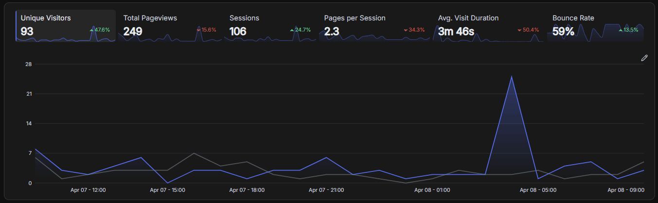
This kind of thing happens more often than people expect. Not because analytics tools are broken, but because they present data in a way that makes the wrong conclusions feel reasonable.
The problem with clean dashboards
Most analytics dashboards are designed to simplify. Data gets aggregated, averaged, and grouped into clean charts that are easy to read.
That works well for getting a quick overview, but it also removes the context you need to understand what's actually going on. By the time you're looking at a graph, a lot of the important detail is already gone.
Averages hide real issues
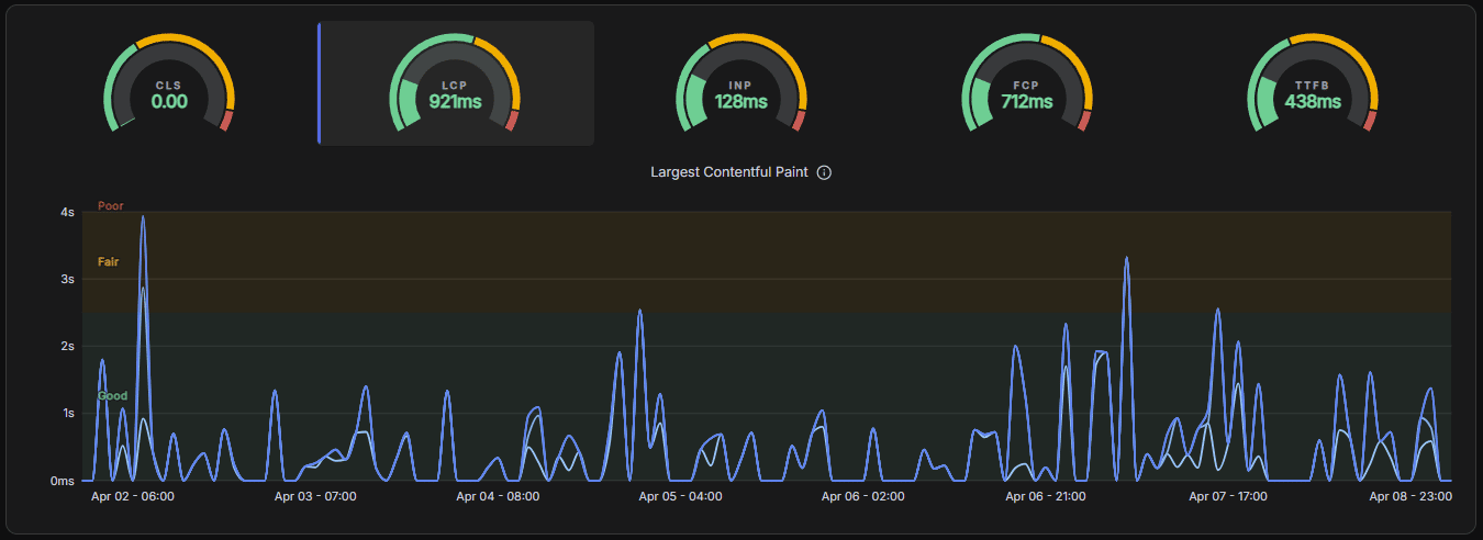
Take performance as an example. If most users have a fast experience but a smaller group experiences severe slowdowns, the average can still look perfectly fine.
From the dashboard's perspective, everything is healthy.
In reality, a meaningful percentage of users is having a bad experience.
Looking at distributions instead of averages usually tells a very different story.
Context is where the truth is
The same issue shows up with aggregation. Problems are often tied to a specific browser, route, or short time window, but dashboards tend to group data by day or page.
A bug that affects a subset of users for 20 minutes can disappear into a daily chart as a small dip: easy to ignore and hard to investigate later.
And when you look at metrics like traffic, performance, and uptime in isolation, it becomes even harder to understand what actually caused a change. A traffic drop might not be a marketing problem at all, it might be a performance issue or a brief outage.
What we've learned building Betterlytics
Working on Betterlytics has made this pattern very clear: the issue isn't incorrect data, it's missing context.
We've been focusing on showing distributions instead of just averages, and on connecting signals like traffic, performance, and uptime so changes are easier to explain. Even small things like annotations make a difference when you're trying to understand why something happened.
Most dashboards don't lie because the numbers are wrong. They lie because they simplify reality just enough to make the wrong story believable.
-
3
Spot on. Looking at average LCP or TTFB is exactly how you miss the fact that 20% of your users are having a terrible experience. Are you guys planning to show p95/p99 percentiles by default to fix this? Love the philosophy behind Betterlytics, keep it up!
-
2
Appreciate it!
We already show p50, p75, p90, and p99 both per page and aggregated across the site, so you can get a better sense of how performance is distributed rather than relying on a single average. On top of that, we've added an "opportunity score" per page to help prioritize where performance improvements actually matter, based on things like traffic volume.
That said, we've also started questioning how useful p99 really is in practice. It's surprisingly easy for it to be skewed by a handful of extreme cases, like someone on a slow connection in a remote area, which can make it look significantly worse than what most users actually experience, especially for metrics like TTFB.
We're currently exploring how to present this better so you get a realistic picture without overreacting to edge cases :)
-
1
That makes total sense. The "opportunity score" sounds like a lifesaver for prioritizing the backlog. And I completely agree on the p99 frontone user on a bad 3G connection during a train ride can completely ruin the chart and trigger false alarms!
Thanks for the detailed breakdown, looking forward to seeing how Betterlytics evolves.
-
-
-
1
We ran into exactly this. A merchant we were researching had 100K daily visitors in his analytics. Turned out 99% were bots. His real traffic was 600-1000 humans. He was optimizing ad spend against fake data for months. The problem isn't the dashboard. It's that most founders treat analytics as truth instead of as a hypothesis that needs validation. The first question should always be "is this traffic real" before "why isn't this traffic converting."
-
1
The data can be correct.
The chart can be correct.
Yet two people can look at the same signal and assemble completely different conclusions from it.Most people read it like this:
signal + dashboard + context → conclusionBut the actual formula is closer to:
signal + dashboard + context + interpretation → conclusionDashboards do not just compress reality.
They create room for projection.Correct data + incomplete interpretation → distorted conclusion
Sometimes the hidden variable is in the reading.
-
1
Hit this exact thing with sprint metrics. 30% velocity jump, two months in a row, team was feeling it. Turned out we had just started logging smaller task types. Accurate data, completely wrong story.
-
1
the bot traffic example is such a good way to open this because everyone has experienced that moment - you see a spike, get excited, dig in, and it's nothing.
the averages hiding real issues point is underrated. p95 and p99 latency tells you so much more than mean response time but most founders never look at it until users are already complaining.
the part about context being where the truth is - that's the whole problem with dashboards in one sentence. you end up reverse engineering what happened from a clean chart that had all the useful information stripped out before you even saw it.
how are you handling the annotation side - is that manual or are you building something that auto-detects when a deployment or config change might explain a metric shift?
-
1
Really like the direction of Betterlytics—privacy-first analytics is clearly where things are heading. The fact that it’s cookieless and GDPR-compliant by default makes it super appealing, especially for founders who want insights without dealing with consent banners or legal complexity.
Curious to see how it evolves, especially around advanced features and integrations—great potential as a solid alternative to traditional analytics tools. -
1
The “dashboards don’t lie, they just remove context” framing is spot on.
What you described feels like the difference between observability and reporting. Most tools optimise for clean summaries, but real debugging happens in the messy edge cases those summaries hide.
The bot example is a good reminder that spikes without narrative are basically noise. Without context, you end up explaining data instead of understanding it.
Curious how you’re handling the balance though, showing distributions and connected signals is powerful, but can also overwhelm users quickly. How do you keep it usable without losing the depth?
-
1
Curious how every single comment of yours ends with "Curious ......" hmmmmm
-


A fairly typical setup today includes one tool for analytics, another for session replay, a third for uptime monitoring, and a fourth for performance metrics. Each of them works well in isolation.
The problem shows up when something goes wrong.
A drop in traffic or conversions usually leads to the same workflow: open multiple dashboards, set the same time range, and try to piece together what happened. Analytics might show the drop, uptime might show a brief incident, performance data might suggest slower response times, and session replay might show users struggling.
All of that information is useful, but it isn't integrated. You have to do the correlation yourself.
That process is slower than it should be, and it's easy to draw the wrong conclusion, especially when signals don't line up perfectly or when you're looking at aggregated data from different systems.
In practice, traffic, performance, errors, and user behavior are not independent. They are different views of the same underlying system. When those views are separated, understanding cause and effect becomes unnecessarily difficult.
This is the main reason we ended up building Betterlytics the way we did.
Instead of treating these as separate tools, we treat them as part of the same timeline. A change in traffic can be seen alongside performance metrics, error rates, and user sessions in one place, without switching context or trying to align data manually.
It doesn't add new information. It just removes the need to reconstruct it.
The result is that issues are easier to understand, and decisions can be made faster, with less guesswork.
I'm curious how others approach this. Are you comfortable working across multiple tools, or have you found ways to consolidate this into a single workflow?
-
1
Sounds a great idea! And I'm fully agree with you, having many tools can cause difficulties to analyse things. Will check your tool, sounds interesting!
-
1
the correlation tax is real. I've lost hours bouncing between dashboards trying to figure out if a conversion drop was a bug, a performance issue, or just bad traffic.
by the time you line everything up the moment's passed. single timeline view makes a ton of sense, the insight is rarely in any one tool it's in how the signals overlap


One thing surprised us while building Betterlytics, our analytics tool:
A lot of founders obsess over Lighthouse scores.
But Lighthouse doesn't measure your real users. It simulates:
one device
one network speed
one environment
In reality, visitors are nothing like that. They might be on:
a 4-year-old Android phone
bad 3G connections
an overloaded laptop CPU
browsers full of extensions
When we started collecting real-user Core Web Vitals, we noticed something interesting.

Some sites with a 95+ Lighthouse score were actually slow for real users.
And some sites with mediocre scores performed great in the wild.
The difference is synthetic tests vs real-user monitoring (RUM).
Synthetic tests are great for debugging. But if you want to know how your site actually feels to users, you need real visitor data.
Curious how others track performance:
Do you mostly rely on Lighthouse, or do you track real-user performance metrics too?
-
2
I’ve seen the same thing when testing production apps. Lighthouse looks great, but real user data sometimes tells a very different story. Are you collecting Core Web Vitals directly from the browser?
-
1
Yeah, exactly! Synthetic tests and real-world data can diverge quite a bit
We collect Core Web Vitals directly from the users' browsers, so the metrics reflect real devices, networks, and usage patterns. This tends to surface issues that Lighthouse miss, especially things like layout shifts from late-loading content or slow interactions on lower-end devices :)
-
1
That makes a lot of sense. Capturing metrics directly from real users is way more valuable than relying only on synthetic tests.
I’ve noticed things like INP and CLS issues show up much more clearly with real traffic, especially on lower-end devices or slower networks. Lighthouse often misses those edge cases.
Are you also tying these metrics back to specific user sessions or segments (like device type or region)? That feels like where a lot of actionable insights come from.
I’ve been working with FastAPI and analytics pipelines recently, so this is exactly the kind of problem I enjoy digging into. If you ever want another set of eyes on performance tracking or data flow, I’d be happy to help.
You can reach me here: kevin.chisumdev@gmail.com
-
1
You're spot on about INP and CLS especially. Those tend to look "fine" in Lighthouse but looks different once real users visit your site.
Yeah, we do tie Core Web Vitals back to sessions and segment heavily (device, browser, geography, etc.). That's honestly where most of the useful insights come from, otherwise it's just aggregate numbers without much direction. Being able to pinpoint "this specific device group is struggling with interactions" makes a huge difference.
-
-
-
1
This comment was deleted 6 months ago
-
-
1
The synthetic vs RUM gap is real. We health-check our site regularly and catch issues Lighthouse misses. Curious how you handle low-traffic sites where RUM sample sizes are tiny.
-
1
This is interesting because a lot of people treat Lighthouse like a final verdict instead of a snapshot.
I’ve seen sites score great but still feel slow or clunky in real use.
Feels like actual user experience matters way more than chasing a perfect number.
-
1
The gap between synthetic scores and real-user experience is one of those things that sounds obvious once you say it, but almost nobody acts on it. A 95 Lighthouse score feels like a stamp of approval. It's hard to look at that number and think "this might be lying to me."
The device gap is what makes it tricky. Lighthouse simulates a mid-tier phone on a throttled connection — which is already better than what a lot of real visitors are actually using. A founder tests their page on a MacBook Pro with fiber internet, sees a green score, and moves on. Meanwhile half their audience is loading the same page on a 4-year-old Android over mobile data, and the experience is completely different.
We ran into a version of this when analyzing page speed across multiple sites. The scores looked reasonable in isolation. But when we compared speed scores against other conversion factors, pages with "good" speed scores still had users bouncing — because the perceived load experience (layout shifts, delayed interactivity) didn't match the synthetic number. The score said fast. The visitor felt slow. Those are two different things.
The broader lesson applies beyond speed too. Any single-metric tool gives you confidence, not clarity. Confidence feels good. Clarity is what actually helps you fix things.
To answer your question: we've learned to treat Lighthouse as a baseline sanity check, not a source of truth. If the score is bad, something is definitely wrong. If the score is good, you still don't know how real visitors experience the page.
-
1
Lighthouse is useful, but it’s still a proxy and not the product experience itself. I’ve seen plenty of cases where a “worse” score still delivered better UX and conversion because the page matched user intent better. Curious which real world metric diverged most for you from the Lighthouse score?
-
1
Spot on. I’ve seen 99/100 Lighthouse scores tank in the wild because of heavy hydration on low-end devices or third-party scripts that fire after the initial paint. Synthetic tests are just a laboratory baseline. At Joinble, we prioritize Edge Computing (Cloudflare) specifically to reduce that variance, but RUM is the only way to see the 'long tail' of user experience. Lab data is for CI/CD; Field data is for business.
-
1
One thing that makes this even more misleading is that many founders end up optimizing for the test itself rather than the real user experience. People spend hours trying to move a score from 92 to 99 in Google Lighthouse by removing unused CSS, compressing images, or shaving a few kilobytes off their JavaScript bundle. Those optimizations can be useful, but they often ignore the things that actually slow users down in production: heavy third-party scripts, analytics tags, blocking APIs, slow backend responses, or hydration delays in modern frameworks. A page can look perfect in a lab test and still feel sluggish the moment a real user tries to interact with it.
Another factor is geography and device variability. Synthetic tests typically run from a small set of locations on controlled hardware, but real visitors might be thousands of kilometers away from your server, using older Android phones, unstable mobile networks, or laptops overloaded with extensions. When you start measuring real-user data through metrics like Core Web Vitals, the picture often looks very different. That’s why I tend to treat Lighthouse primarily as a debugging tool rather than a performance KPI. It’s great for identifying technical issues, but the only thing that really matters is how fast the site actually feels to the people using it.
-
1
Well explained, that's exactly the issue. A lot of advice online pushes people to chase a 99+ Lighthouse score, often for SEO reasons, but that number itself isn't what Google cares about. What matters is the "real" user experience, reflected in Core Web Vitals from the Chrome User Experience Report.
Lighthouse is great for debugging and spotting potential issues, but it won't capture things like slow third-party scripts, backend latency, or how the site performs for real users on different devices and networks.
-
-
1
Gtmetrix
-
1
I often found that Lighthouse would give me different scores than Google Page Speed. I could never quite figure out which was more accurate. What do you think?
-
1
That's expected! They're measuring different things. Lighthouse uses synthetic lab tests, while Google PageSpeed also shows real user data when available. For accuracy, real user metrics naturally matters more :)
-
-
1
Interesting insight. Lighthouse scores can definitely be misleading compared to real user data.
I'm currently building a small web experiment inspired by the Million Dollar Homepage — a pixel grid where anyone can buy a block and place their logo with a link. It's fascinating to see how performance and traffic behave with real users. -
1
Interesting insight. Lighthouse scores can definitely be misleading compared to real user data.
I'm currently building a small web experiment inspired by the Million Dollar Homepage — a pixel grid where anyone can buy a block and place their logo with a link. It's fascinating to see how performance and traffic behave with real users.-
1
This comment was deleted 6 months ago
-
-
1
Great explanation! Sometimes I also notice my Lighthouse scores don’t match real user experience—especially with dynamic content or heavy third-party scripts. Lab tests vs real users can be quite different!


Last night we released MCP support for Betterlytics.
The idea: give AI agents access to real website usage data so they can make better decisions about code and product changes.
Right now most analytics lives inside dashboards; charts, filters, tables, etc. Humans open the dashboard, interpret the data, and then decide what to change in the product.
With MCP (Model Context Protocol), analytics can be exposed as tools that an AI agent can query directly.
That means an agent working on your codebase can ask things like:
"Which pages get the most traffic?"
"Did the landing page change yesterday affect conversions?"
"Which pages have high traffic but poor engagement?"
"Where in our onboarding flow do users drop off?"
The agent can query Betterlytics through MCP and use that information as real-world context for product or code decisions.
Instead of making changes blindly, the agent can reason about how users actually interact with the site.
The implementation itself was relatively small, but the UX shift feels significant, where analytics stops being just a dashboard and becomes context that tools and agents can actively use to make product decisions.
Has anyone else experimented with giving agents access to real product data like this?
-
3
This feels like one of those features that sounds powerful but becomes much clearer when it’s demonstrated. A quick demo showing an agent reasoning about real user data through Betterlytics could make the impact immediately obvious for developers and teams. I help SaaS builders turn new features into simple launch videos that communicate the value quickly, so if you ever plan to promote this release I’d be glad to help.
-
2
Great feedback. Show don’t tell
-
1
Sure, i just drop some of my work above please check, if you want we can connect over LinkedIn, let me know what you think
-
-
1
Thank you, feel free to drop your portfolio. A video would indeed capture the essence better :)
-
1
if you want we can connect over LinkedIn, Please let me know your LinkedIn profile
-
1
https://drive.google.com/file/d/1bz5O3dakiP0sbV0vybbD2g-e7cJI2qEA/view?usp=drive_link
https://drive.google.com/file/d/1kS05JuBPvpgDZvF3V5c8vL0s01eYkh06/view?usp=drive_link
https://drive.google.com/file/d/1t6MC4T2kIGBJ7aJwN9n3VKp4Zv5bKsTF/view?usp=drive_link
https://drive.google.com/file/d/1CtY7S7ryKT9m4TwsrEznCiEMaNd3ZxXG/view?usp=drive_link
https://drive.google.com/file/d/1gUqFKeKUYgVHwo_nR6Ga6879ksGOGt8j/view?usp=drive_link
-
-
-
1
Yes, but I didn't see much improvement in agent performance
-
1
The framing here is spot on. "Analytics stops being a dashboard and becomes context" is exactly the shift. Agents work better when context is structured and queryable, not buried in a wall of text.
Same principle applies to how you write the prompts that instruct those agents. A flat blob of instructions gives the model everything at the same priority level. Breaking it into explicit blocks (role, context, constraints, output format separately) makes a real difference in how reliably the agent follows through.
I've been building flompt (https://flompt.dev) for exactly this, a visual prompt builder that decomposes prompts into 12 semantic blocks and compiles to Claude-optimized XML. Open-source: github.com/Nyrok/flompt
-
1
This is interesting because it feels like the difference between “AI guessing” and “AI working with context.”
The question I’d have is whether the real unlock is analytics access itself, or the layer that turns raw product data into decisions an agent can actually act on reliably.
-
1
The framing of analytics as context infrastructure is spot on. The next challenge becomes how you structure the prompt that tells the agent what to do with that data. When the agent gets a blob of analytics context mixed in with its task instructions, it often underweights it. When the analytics come in as a clearly labeled input block separate from the objective and constraints, the agent reasons with it much more reliably.
It is the same structural problem you solved on the data side. The prompt side has the same gap.
I built flompt (https://flompt.dev) for this, a visual prompt builder that separates prompts into typed blocks (role, objective, input, constraints, output format). The input block is specifically for this kind of structured context injection. Open-source: github.com/Nyrok/flompt
If you find it useful, a star on github.com/Nyrok/flompt would mean a lot. Solo open-source project.
-
1
The framing of analytics as "context infrastructure rather than a dashboard" really stuck with me. That's the shift. Nice execution on the MCP integration.
-
1
This is a really interesting direction. Exposing analytics as a queryable layer for agents feels like a natural evolution beyond dashboards.
One question I keep thinking about with MCP-style integrations is how agents deal with partial or misleading data windows. For example, if an agent sees a drop in conversions shortly after a deploy but only has a few hours of data, it might prematurely roll something back or optimize for noise rather than signal.
Humans usually handle this with context (“let’s wait 24 hours before deciding”), but an agent needs explicit guardrails. Do you handle this with query constraints (e.g., minimum time ranges, confidence thresholds), or do you expect the agent layer to manage that reasoning?
The idea of analytics becoming context infrastructure rather than a dashboard is compelling though. It reminds me of how observability tools evolved from graphs into APIs that automated systems can reason about.
-
1
The question I keep thinking about: how do you handle the agent acting on incomplete data? Like if it only has 2 days of post-change data, does it wait or
-
1
This is exactly where analytics should be heading. Dashboards are for humans who have time to interpret. Agents need raw queryable access.
The "did the landing page change affect conversions" example is the killer use case. Right now, that workflow is: deploy change → wait → open dashboard → stare at charts → guess. Giving the agent direct access means it can correlate the change with outcomes in near real-time and even roll back if things go south.
I've been thinking about this same pattern in game dev. Imagine an AI agent that has access to player behavior data; drop-off points, engagement heatmaps, where players get stuck and can adjust NPC difficulty or tutorial flow dynamically. Suddenly your game isn't just reacting to code, it's reacting to how people actually play.
The MCP layer is interesting because it's not another dashboard. It's a bridge. Analytics becomes a live context engine instead of a retrospective report.
Curious: have you run into any challenges with query complexity or rate limiting? Real user data at scale gets messy fast.
(Full disclosure: exploring similar agent-data integrations in game dev via AI Powered Game Dev For Beginners - different domain, same "give agents real context" philosophy.)
Nice launch.
-
1
Thank you :)
In terms of query complexity, we have abstract layers where the agent can select it's own dimensions to query by, that is time ranges, data dimensions, granularity and so on. This gives flexibility for everyone :)In regards to rate limiting, it is not an issue. We've set a generous rate limit of 60 requests per second - an agent won't ever hit this and our servers can handle much higher loads than that :)
-


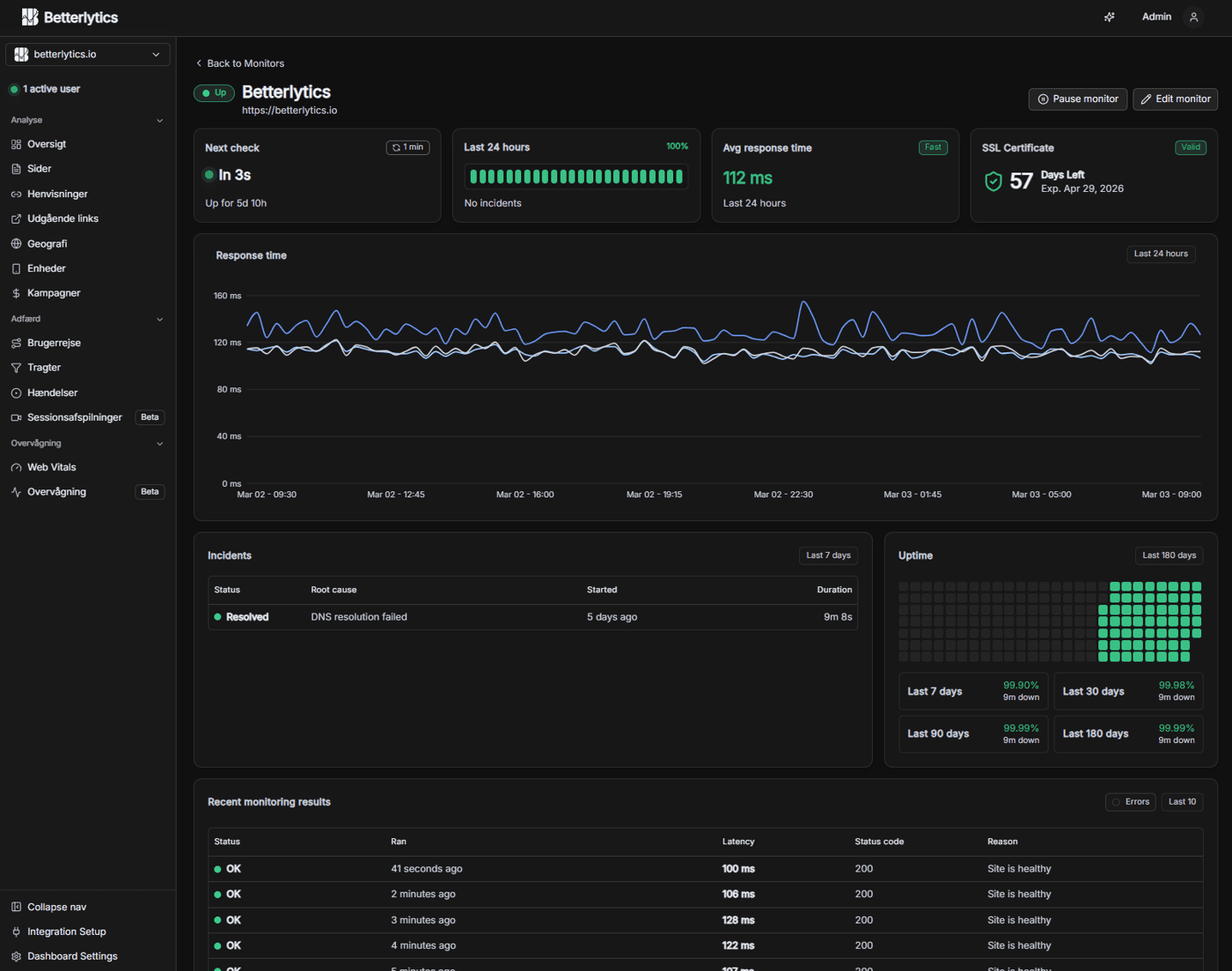
When we first added uptime monitoring to Betterlytics, it was simple: check the status code and alert if the site goes down.
But a few users pointed out something we couldn't ignore:
A page can return 200 OK and still be broken.
The server responds, but the database failed.
The app loads, but key content is missing.
A checkout page renders, but the "Buy" button isn't there, and so on.
Technically up. Functionally unusable.
So we added keyword-based checks. Instead of only verifying that a page responds, you can verify that it contains something it's supposed to contain; a specific word or piece of UI text. If it disappears, you get alerted.
We also added direct notifications to Slack, Discord, Teams, Pushover, and other channels. When something important breaks, it should show up where your team already works and where you'll actually see them.
It's a small shift, but it changed how we think about uptime. Being reachable isn't the same as being usable.
-
2
This is a thoughtful take on a growing need in the analytics space.
Tools like Betterlytics show how the industry is shifting toward privacy-first analytics that still provide meaningful insights without invasive tracking or cookie banners.
I especially like the focus on lightweight performance and developer-friendly integration those details matter a lot for smaller projects and indie founders who want actionable data without the complexity or compliance headaches of traditional tools.
It’s encouraging to see alternatives that prioritize both user privacy and practical analytics instead of forcing developers to choose between the two. -
2
This resonates so much with what we've seen in the LLM space. You can get a 200 OK from OpenAI or Anthropic, but your model might be: - Burning through your budget with inefficient prompts - Returning lower quality responses than usual - Taking 10x longer to respond - Failing silently on edge cases The same principle applies - being reachable isn't the same as being usable. We ended up building similar "functional checks" for LLM operations at zenllm io because traditional monitoring just wasn't cutting it. Keyword-based checks are brilliant for web apps. For LLMs, we do something similar by monitoring response quality patterns, cost per token trends, and latency percentiles rather than just "did the API respond." Really smart evolution on your monitoring approach. The Slack/Discord integration sounds like exactly what teams need - alerts where people actually see them.
-
1
Thank you! Yes, it's so important to get notifications where your team actually lives, otherwise they just become another dashboard nobody checks.
And really interesting work you've done. I wasn't fully aware of how intricate AI monitoring can get beyond basic availability checks. It sounds like a very cool space to be building in. Best of luck with it!
-
-
2
The GDPR cookie banner problem is something our clients bring up almost every project honestly.
We build apps for startups in US and Europe and European clients specially are always stressed about compliance. They want analytics but dont want to deal with consent banners and legal headache that comes with it.
Cookieless approach is smart direction. We recommended Plausible to few clients before but always felt it was bit too expensive for early stage startups.
Will try Betterlytics for next client who asks. Curious, for mobile apps is there any SDK or is it currently web only? Most of what we build is Flutter and React Native so that would be deciding factor for us.
-
1
The GDPR/cookie banner discussion comes up in almost every European project we touch as well, and Plausible is indeed quite expensive when you're just running a small website.
Right now Betterlytics is built specifically for websites and SPAs, so there isn't an official SDK for Flutter or React Native yet, unfortunately.
Nonetheless, we appreciate you considering Betterlytics :)
-
-
1
This is such an underrated point.
I’ve seen this happen a lot in real scenarios, especially in SaaS funnels. Everything returns 200, dashboards look “alive”, but the actual money flow is broken (forms not submitting, buttons not triggering, APIs silently failing…).
From a business perspective, that’s actually worse than downtime, because you don’t even notice you’re losing revenue.
Keyword checks are a great step. Another thing that worked well for us was simulating real user actions (like completing a form or triggering a key flow) to detect these “false positives”.
“Technically up, functionally dead” is probably one of the most dangerous states for a product.
-
1
The dashboard looks awesome. If you don't mind sharing, what's your net profit per month, and how did you decide to work on this product, specifically?
I'm curious how many users you talked to before starting to build, too.
-
1
We've been working on this project for over a year. It originally came from a need in our own production sites. Most privacy-focused analytics tools we tried were either missing key features or too limited for our use.
Over time it also became clear that several tools naturally belong together: uptime monitoring, client-side error tracking, website analytics, and similar signals about how a site is performing.
We're three developers working on it full-time, each with many years of experience, and along the way we've also picked up a number of enthusiastic contributors
-
-
1
This is a great point.
“System working” and “system returning a response” are very different things.
I’ve noticed something similar with AI tools while building Franklin Prompt Studio — an answer can technically be “complete” but still be missing key assumptions or risks.
Technically correct, functionally misleading.
-
1
Great point: “reachable” ≠ “usable”. 200 OK only tells you the web server answered, not that the critical user path works.
Keyword checks are a solid step. I’ve also found two things helpful in practice:Synthetic journeys for the core flow (landing → signup → key action → checkout)
Alerting on behavioral signals (sudden drop in signups/purchases) alongside uptime
Curious: do you see more failures caught by keyword/UI-text checks, or by full journey checks? And how do you avoid flaky alerts when UI copy changes?
-
1
It is recommended that users select keywords that largely remains unchanged (e.g. a header button/label, or a footer label). If UI-text changes, it will naturally alert the user and the user can simply adjust their keyword trigger to match again - don't select dynamic words :D


For a long time, whenever we saw a spike or drop in analytics, the process looked something like this:
"Did traffic actually change?"
"Was there a deploy around that time?"
"Did we run a campaign?"
"Did someone from our team post on social media?"
"Was the site down for a bit?"
All the answers existed, just not in the same place.
Our analytics showed what changed, but not why. The context lived in Discord messages, deploy logs, incident reports, or someone's memory.
What surprised us is how often this led to wrong conclusions.
A traffic drop would look scary until we remembered a short maintenance window.
A spike looked like success until we realized it came from a test campaign or a bot spike.
Once we started placing annotations directly on the timeline (deploys, incidents, launches, campaigns), interpretation changed immediately.
Suddenly:
Drops had explanations
Spikes had context
"Investigations" turned into quick confirmations
The data didn't change, our confidence in it did.
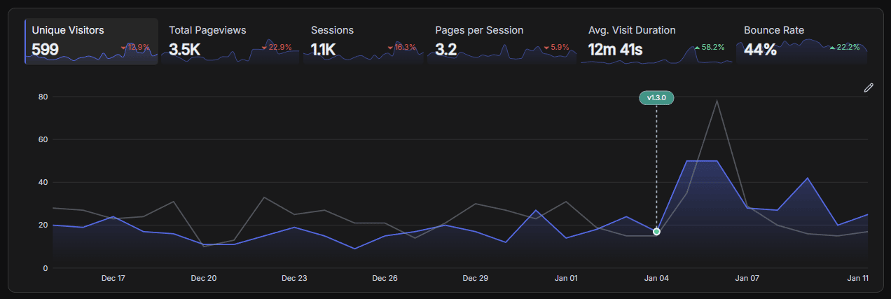
It also shifted how we talked about analytics internally. Instead of debating whether a change looked real, we could point at the timeline and say: this explains it.
I've noticed most analytics tools do a great job at collecting metrics, but very little at helping you remember what was happening when those metrics changed.
Curious how others handle this today:
Do you annotate dashboards?
Keep a separate changelog?
Or just rely on memory and Discord searches?
-
3Totally agree raw dashboards rarely tell the full story. We’ve seen similar issues in outsourcing and data operations environments (like teams at HabileData or Hitech BPO) where spikes in output or drops in turnaround time were initially flagged as performance issues, but annotations later revealed things like bulk client uploads or planned process changes. Without that context, teams end up solving the wrong problem. Annotations basically turn dashboards from ‘what happened’ into ‘why it happened,’ which is where real decisions come from.
-
1
This comment was deleted 8 months ago


When we started looking at performance, we did what most people do:
we focused on the worst-performing pages.
If a page had bad Core Web Vitals, it went to the top of the list.
Once we started looking at real user performance data alongside traffic, that approach stopped making sense.
What we noticed:
Some pages were very slow, but barely anyone visited them
Other pages looked "okay" from a Core Web Vitals perspective, but had a lot of traffic
Small regressions on those high-traffic pages affected far more users than the truly slow ones
In other words, the slowest page wasn't always the biggest problem.
Performance issues turned out to be more about impact than extremes. A page that's slightly slower but used by thousands of users can matter more than a page that's very slow and rarely visited.
In practice, this meant that pages with decent performance but a lot of traffic surfaced as higher priority than very slow pages that almost nobody visited:
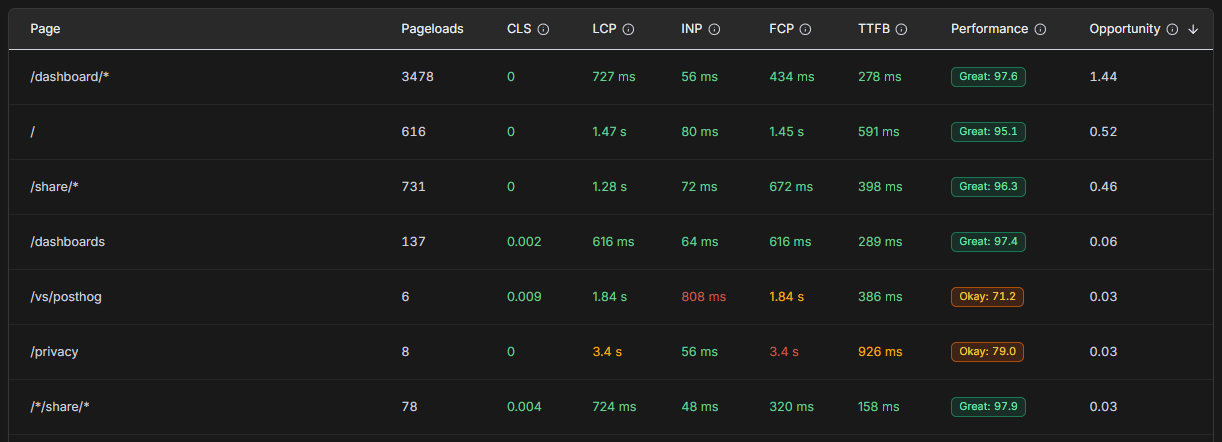
Once we started weighting Core Web Vitals by usage, our prioritization changed. We began scoring pages based on a mix of performance metrics and actual traffic, instead of looking at performance in isolation. That pushed us away from fixating on the worst scores and toward fixing issues that affected the most people.
We've been collecting real user Core Web Vitals alongside analytics in Betterlytics, and seeing performance and traffic together made this pattern obvious.
Curious how others prioritize performance work:
Do you still start with the worst-performing pages, or do you factor in usage and impact as well?
-
3
This sounds.
Performance is a user-impact problem, not a leaderboard problem.
A 100ms regression on a high-traffic page hurts more users than a 2s delay on a dead page.
Weighting CWV by usage feels like the right mental model.-
1
Well put.
I think part of why this isn't intuitive is that most performance tools focus on measuring pages in isolation. Lab tests like Lighthouse are great for spotting issues, but they don't know anything about how much a page is actually used.
Once you look at performance together with traffic, it stops being about scores and starts being about where fixes will help the most users.
-
-
1
This is a great point. Performance isn't about chasing the worst score, it's about reducing the most friction. Traffic-weighted core web vitals feels like a much more practical way to prioritize work.
-
1
We saw a similar pattern with AllInOneTools — some of our slowest pages barely mattered, while tiny regressions on high-traffic tools had outsized impact on user trust and retention.
Optimizing for user impact, not just worst metrics, completely changed our priorities.-
1
100%. Impact beats worst-case metrics every time. A small slowdown where users actually are can do far more damage than a terrible page no one visits.
-
1
Exactly. It’s tempting to chase worst-case numbers, but the real damage usually happens in the paths users hit every day. We found that prioritizing those “boring but busy” flows did more for trust than any big optimization elsewhere.
-
-
-
1
With my experience, psychology also has it own impact in doing conversion. Sometimes, everything looks great and the traffic keep coming in but, zero conversion. Pre-framing them has always been helpful
-
1
That's a good point. Performance and reliability set the floor, but they don't guarantee conversion.
We've seen similar cases where everything looks fine technically, but the issue is more about messaging, trust, or expectations rather than speed.
Pre-framing definitely plays a bigger role there.
-


Betterlytics is a web analytics tool. People use it to understand what's happening on their websites.
At some point we realized there was a blind spot: analytics only work when the site is up.
If your site goes down, traffic drops to zero, events stop coming in, and analytics don't really tell you why. You just see a flat line after the fact.
Uptime monitoring solves that very basic problem:
Is the site reachable?
When did it go down?
How long was it unavailable?
We decided to build uptime monitoring directly into Betterlytics, not to replace dedicated monitoring tools, but to cover that gap next to analytics.
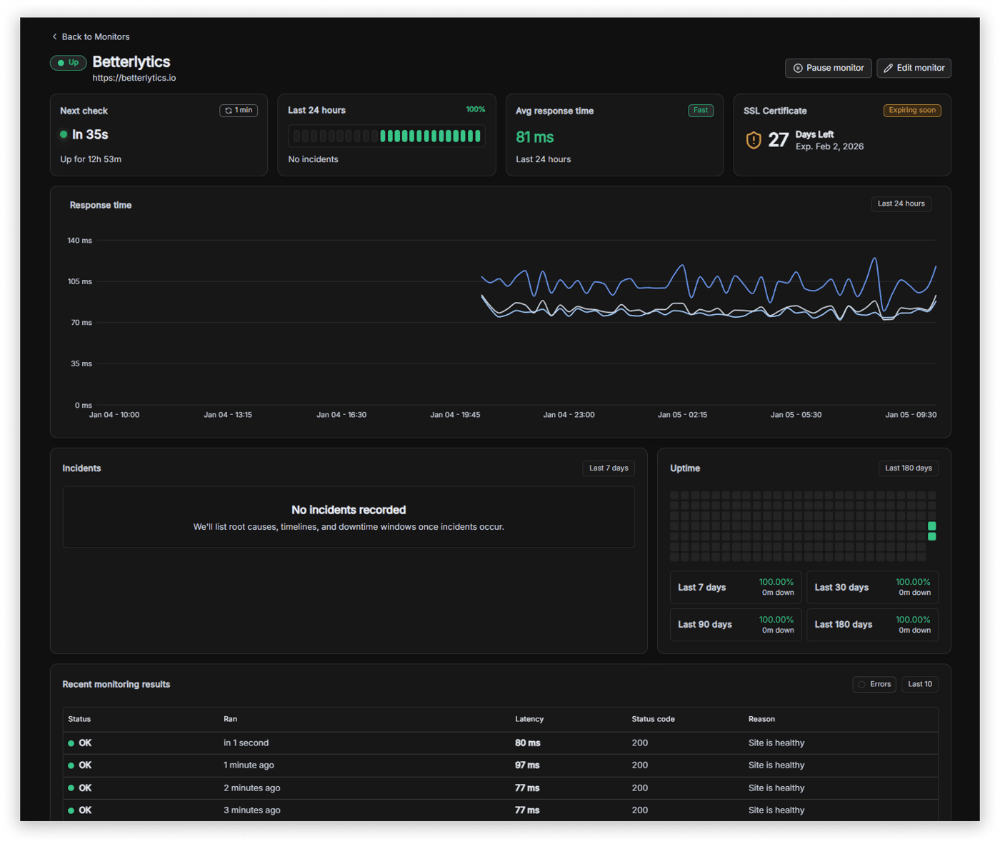
The goal isn't complexity or enterprise features. It's simply to have uptime and traffic in the same place, so when something breaks you don't have to switch tools to understand what happened.
This felt more like completing and complementing the picture than adding a "new feature."
Curious how others handle this:
Do you keep uptime and analytics separate, or do you want them together?
-
2
UI looks pretty cool!
-
1
Thank you! :)
-
-
2
This looks really promising. Privacy-first, lightweight analytics are exactly what modern websites need. Would love to see how Betterlytics compares with Plausible or Umami in real-world usage. Wishing you a successful launch
-
2
Thanks for your kind words!
Plausible and Umami are both solid tools and intentionally very focused. Betterlytics takes a slightly different approach.
In addition to traffic and events, we also capture things like page performance (Core Web Vitals), so you can see how fast individual pages load and where you can optimize your site.
We try to keep the default view simple, like Plausible and Umami, but also offer drill-downs for cases where you want more detail than a single-page dashboard can provide.
-
-
2
Really cool to see Betterlytics taking shape!
One thing that stood out to me is how you’re making uptime monitoring not just a checkmark feature, but something actionable with clarity around incidents and alerts — that’s what separates useful tools from noise in this space.
Curious how you’re thinking about noise reduction in alerts/notifications as usage grows — too many false positives can kill trust fast. Have you experimented with tuning thresholds or UX patterns there?
Excited to see where this goes!
-
3
Thanks for sharing your thoughts!
Noise and false positives were one of the main things we discussed early on. Rather than hard-coding thresholds, we let users configure their own timeout and failure thresholds so it matches their setup.
We also use a rolling window for incident detection. That way, "flappy" services (success -> fail -> success -> fail) are treated as a single ongoing incident instead of generating repeated alerts.
It's still intentionally simple, but the goal is to keep alerts meaningful rather than frequent.
-
-
1
Uptime + analytics covers a lot, but there’s still a gap.
Both can look ‘healthy’ while the site is actually broken.
200 responses, traffic still coming in, but key flows not working.
That’s where things get tricky.
-
1
I like the way you frame this as “completing the picture” rather than adding features.
I’ve personally kept uptime and analytics separate so far, mostly because I treated uptime as an ops concern and analytics as a product concern.
But in reality, when something breaks, the first question is often “did traffic drop because users left, or because the site was down?”
Having both timelines in one place actually feels more practical than I used to think — especially for smaller teams that don’t want to juggle multiple tools.
-
1
Yeah, I agree. Uptime is definitely still an ops concern, and for anything serious you'll want proper monitoring in place.
For us this wasn't about replacing that, but about catching and explaining the obvious stuff faster. Sometimes analytics shows a sudden drop and uptime gives you the reason immediately, or vice versa.
Having both timelines together won't solve every problem, but it does remove a bit of guesswork, especially for smaller teams where the same person ends up wearing both the ops and product hats.
In a way it's like having multiple monitors on your desk, you don't need them, but once you have more than one, it's hard to go back. ;)
Appreciate your input
-
-
1
Uptime + analytics in one place makes sense - you see WHAT happened (site went down, traffic dropped). But there's a layer most analytics miss: understanding WHY your site matters to visitors in the first place.
You can have perfect uptime and traffic flowing, but if visitors don't immediately understand what you offer and why it's relevant to them, they bounce before you can measure engagement.
That's the gap between monitoring behavior and ensuring comprehension. Analytics tell you what users did, not whether they understood what they were looking at.
We're building voice agents that guide users through products in real-time (demogod.me) - basically ensuring people comprehend your value before you start measuring their actions.
Your tool nails the "what's happening" layer. The missing piece is the "do they get it" layer - making sure visitors understand your offering fast enough to become the engaged users you're tracking.


We recently did a UI overhaul for Betterlytics (our open-source analytics tool).
It’s not live yet - we’ve been sharing it with users and gathering feedback first.
The result? Mixed responses.
Some people love the fresh look. Others prefer the “old but familiar” version. Some people find the previous version more visually appealing, while some find the new one more professional.
And a surprising number said they don’t really care, as long as the insights are accurate and fast.
A few takeaways so far:
UI polish matters less than we expected for an analytics-heavy product.
Changing base-theme and layouts feels riskier than just visual tweaks.
Early user feedback is brutally honest (and that’s a good thing).
We’re stuck between:
Shipping the redesign because we personally feel it’s better.
Iterating further and risk delaying forever.
Keeping the old UI and focusing only on features.
Curious if anyone else has been through this:
How do you decide when a redesign is “good enough” to ship?
Have you ever shipped a redesign and regretted it?
Would love to hear how other founders handled this.
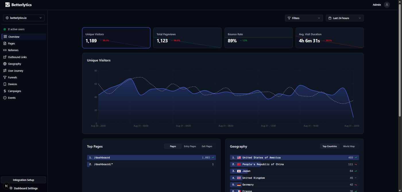
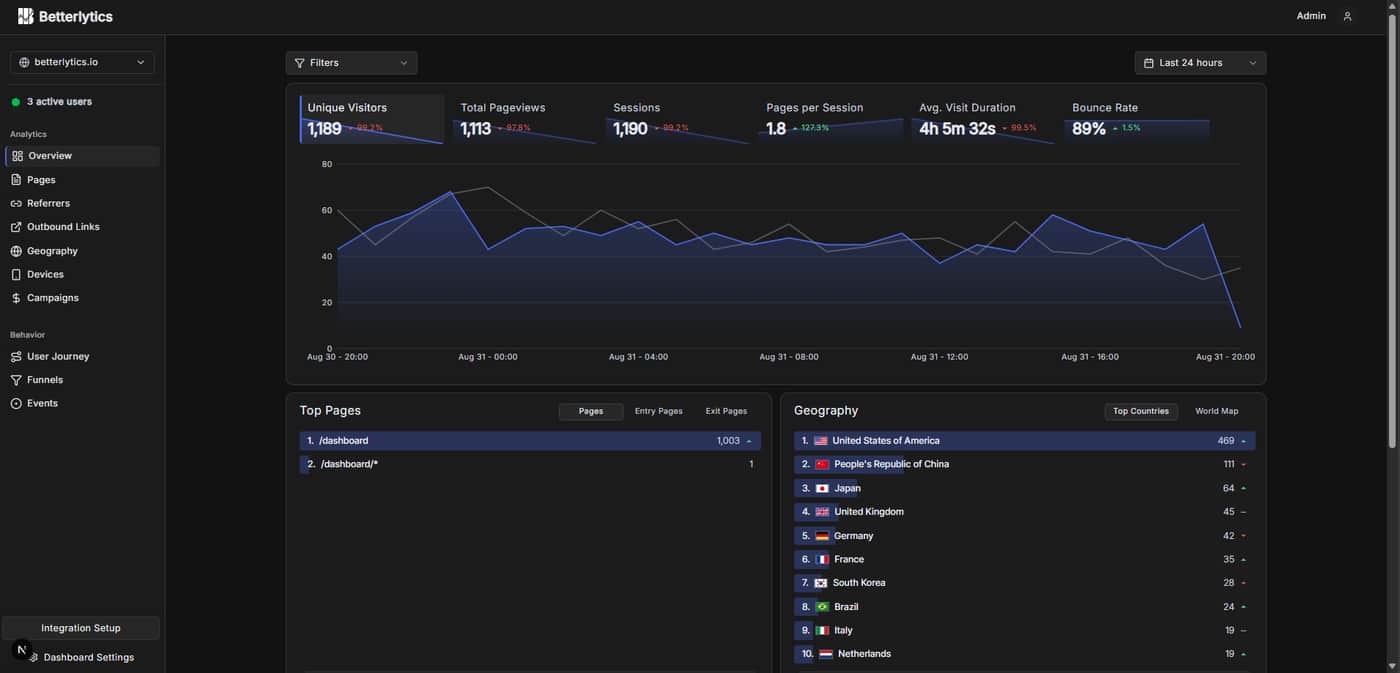
Here's the before and after of our UI overhaul:
Before:
After:
-
3
Yea this seems like one of those cases where overthinking can happen. I would keep the old design, slowly integrate any good parts of the new design. such as the brighter green dot. The older design has strengths, looks more readable .. but overall the changes should not lead to any delaying of shipping...
-
1
Agreed 👍 We even considered doing an A/B test just to get the new version out and see how people actually use it. That said, since we’re a larger team, we’re able to keep building other features in parallel while feedback comes in, so progress isn’t blocked either way!
-
-
3
There are merits to both designs, the left hand nav is clearer for the user on the after, but overall the before layout has a bit more and and feels friendlier and less cramped, I also prefer the shade of the boxes on the original and the deeper black/blue colour way, feels more polished. I see why you have moved the filter box to give it balance but it still makes more sense being next to the date filter.. If you wanted to fill the void you could have a small title in that space .. eg. overview . That being said these are small things and if you are overall happy with what you produced and are confident that it's for the greater good of the user, sometimes you just need to push forward.
-
1
Thank you for your feedback! We're continuously iterating the design while listening deeply to feedback.
-
-
2
Love the transparency here..
-
2
I personally like the new UI re-design!
Feel free to launch this on ProofStories as well to drive some additional traction - we also just launched a directory!
-
1
Thank you, much appreciated :)
-
-
2
The difference between the two UIs isn't tremendous, so I don't think you run the risk of shipping and frustrating existing users.
I like the additional metrics at the top of your new layout where you're now covering everything most people would want to see at a glance. The addition of the Behavior heading in your left column is good and makes the list more scannable.
As for users who find the old version more visually appealing, I am going to make a couple guesses as to why:
(1) The stats at the top are easier to read on the old version. In the new version, the brighter lines with gradients underneath make the numbers slightly harder to read. However, they do make the lines easier to "read" at a glance. Both versions work. The only question is whether you think users prioritize the values or the trendlines for easiest reading. Neither approach is a dealbreaker, and both look good.
(2) This might sound odd, but the curved trendlines on the old version probably read as "friendlier" to some users than the more jagged lines that go point-to-point.
Good luck! Both versions look great.
-
2
Thanks for feedback! All your points are great and will definitely be taken into consideration!
-
-
2
I’ve been through something similar. The truth is most users care way more about speed and clarity than design polish. In my case shipping the redesign and improving it later worked better than waiting forever. How much feedback is holding you back versus just preference noise?
-
1
We actually found the newer design more appealing ourselves, mainly because the old one felt overwhelmingly blue (blue background, blue-tinted cards/sidebar, blue primary, etc.). It started to feel blue-monotonous, so we tried to revise the scheme to highlight our primary color more intentionally.
That said, about 80% of the people we’ve spoken to still prefer the previous version and find it more visually appealing. That puts us in a tricky spot, we don’t want to ship something the majority of feedback is pushing back on. Right now we’re iterating based on all the input we’re getting, with the goal of landing on something that’s useful, intuitive, and visually appealing!
-
-
1
Very good question. I'm not a user and I like the old UI a little bit more. You will always have users who don't like UI changes, and that's okay. They will get used to it. In this case I would say it doesn't really matter which design to keep, they are both good. So rather keep focusing on developing real impacting improvements.
-
1
product build not vs product sustained


Comment