
Shadcn Space
Your Space to Design, Build, and Ship Websites & Apps Faster
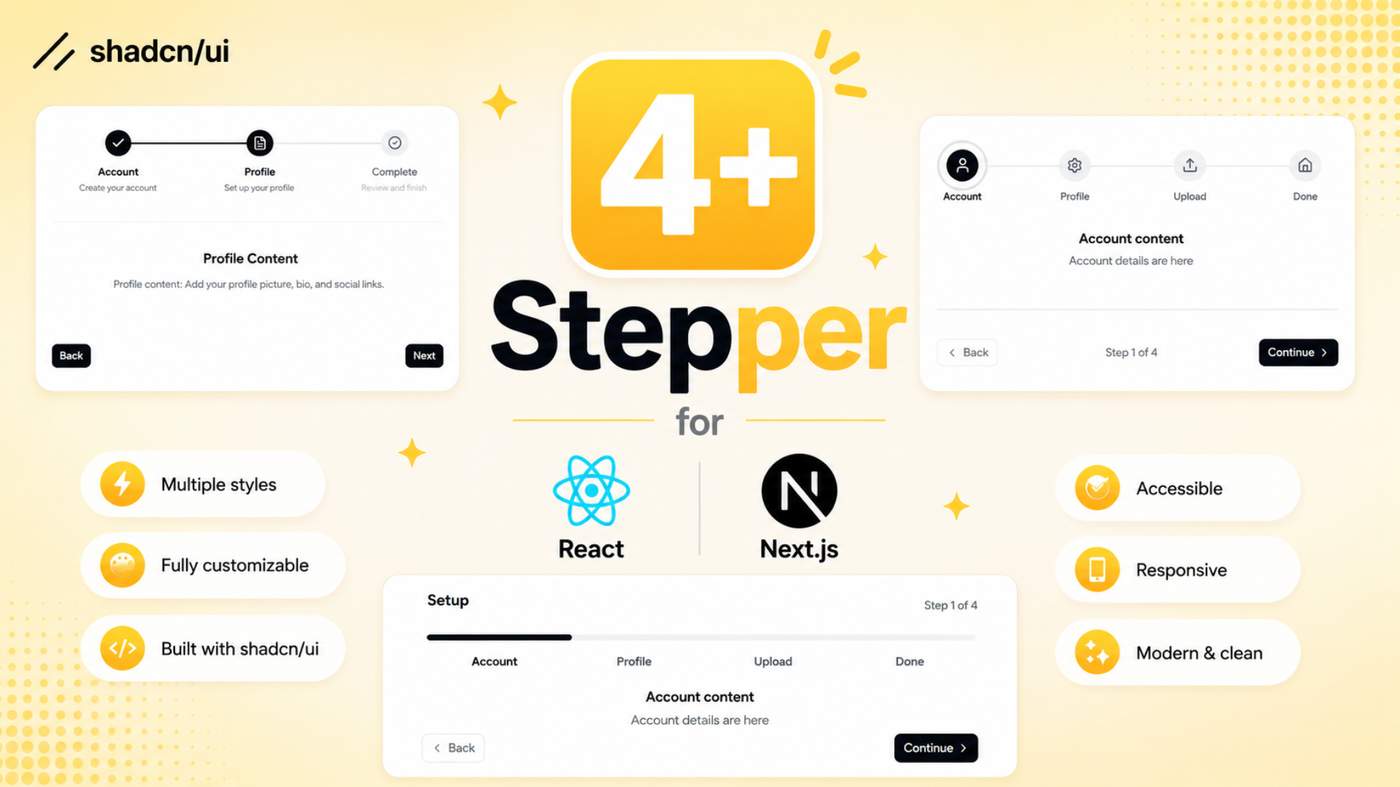
Build better multi-step experiences with our collection of Shadcn Stepper Components. These ready-to-use UI components are perfect for onboarding, forms, checkout, registration, configuration wizards, dashboards, and other step-based workflows.
Designed with Next.js, React, TypeScript, Tailwind CSS, Base UI, and Radix UI to help you build modern interfaces faster.
Here Are 4+ Types of Shadcn Stepper Components Included
Custom Square Badges Stepper
A simple and customizable square-badge stepper for displaying progress across multiple stages. Use it for onboarding, checkout, registration, and application workflows.
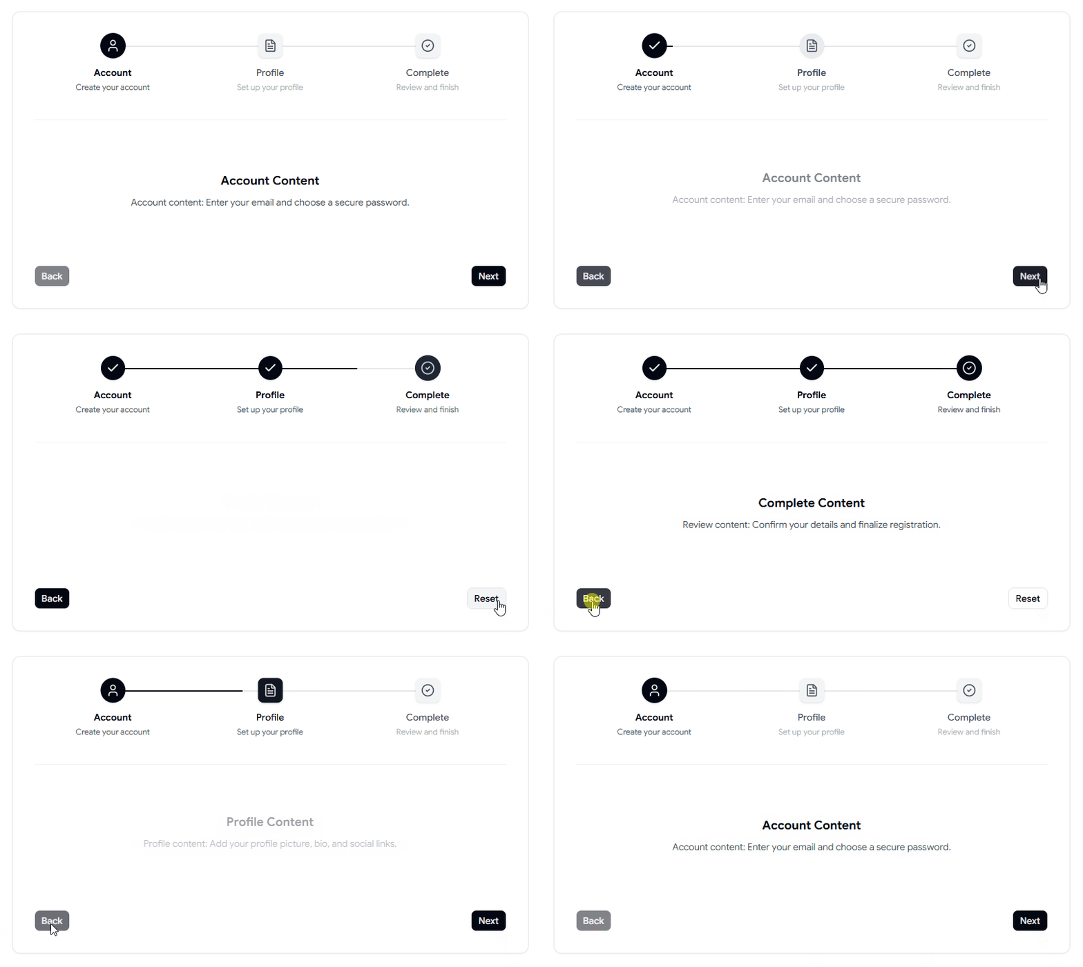
Multi-Step Wizards Stepper
A user-friendly multi-step wizard for breaking complex tasks into simple stages. Great for registration forms, checkout flows, account creation, and application processes.
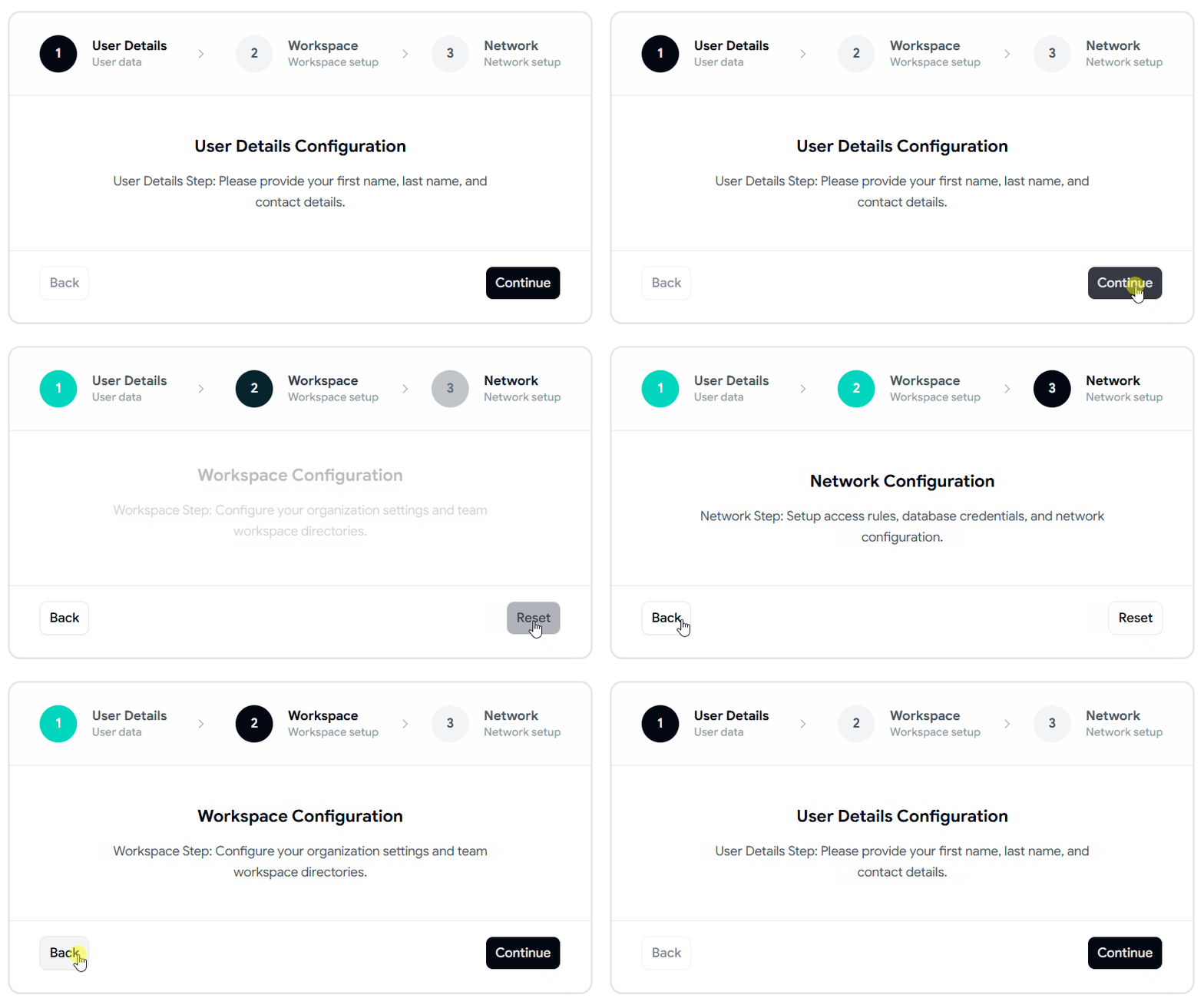
Animated Progress Indicators Stepper
An animated stepper with smooth progress transitions that clearly show the user's current position in a workflow. Ideal for forms, onboarding, checkout, and dashboards.
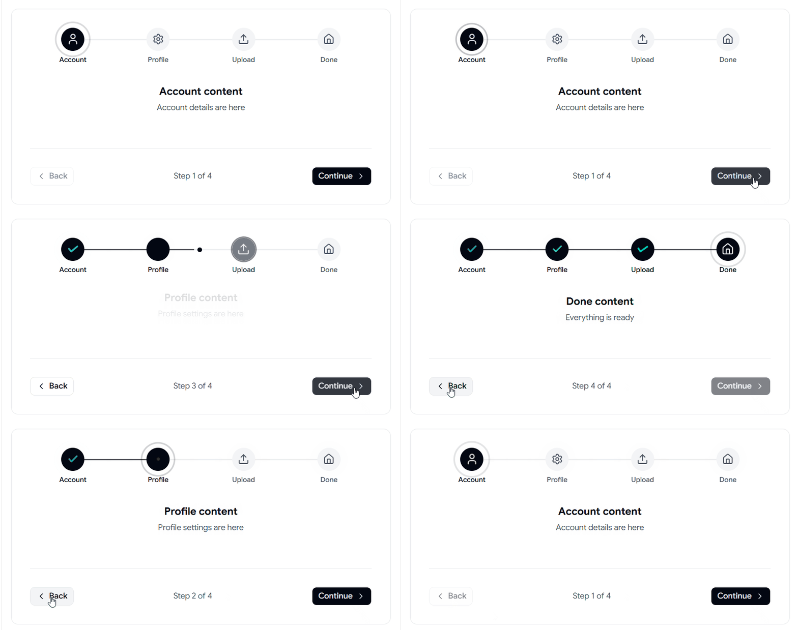
Segmented Progress Pill Stepper
A clean progress pill that makes it easy for users to understand their position within a multi-step workflow. Great for setup screens, forms, checkout, and dashboards.
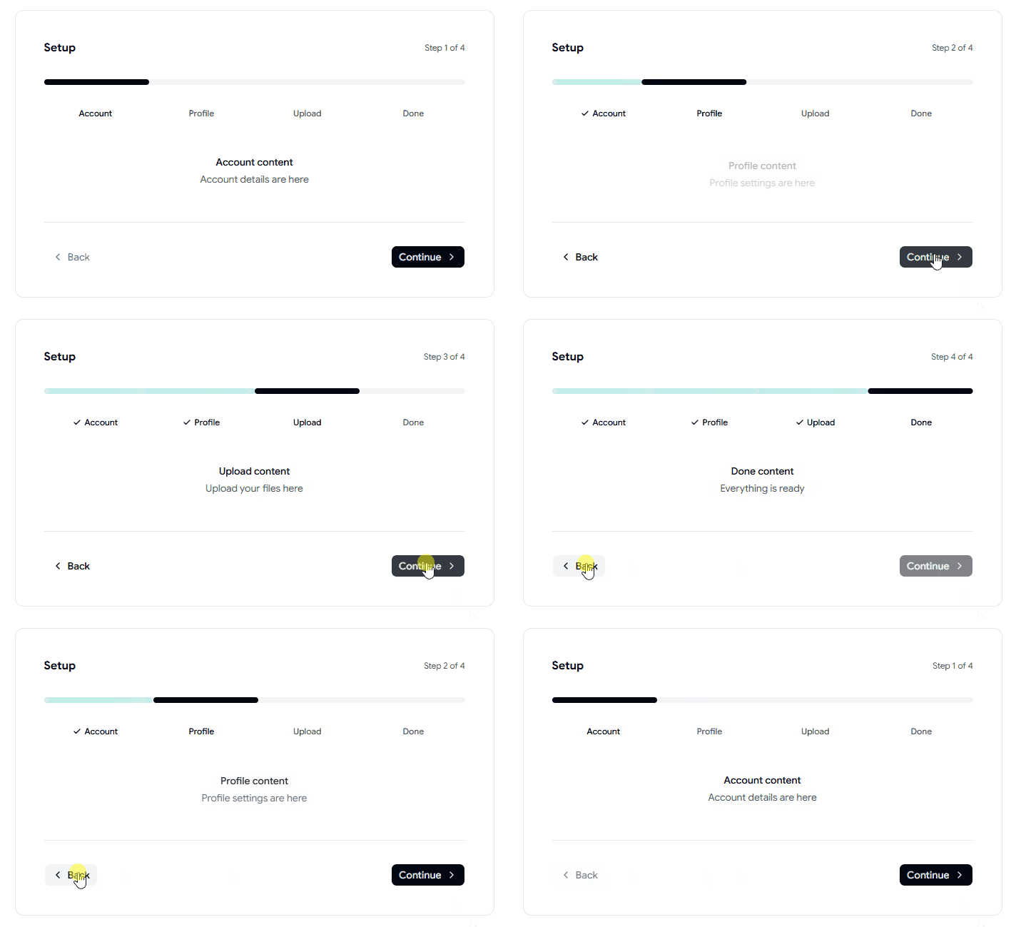
Explore Shadcn Stepper Components Today.

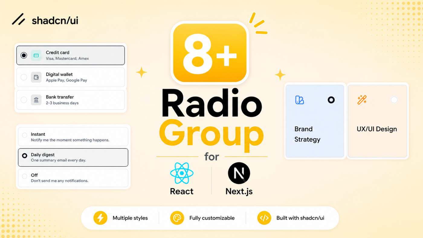
Build cleaner selection interfaces with our collection of Shadcn Radio Group Components. These customizable React and Next.js components are designed for forms, settings panels, pricing plans, checkout flows, dashboards, and other modern web applications.
Here Are the Types of Shadcn Radio Group Components
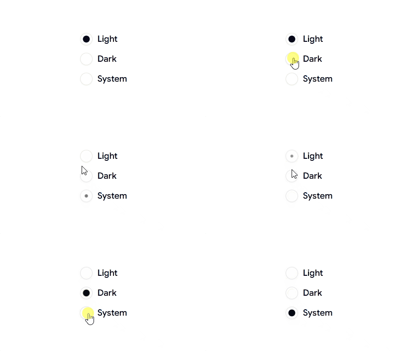
Radio Group Animated Demo
A modern animated radio group featuring smooth interactions and selection states, perfect for settings pages, theme selectors, preferences, dashboards, and modern SaaS applications.
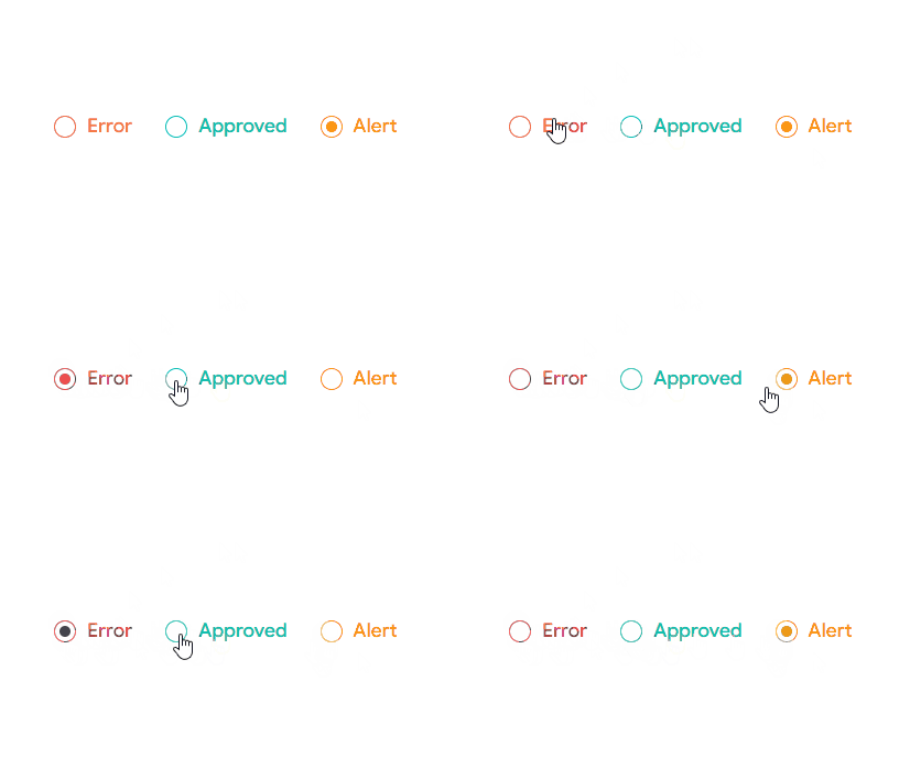
Radio Group Colors Demo
A colorful radio button layout with visually distinct options and states, ideal for forms, status selection, settings panels, admin dashboards, and modern application interfaces.
Radio Group with Plan Cards
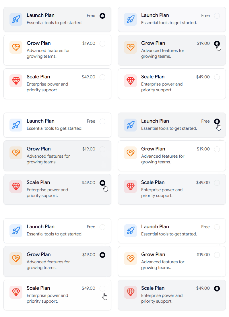
Explore More Shadcn Radio Group Components Today.

What’s new:
• 21+ Shadcn Blocks
• 12+ UI Components
This update introduces new Landing Pages, Announcement Bars, Hero sections, Compare blocks, Contact & Team sections, User Profile dashboards, Email Applications, Login & Register forms, Integration blocks, and Logo Clouds.
It also includes new Sortable and Aspect Ratio UI components.
Shadcn Space now offers:
• 418+ Ready-to-Use Shadcn UI Blocks
• 406+ Shadcn UI Components
• 10+ Shadcn Templates
• React + Next.js Dashboard Kit
• Shadcn Figma UI Kit
• Shadcn MCP Server
• Shadcn CLI
• Shadcn Builder
See what's new in today's changelog.
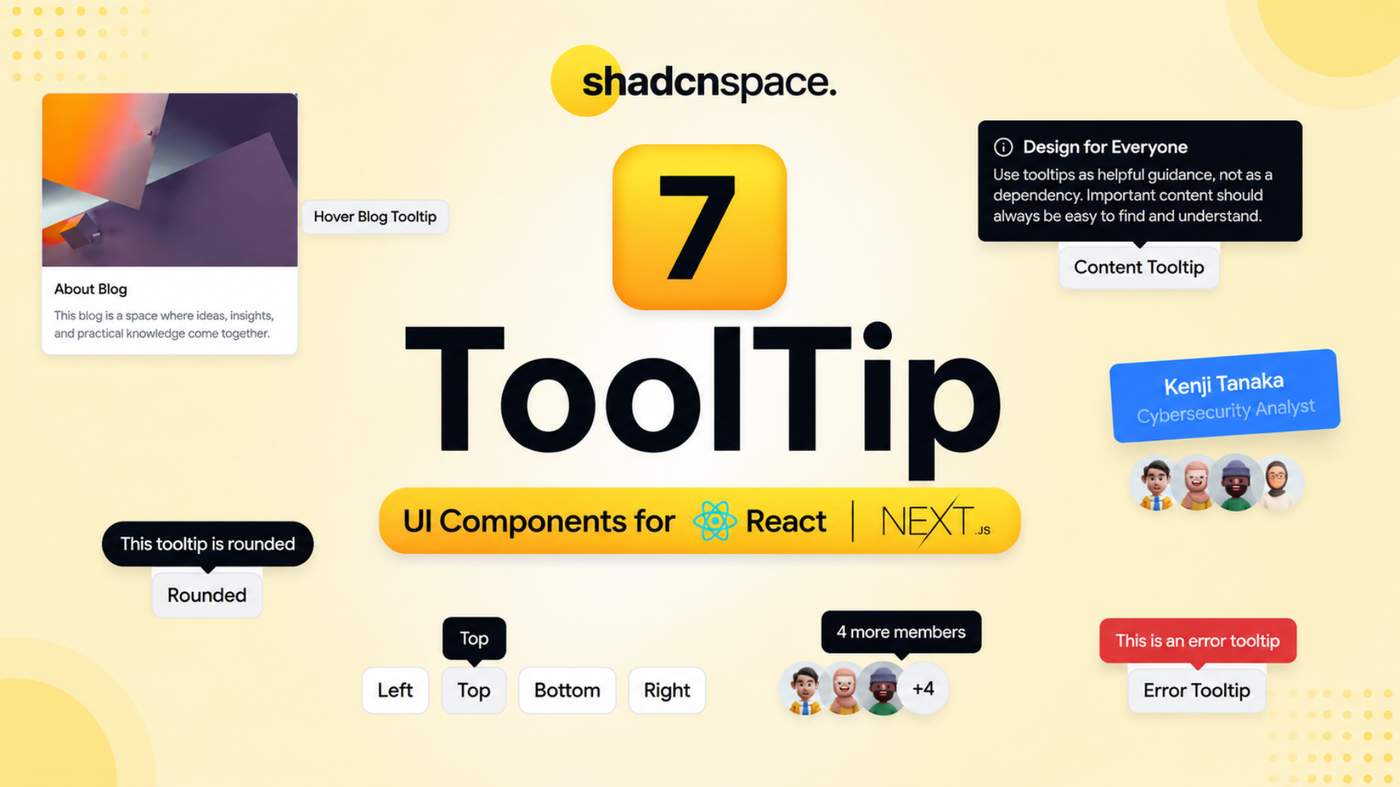
These ready-to-use tooltip patterns are designed to provide helpful information, contextual guidance, validation feedback, and additional details without cluttering the interface.
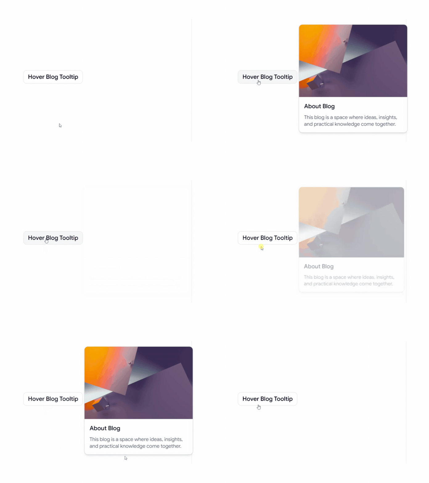
Hover Blog Card Tooltip
A rich hover tooltip for displaying blog information and content previews without leaving the current page. Perfect for blogs, content platforms, and editorial websites.
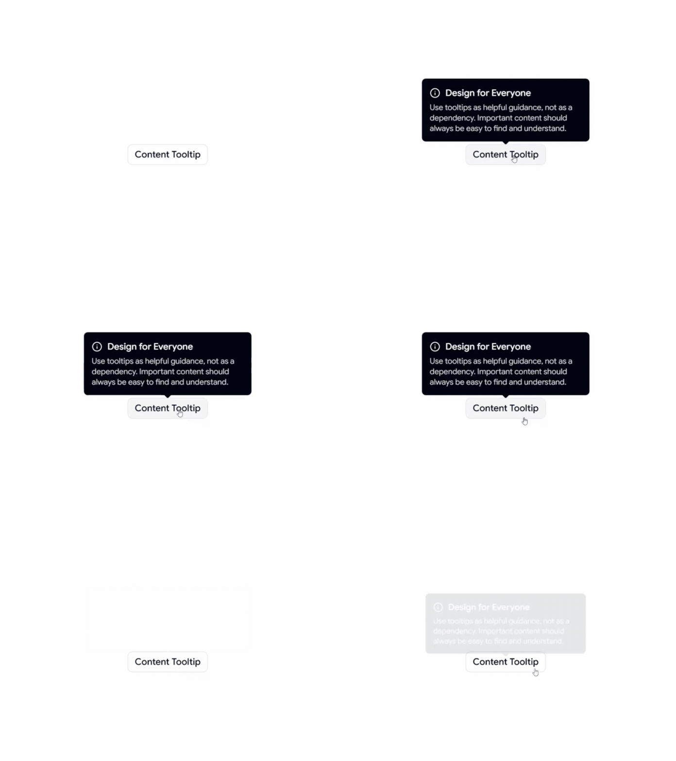
Content Tooltip
A simple content-focused tooltip for displaying helpful information, explanations, and contextual guidance when users interact with UI elements.
Animated Tooltip
An interactive tooltip with smooth animated transitions, designed to create a more engaging and polished user experience.
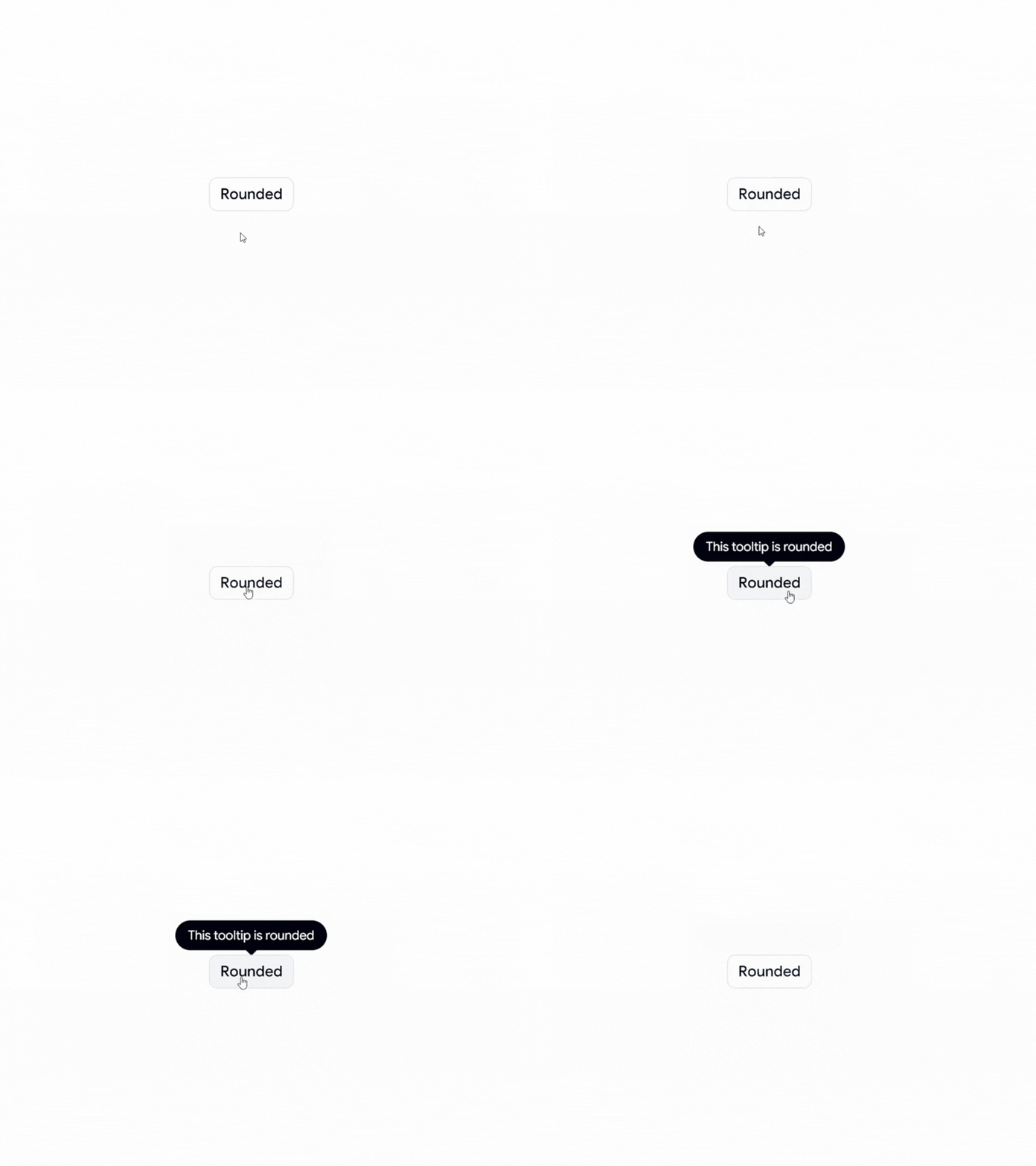
Rounded Tooltip
A clean and modern rounded tooltip style that fits naturally into contemporary interfaces and design systems.
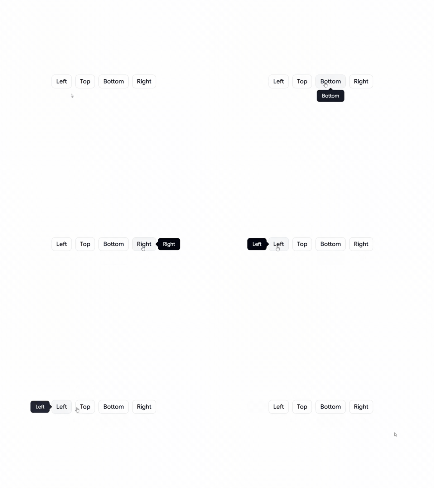
Positional Tooltip
A flexible tooltip with different positioning options, making it suitable for buttons, icons, navigation, forms, and other interactive elements.
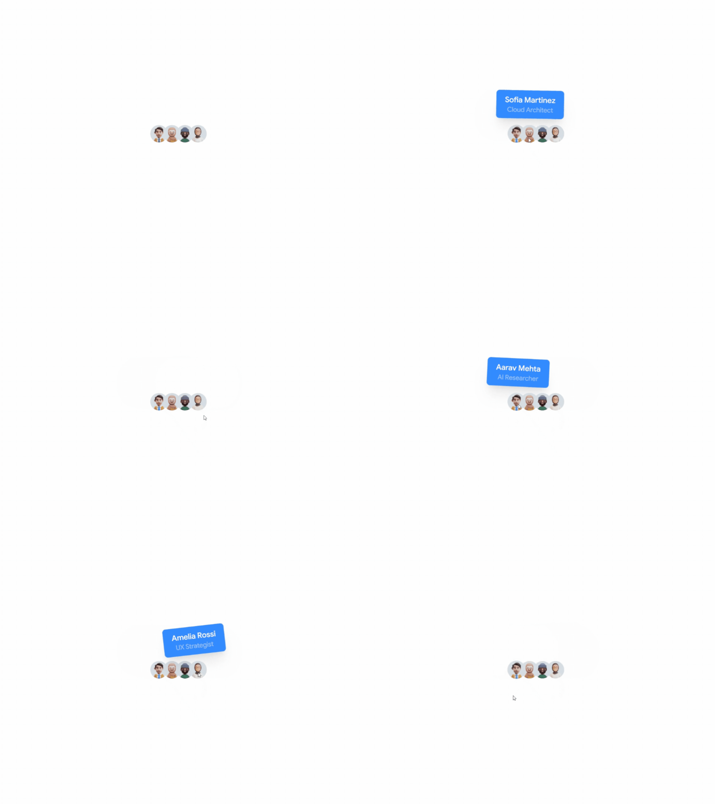
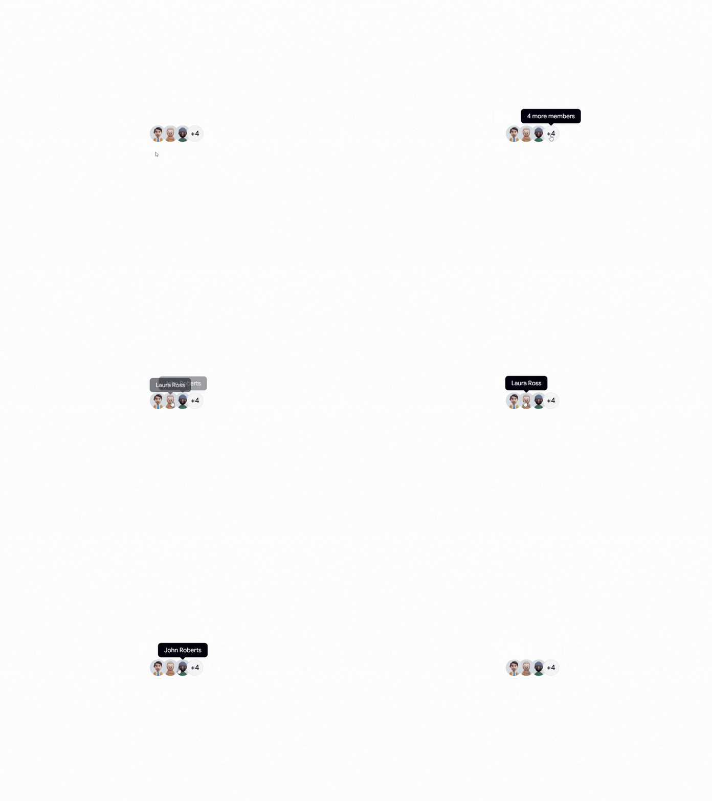
Avatar Tooltip
An avatar-based tooltip for displaying user information and profile details. Ideal for team sections, social platforms, collaboration tools, and user profiles.
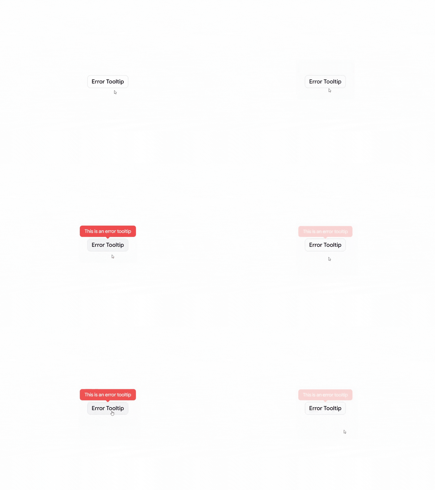
Error Tooltip
An error-focused tooltip for displaying validation messages, warnings, and helpful feedback when users interact with an invalid field or action.
Why Use Tooltips?
Tooltips provide additional context without taking up permanent space in the interface. They can help users understand icons, actions, form fields, and unfamiliar UI elements while keeping the overall design clean and focused.
Design Tips
Keep tooltip content short and easy to understand
Use tooltips for supporting information, not essential content
Make important information visible without requiring hover
Keep tooltip positioning consistent throughout the interface
Avoid putting too much information inside a tooltip
Consider keyboard and touch interactions when designing tooltip experiences
Perfect For
React applications, Next.js projects, Shadcn UI websites, SaaS products, admin dashboards, social platforms, team management apps, blogs, e-commerce websites, and modern web applications.
Check out Shadcn Tooltip today.
New on Shadcn Space:
• 26 Shadcn Blocks
• 8 UI Components
Including Waitlist, Coupons, Product Comparison, AI Ops, Forms, Calendar App, Cards, Ratings & more.
Shadcn Space now features:
• 397+ Reusable Shadcn UI Blocks
• 393+ UI Components
• 10+ Templates
• React + Next.js Dashboard Kit
• AI Form Builder
• Landing Page Builder
• MCP Server
• Pro Figma UI Kit
See what’s new in today’s changelog.
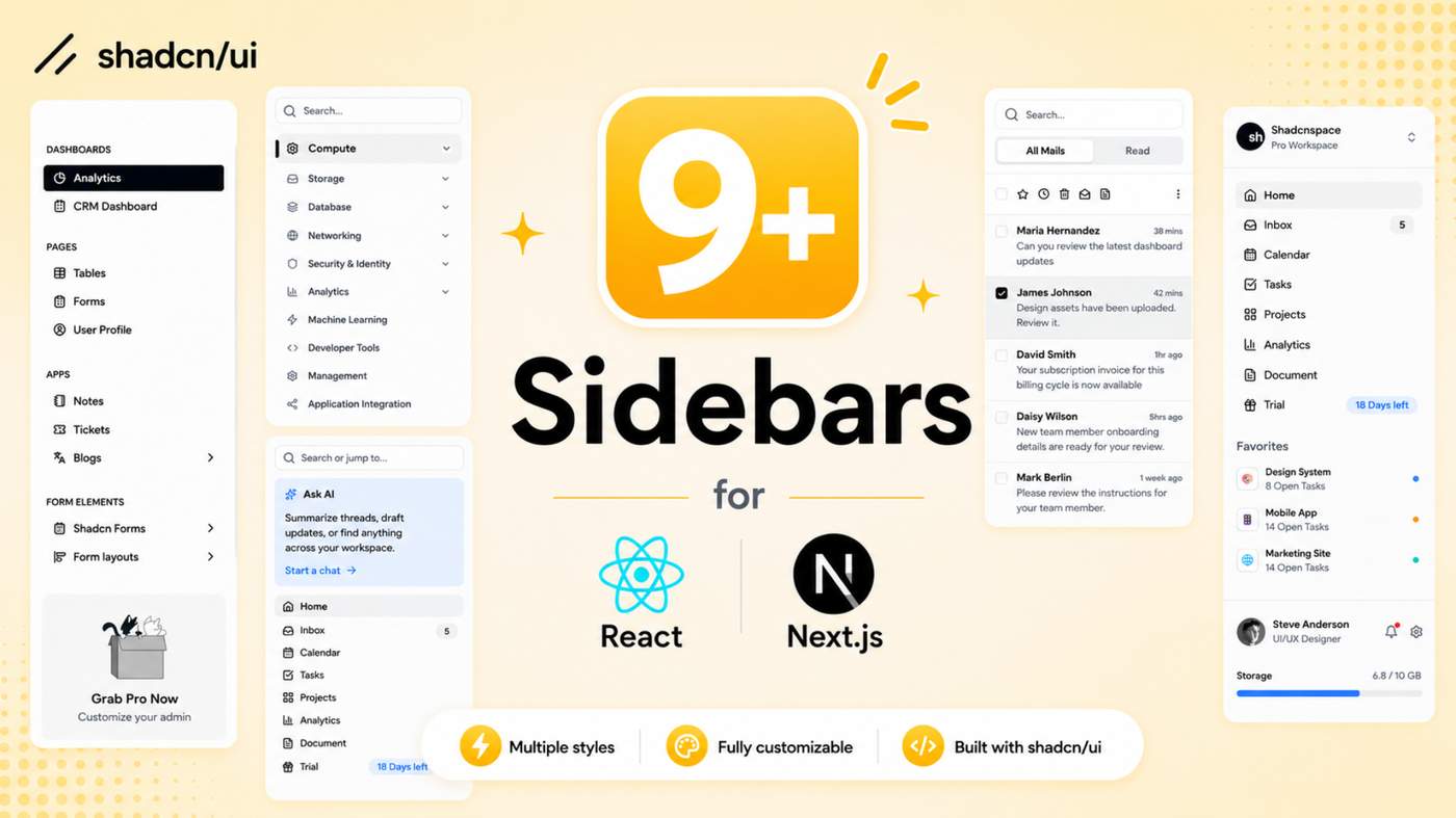
Build better dashboard navigation with our collection of Shadcn Sidebar Blocks & Sections. From compact sidebars to advanced workspace layouts, these components are designed for modern React and Next.js applications.
Built with React, Next.js, TypeScript, Tailwind CSS, Base UI, and Radix UI.
Here Are 9+ Types of Shadcn Sidebar Blocks
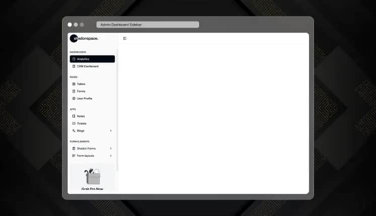
Admin Dashboard Sidebar
A clean navigation sidebar created for admin dashboards, analytics platforms, CRM systems, and productivity applications.
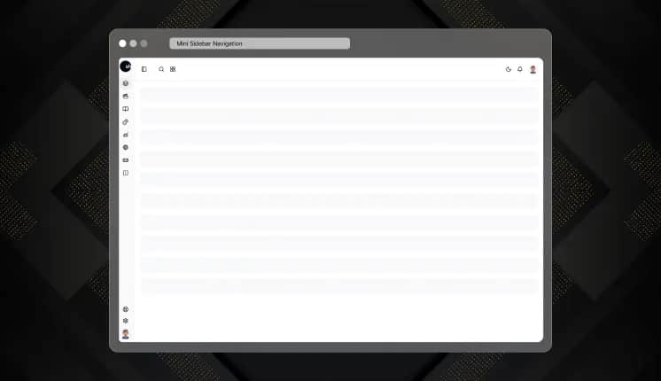
Mini Sidebar Navigation
A responsive mini navigation layout that keeps interfaces clean while offering quick access to important sections.
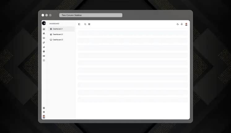
Two Column Sidebar
A dual-column navigation layout built for enterprise dashboards, documentation portals, and feature-rich applications.
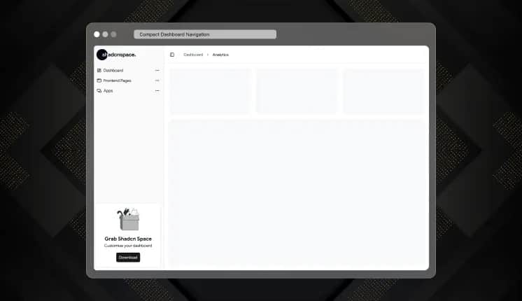
Compact Dashboard Navigation
A responsive, compact sidebar built for business dashboards, reporting tools, design systems, and enterprise software.
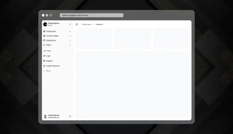
Admin Sidebar with Promo
A modern admin sidebar with built-in promotional and upgrade sections, ideal for SaaS platforms, subscription-based products, and premium admin dashboards.
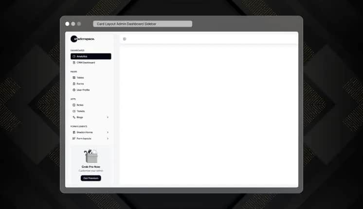
Card Layout Admin Dashboard Sidebar
A clean, card-based sidebar with grouped navigation, designed to create intuitive, organized, and visually appealing dashboards.
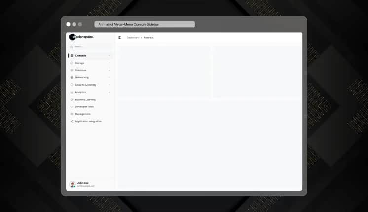
Animated Mega-Menu Console Sidebar
A modern console-style sidebar with animated mega menus, expandable navigation, and smooth interactions, ideal for developer tools, AI platforms, and enterprise applications.
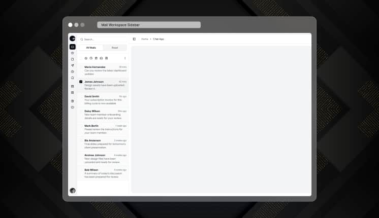
Mail Workspace Sidebar
A productivity-focused sidebar with an email-style layout, designed for messaging apps, team collaboration platforms, inbox management, and communication tools.
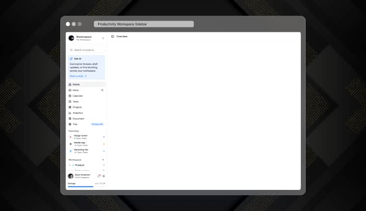
Productivity Workspace Sidebar
A clean, productivity-focused sidebar designed for task management, note-taking apps, project workspaces, team collaboration platforms, and modern business tools.
Check out Shadcn Sidebar Today.
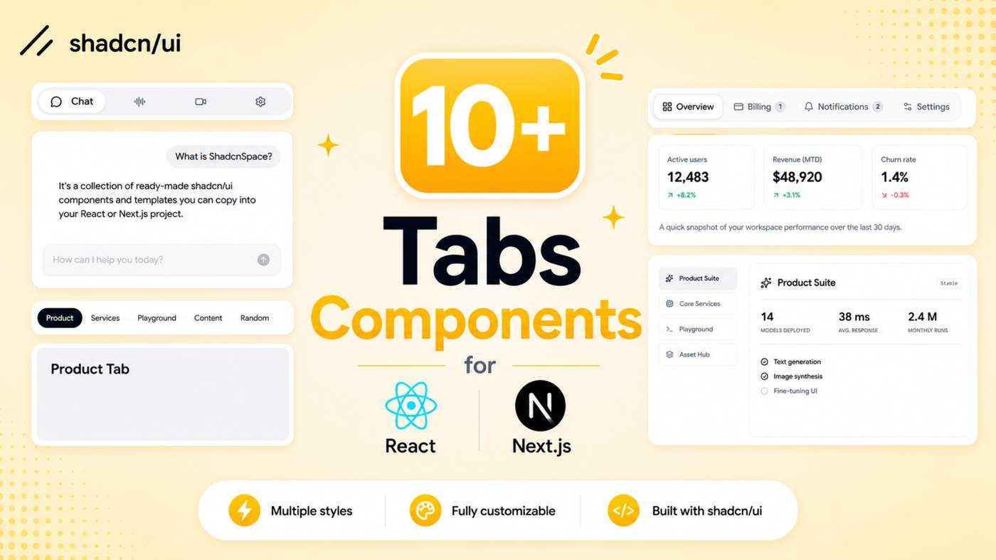
Tabs are one of the simplest ways to organize content and improve navigation.
We created 10+ reusable Shadcn Tabs Components for dashboards, AI apps, documentation, settings pages, and modern React interfaces.
Built with React, Next.js, TypeScript, Tailwind CSS, Base UI, and Radix UI.
Here Are 10+ Types of Shadcn Tab Components
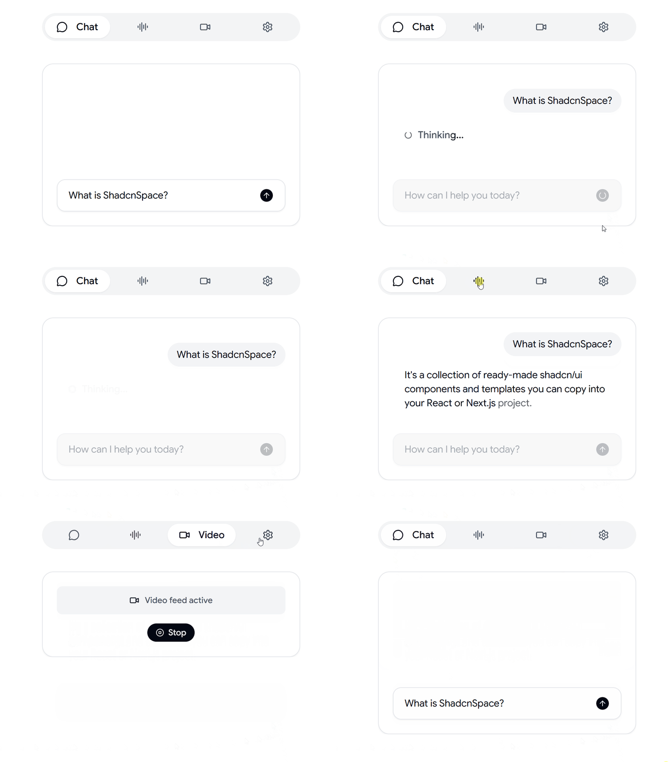
AI Assistant Tabs
A reusable Shadcn tab component designed for AI assistants, chat interfaces, documentation websites, and interactive conversational applications with smooth and organized navigation.
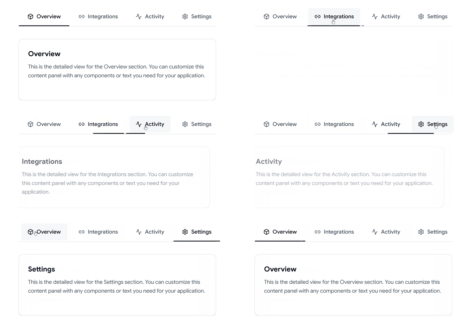
Underline Tabs
A clean underline tab navigation designed for modern websites, dashboards, and web applications.
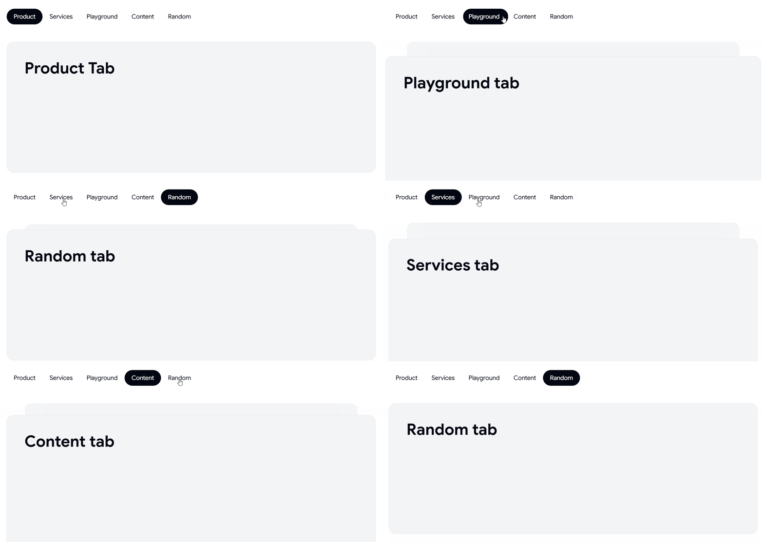
Horizontal Tabs
A reusable horizontal tabs layout that helps organize content for dashboards, SaaS applications, landing pages, forms, documentation, and responsive user interfaces.
Seasonal Preview Tabs
Interactive preview tabs for showcasing products, seasonal themes, marketing campaigns, and creative content.
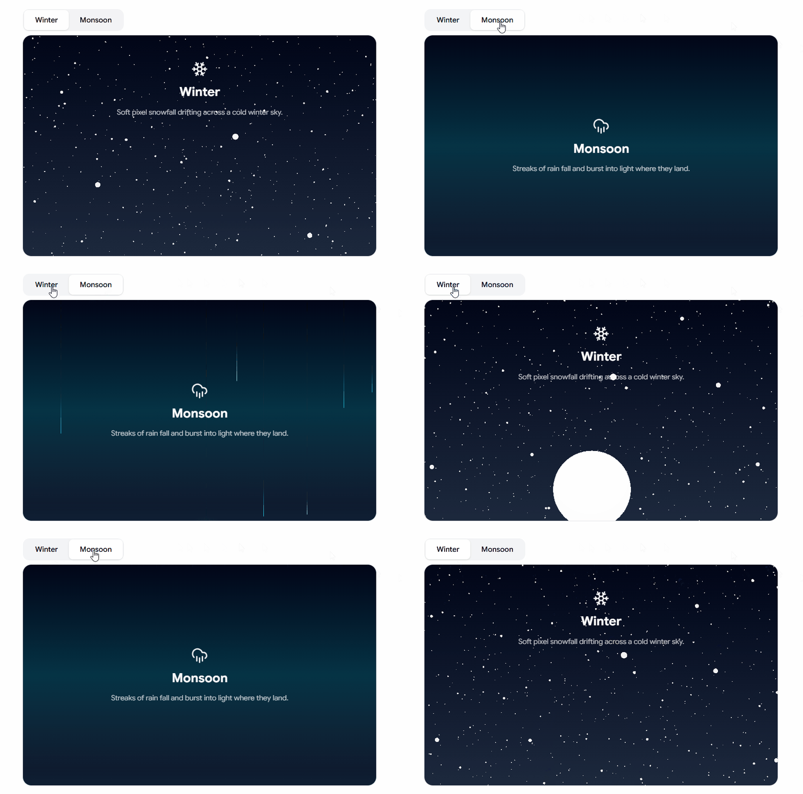
Explore the Full Collection Shadcn Tabs.
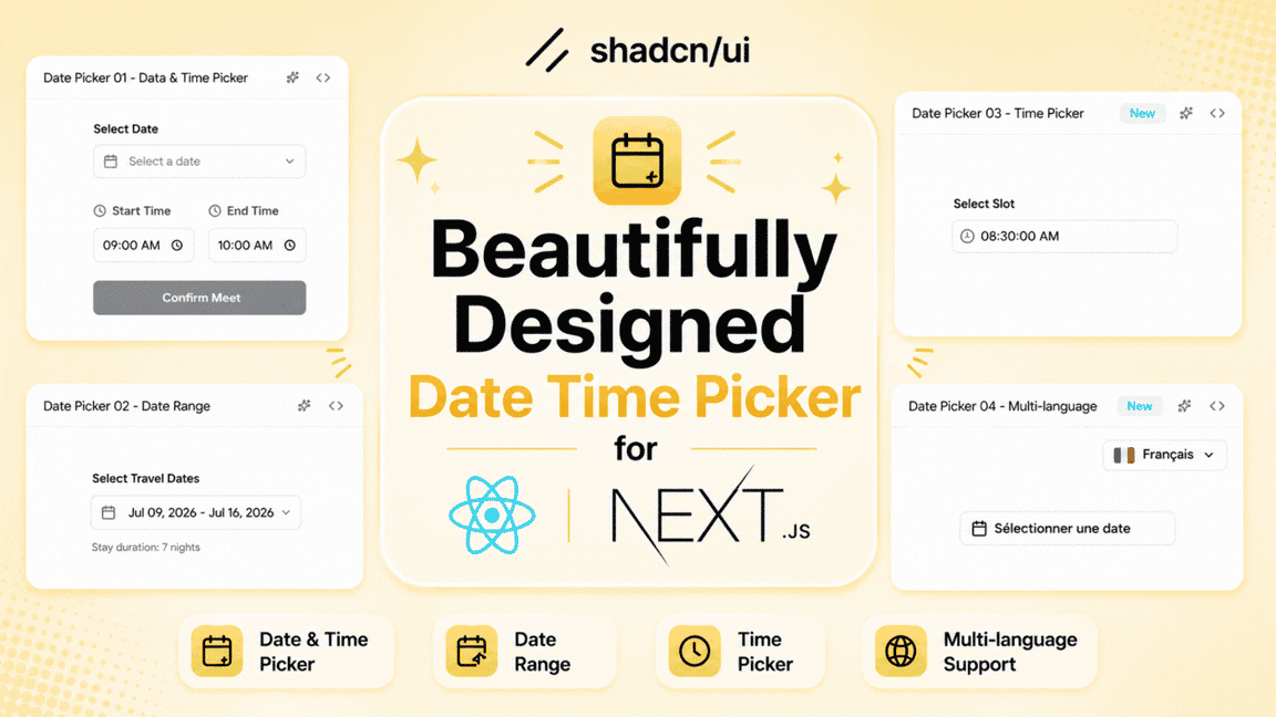
Explore our collection of Shadcn Date Time Picker Components & Examples for React and Next.js. This collection includes modern date pickers, date & time pickers, date range pickers, time pickers, and multilingual calendar components designed for real-world web applications.
Here Are 4 Types of Shadcn Date Time Picker Components Included
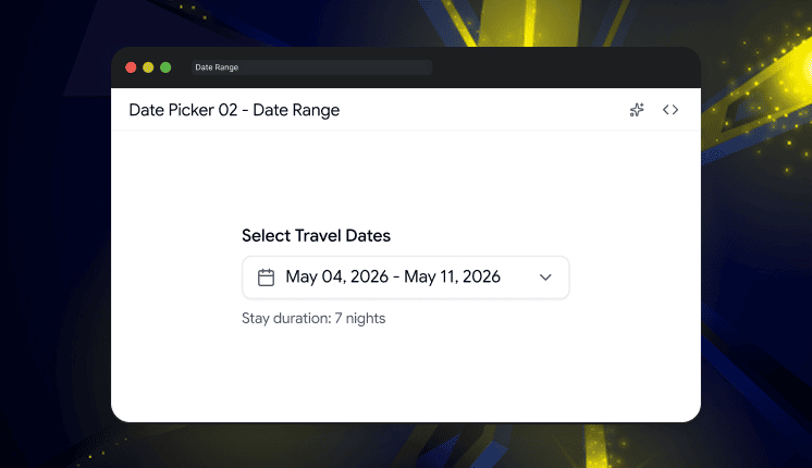
Date & Time Picker
A modern date and time picker for scheduling appointments, booking systems, forms, and event management.
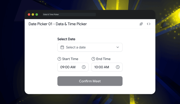
Date Range Picker
A flexible date range picker perfect for travel bookings, analytics dashboards, reports, and filtering data.
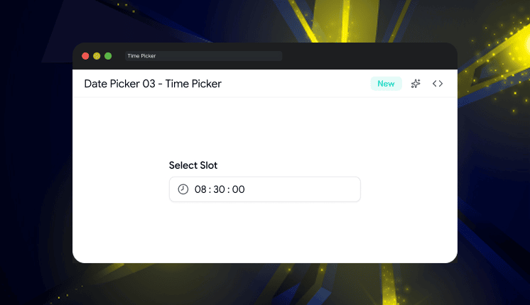
Time Picker
A clean and intuitive time picker with hour and minute selection for forms, reminders, and scheduling interfaces.
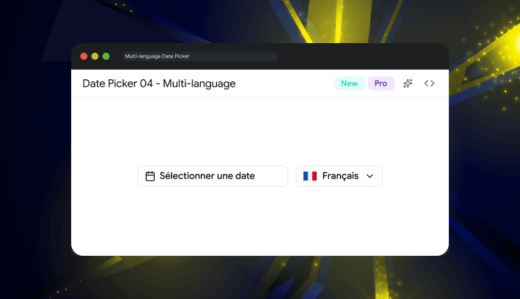
Multi-language Date Picker
A localized date picker supporting multiple languages and regional formats for international web applications.
Why Developers Use Shadcn Date Picker Components
Build modern date and time selection interfaces quickly
Create booking and scheduling experiences
Add date range filters to dashboards and reports
Support multiple languages and regional date formats
Improve user experience with intuitive calendar interactions
Save development time with reusable UI patterns
Best For
React Applications
Next.js Projects
Shadcn UI Websites
SaaS Dashboards
Booking Platforms
E-commerce Stores
Admin Panels
Analytics Platforms
Event Management Systems
Mobile-Friendly Web Apps
Modern Web Applications
Check out Shadcn Date Time Picker Today.

This month’s release includes:
• Astro version of the Saazio SaaS Template
• React version of the Admin Dashboard
• 19 new shadcn UI Blocks
• 26 new UI Components
Shadcn Space now includes:
• React + Next.js Admin Dashboard Kit
• 371+ Ready-to-Use UI Blocks
• 385+ UI Components
• Landing Page Builder
• MCP Server Support
• AI Form Builder
• Pro Figma UI Kit
• 10+ Templates
See what’s new in today’s changelog.
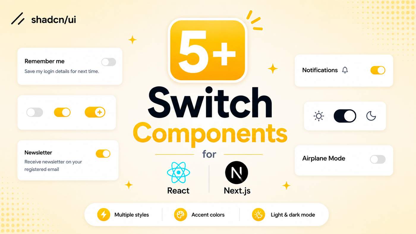
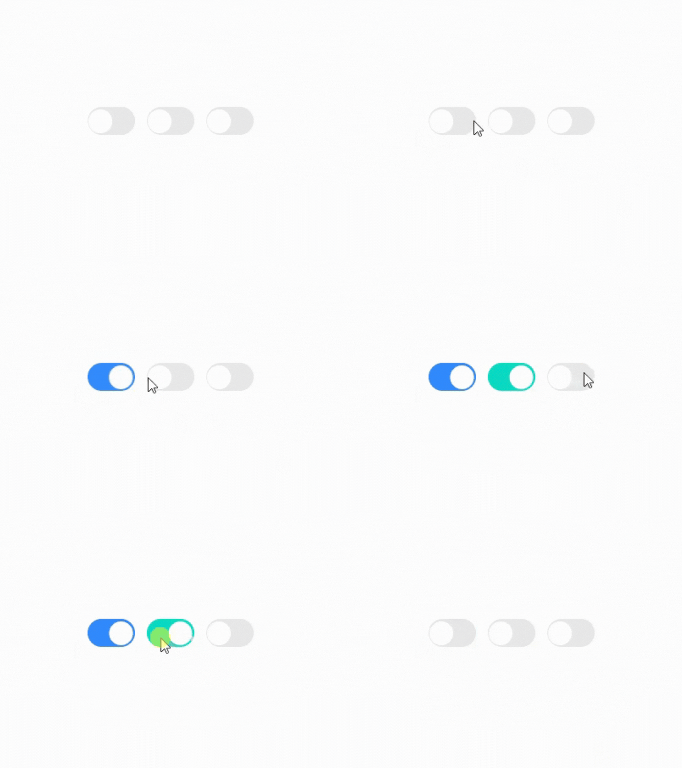
Explore our collection of Shadcn Switch Components featuring modern, interactive toggle switch variants built with React, Next.js, TypeScript, Tailwind CSS, Base UI, and Radix UI.
Here Are 5+ Types of Shadcn Switch Components Included
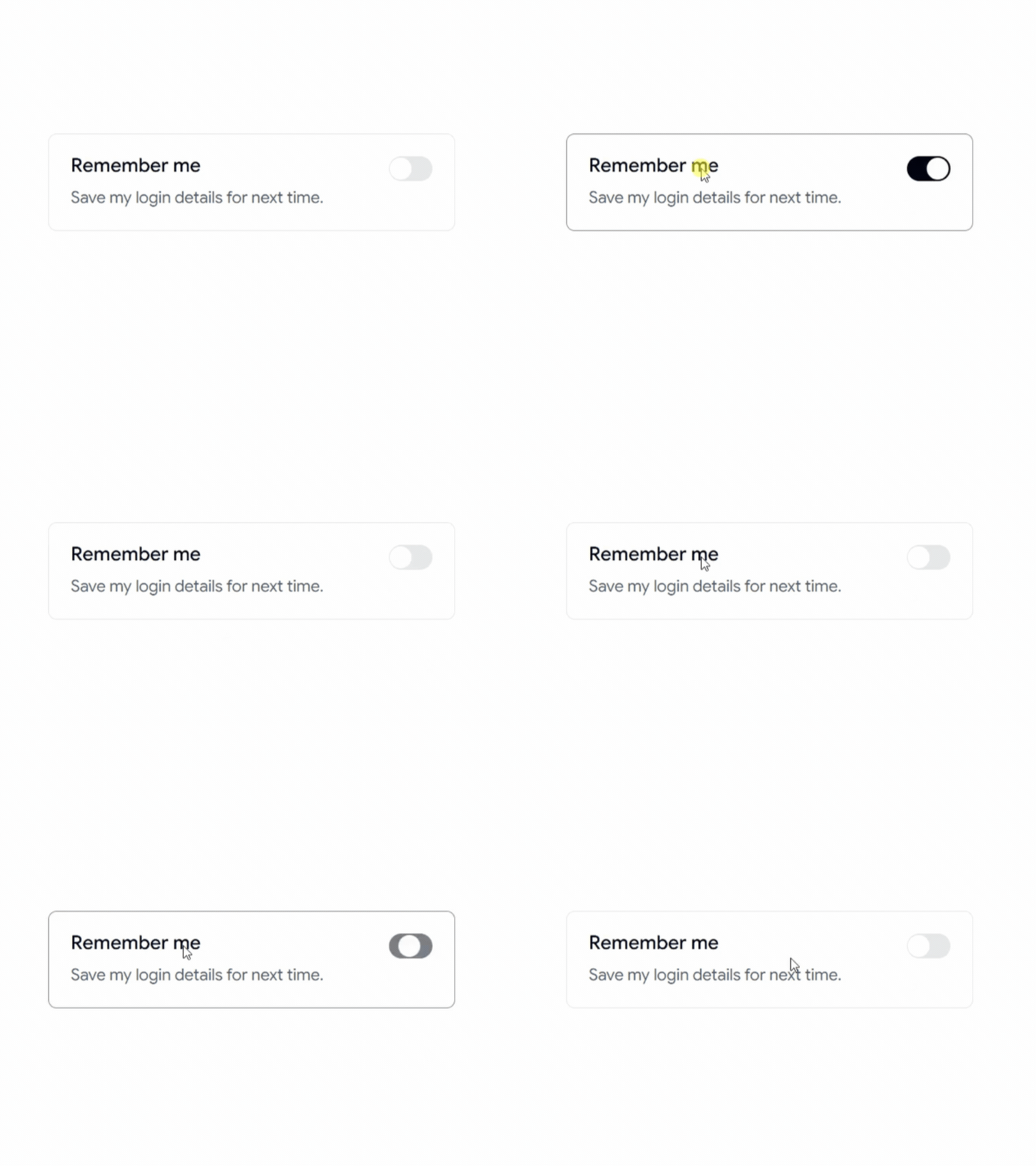
Switch Active Effect
A modern switch with a smooth active animation, perfect for settings pages and interactive controls.
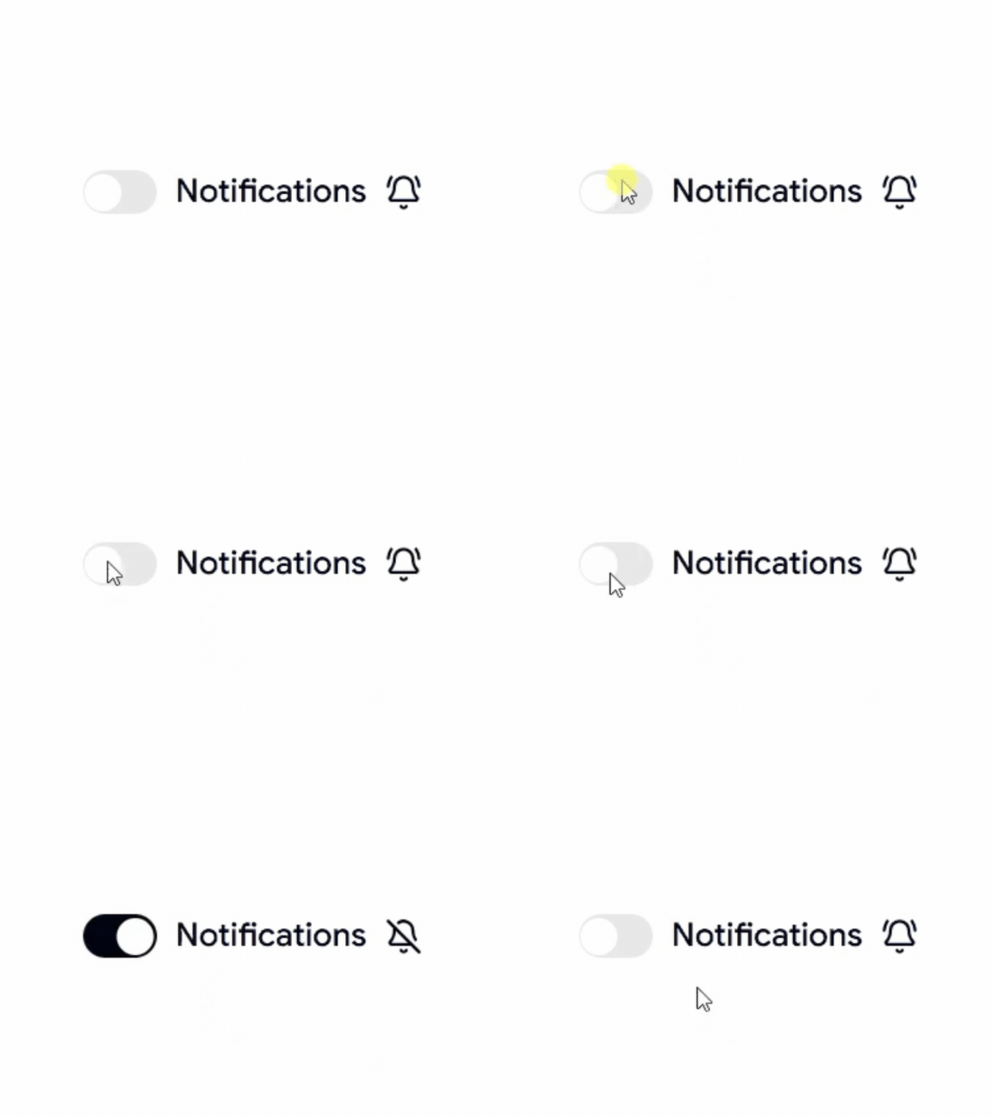
Switch With Icon
A switch featuring icons to clearly indicate enabled and disabled states.
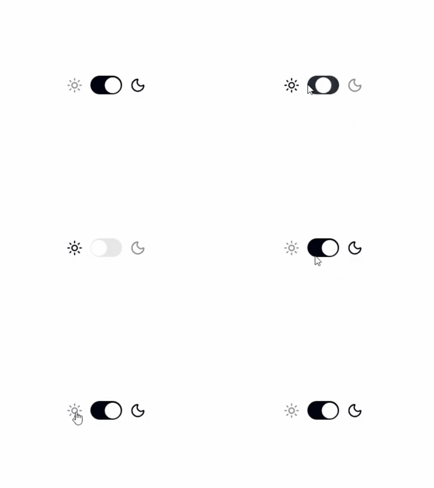
Switch Toggle Theme
A dark mode and light mode switch for modern websites and dashboards.
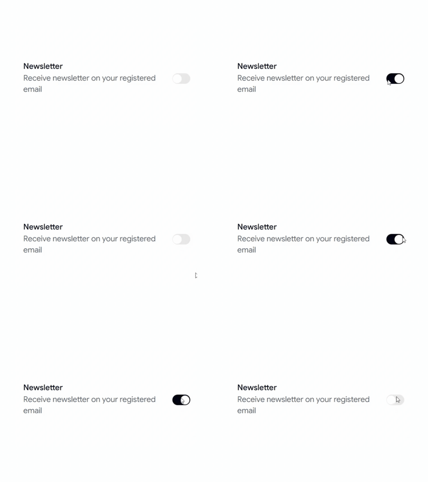
Switch With Description
A switch combined with descriptive text to provide additional context for each setting.
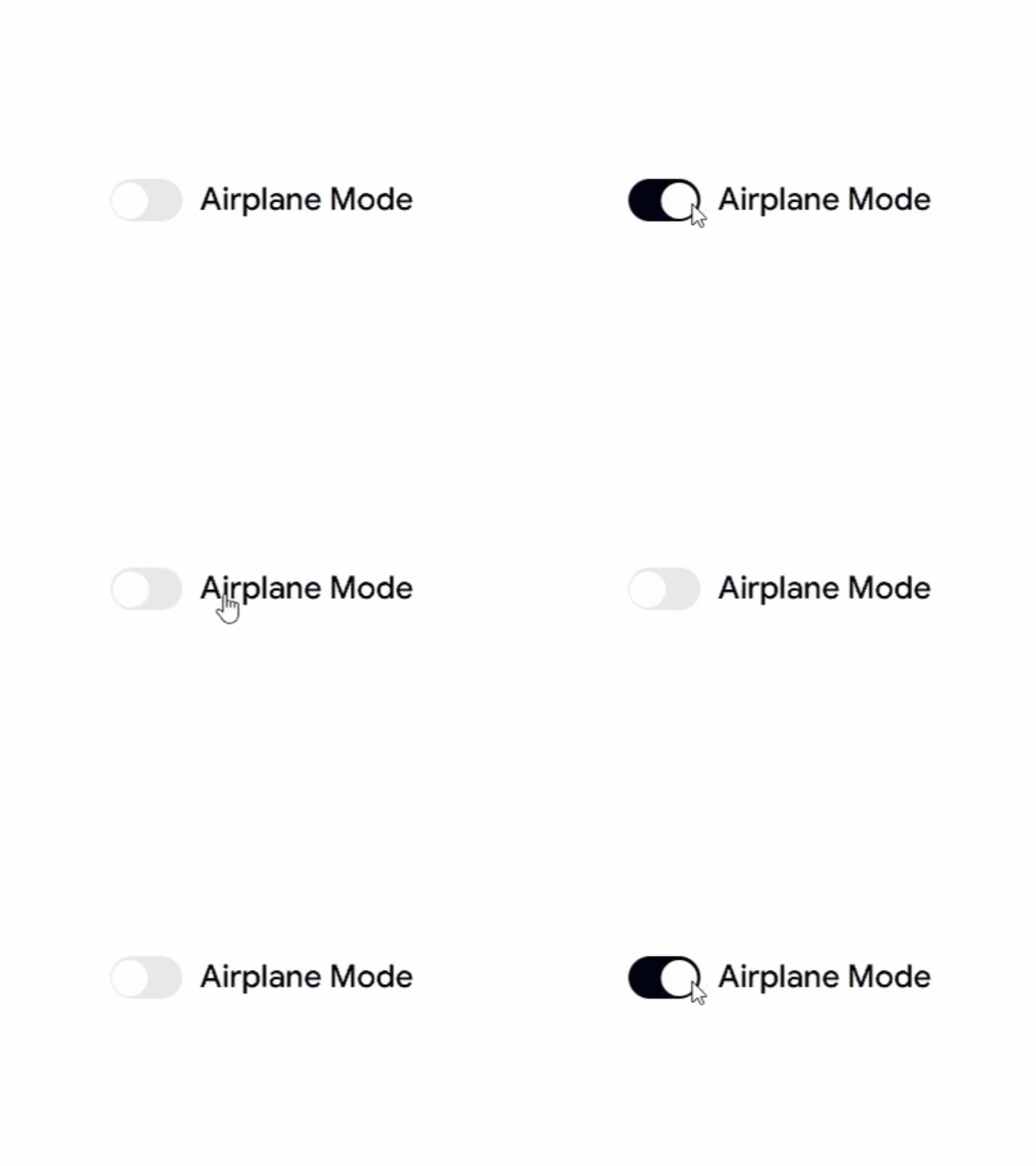
Switch With Label
A clean switch with labels, ideal for forms, preferences, and application settings.
Switch Custom Colors
A customizable switch with different color variants to match your design system and branding.
Why Developers Use Shadcn Switch Components
Switch components provide a simple and intuitive way to enable or disable features, preferences, and settings without adding unnecessary complexity to the user interface.
Best For
React Applications
Next.js Projects
Shadcn UI Websites
SaaS Products
Admin Dashboards
User Settings Pages
Dark Mode Toggles
Feature Flags
Preference Panels
Modern Web Applications
Check out Shadcn Switch today


Comment