
PinkLion
AI-powered investing copilot

Hey Indie Hackers! 👋
For the past few weeks, we’ve been building one of the most requested features on PinkLion and today it’s finally live:
➡️ Automated Portfolio Rebalancing (with real trade plans!)
If you invest regularly, you know the pain:
Your portfolio drifts, weights get off balance, and suddenly your “diversified strategy” is… nothing like what you originally intended.
We wanted to fix that without forcing users into spreadsheets, manual calculations, or guesswork.
🔥 What we built
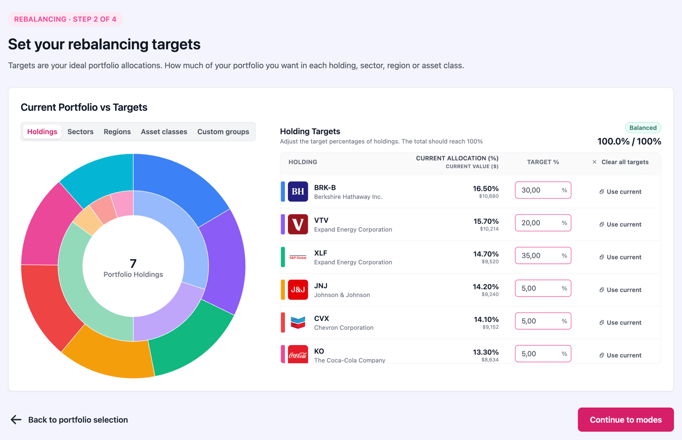
1. Target Allocation Setup
Define the allocation you want for your holdings (or the one you should have).
Or skip individual holding allocations and define allocations on sector, region and asset class level.
2. Three Rebalancing Modes
Because not everyone wants a full rebalance every time:
Standard Rebalance - tightens everything to target
Low Turnover - fixes only the biggest drifts
New Cash Only - uses deposits/dividends; no selling
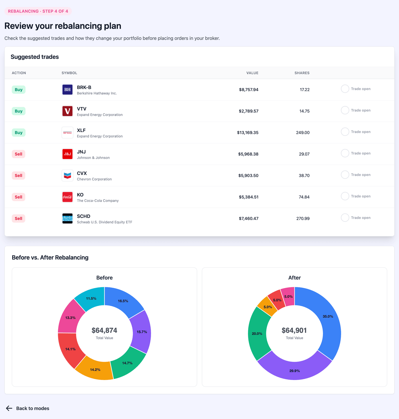
3. Auto-Generated Trade Plan
PinkLion creates a clean buy/sell list showing exactly what to do.
No guesswork. No spreadsheets. No “uhhh… how many shares was that again?”
4. Before/After Portfolio Snapshot
See exactly how your allocation will change before confirming anything.
5. Fractional-Share Friendly
It even optimizes tiny differences using fractional trades - super useful for cash-based rebalancing.
💡 Why we built this
Users constantly told us they wanted to keep their portfolio aligned, but:
didn’t want to calculate trades manually
didn’t know how much to adjust
didn’t want unnecessary turnover
wanted to keep risk consistent
Rebalancing was a top-5 user pain point, and most tools ignore it (unless you’re using expensive wealth-management platforms).
So we built a version designed for real humans - fast, visual, and dead simple.
🧭 Try it here
👉 Rebalancing is now live for every portfolio
(Login required): https://pinklion.xyz/ → Login/signup → Simulations → Rebalancing

After weeks of crunching API quirks, holdings trees and messy ETF datasets…
I finally shipped one of the most requested features on PinkLion:
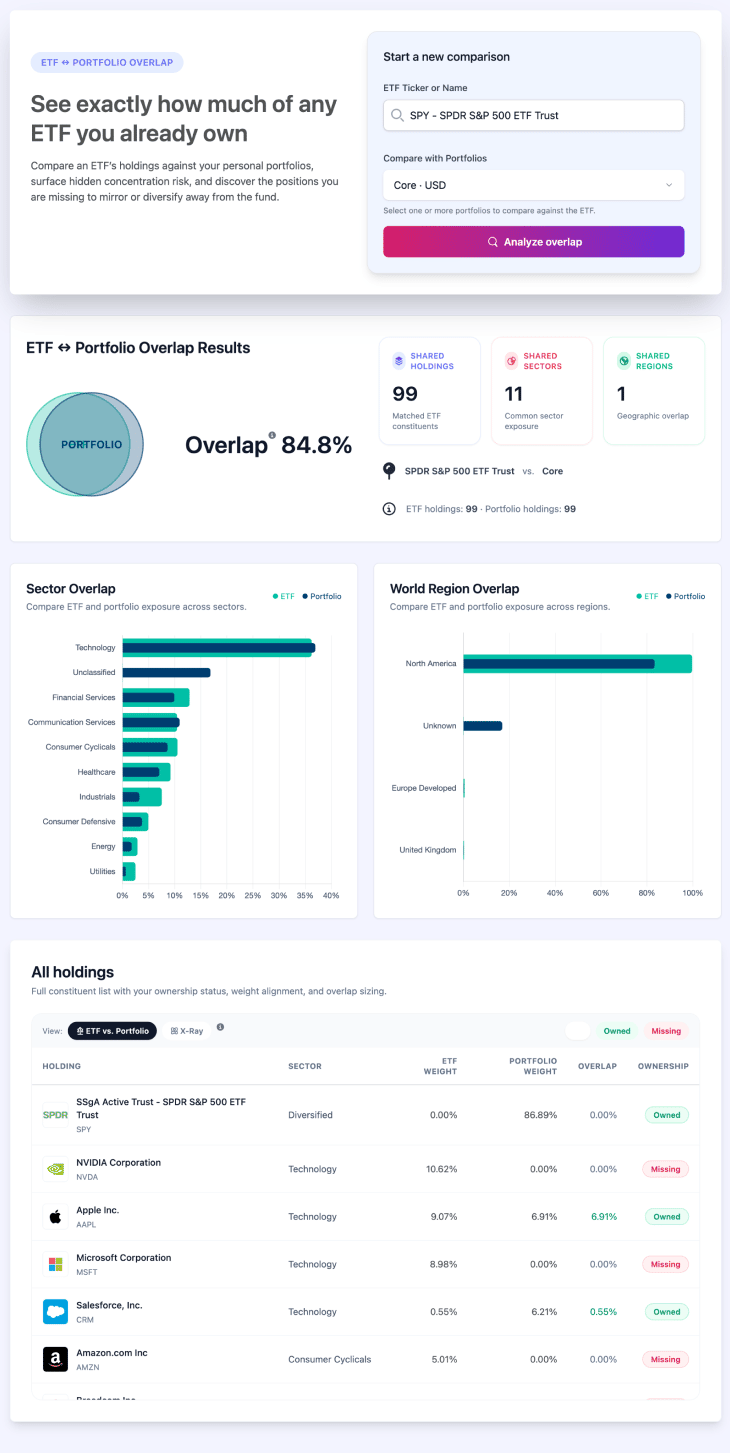
🔥 ETF–Portfolio Overlap - instantly see how much an ETF REALLY overlaps with your portfolio.
Most people think adding a new ETF means “more diversification.”
In reality… you often just buy the same stocks twice. Or three times.
This tool exposes that.
What it does (and why it matters):
🔍 Overall Overlap % - How similar an ETF is to your portfolio in a single number.
📊 Sector & Region Overlap - Surprising how often ETFs look different… but aren’t.
📈 Holdings-Level Overlap - See exactly which stocks you’re doubling up on.
🩻 X-Ray Mode - Breaks down every ETF/fund in your portfolio into its underlying holdings, so you can compare the true stock exposure vs. any ETF.
This makes it insanely easy to:
✅ Avoid hidden concentration risk
✅ Spot redundant ETFs
✅ Pick ETFs that actually add new exposure
✅ Build a cleaner, smarter portfolio
Where to find it
Inside your dashboard → Analytics → ETF–Portfolio Overlap
Still in beta
It works best for US ETFs right now. EU ETFs are supported but you might see the occasional hiccup while we keep tuning the dataset.
If you’re curious about the overlap of your own portfolio…
go break it and tell me what needs to improve 💬
-
1
If you’re launching , consider posting on targeted subreddits related to your niche. I’ve helped founders do this and it usually brings early users.
If you want, I can suggest a few subreddits based on your audience.


Hey Indie Hackers! 👋
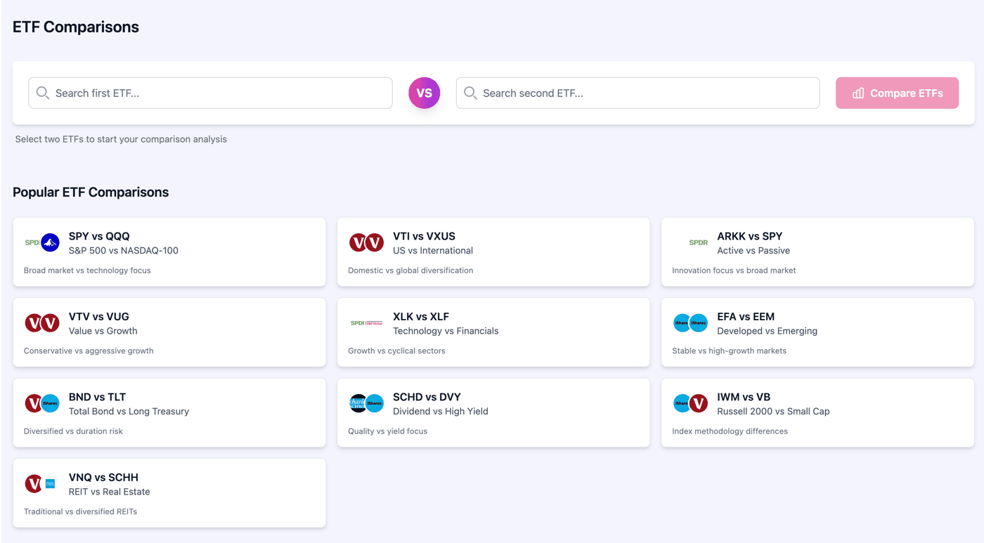
We’ve just shipped a new ETF comparison experience in PinkLion. It lets you line up two funds and answer the real questions quickly: Which one performed better? Which is cheaper? What’s the risk? Where is my money actually invested?
What you can compare (side-by-side)
Performance: YTD, 1-yr, 3-yr, 5-yr, 10-yr (aligned start dates), plus a clean cumulative chart
Risk: rolling volatility, drawdowns, and a simple Sharpe read
Costs & size: expense ratio, AUM, holdings count
Exposure: asset allocation, sector weights, country/region mix
Holdings: top positions to spot overlap before you double-up
Quick demos (popular pairs)
(If you have a favorite pair, drop it below and I’ll spin up the comparison.)
Why I built it
Most “compare” pages are either just two fact sheets or two price charts. That’s not enough to choose a core fund. This tool pulls together returns, risk, costs, and exposures in one pass so you can decide in minutes—not tabs.
What’s next
Holdings overlap score and “what changed” month-to-month
Save/share comparisons
Add more factor lenses (quality, momentum, dividends)
I’d love feedback:
Which comparisons should be one-click presets?
What’s missing for your decision process (tax, tracking error, distribution schedule)?
If you want to try it, ping me with the pair you care about and I’ll post back a live compare. Happy to hear all critiques UI, metrics, data caveats so I can tighten this up. 🙏

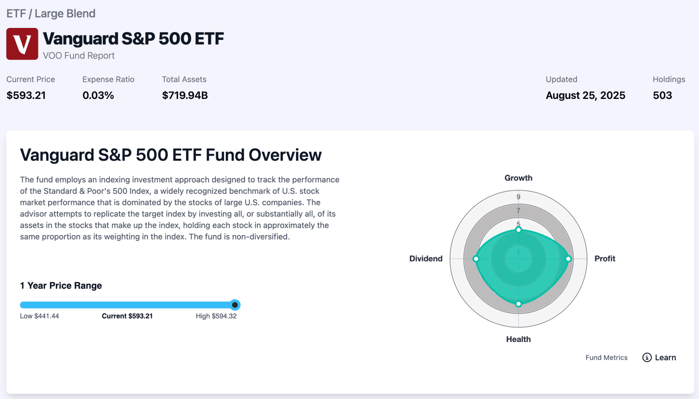
A few weeks ago we shipped Stock Reports and the #1 request was: “Do this for ETFs and mutual funds.” Done. PinkLion now has deep-dive ETF/Fund Reports across 50k+ tickers fast, visual, and built for real decisions.
Access the reports: log in here → https://app.pinklion.xyz/accounts/login/
What’s inside each Fund Report?
Overview at a glance: Price, expense ratio, AUM, holdings count, latest update, 1-year price range, returns, risk, and yield/valuation ratios.
Fund Scoring (0–10): Growth, Profit, Health, Dividend scores to orient you in seconds.
Price history: Clean long-term chart with quick drawdown cues and timeframe toggles.
Asset allocation: Stocks/bonds/cash/other with weights.
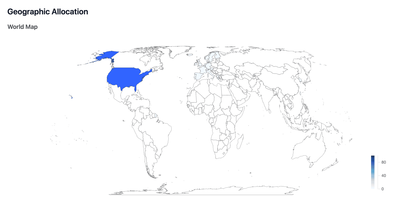
Geographic breakdown: Regions + country map to see home/overseas tilt instantly.
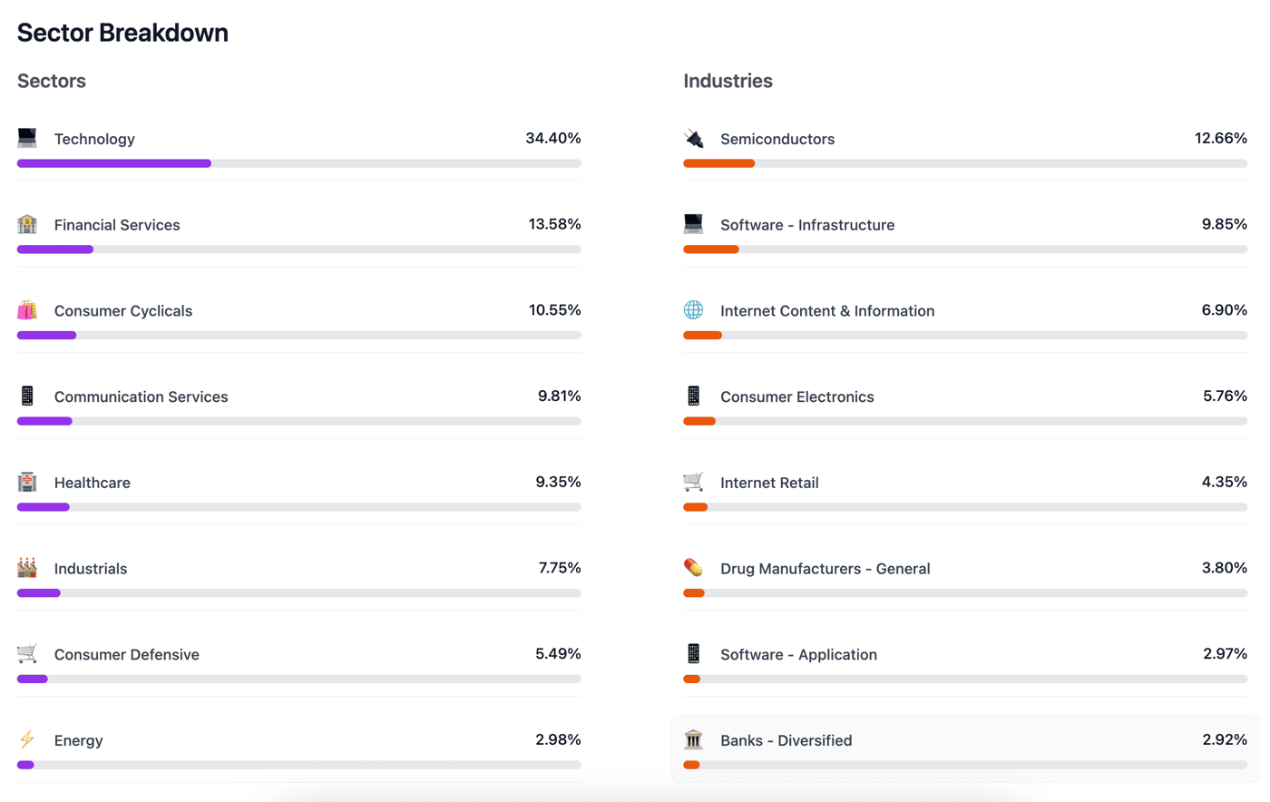
Sector breakdown: Drill into exposures (e.g., tech vs healthcare) with sortable weights.
Holdings transparency: Full constituents, not just the top 10 but all holdings, so you can spot overlap with what you already own.
Fund basics: Issuer, exchange, category, domicile, identifiers (ISIN/CUSIP) for clean record-keeping.
Why it matters
Allocation clarity: See exactly where your fund invests, no spreadsheet gymnastics.
Fee & risk checks: Expense ratio, volatility, beta, Sharpe, and yield in context.
Portfolio overlap: Full holdings make duplicate exposure obvious before you add another fund.
Zero learning curve: Same clean layout as our Stock Reports open, skim, decide.
Quick examples
Broad market: IVV, VOO, VTI • Tech tilt: QQQ, VGT • Dividend focus: VYM, SCHD
(All major ETFs and many mutual funds are covered.)
What’s next
Side-by-side Fund vs Fund comparisons
Hey Indie Hackers! 👋
I’m excited to share a major new milestone for PinkLion we’ve just rolled out stock-specific reports covering over 100,000+ stocks worldwide.
These reports are designed for retail investors who want quick, high-quality insights without wading through endless PDFs or spreadsheets. You can now explore detailed data for popular stocks like Apple (AAPL) and Nvidia (NVDA), and that’s just the beginning.
What’s Inside Each Stock Report?
Overview: Key stats like price performance, dividend yield, and fundamental metrics.
Valuation: DCF-based intrinsic value estimates and valuation ratios like P/E, P/S, and P/B.
Income Statement: Revenue, net income, and EPS growth trends.
Other Insights: Metrics that retail investors actually care about — made simple and visual.
Examples:
Computer Modelling Group (CMG.TO) Past Performance
Why We Built This
Retail investors often rely on incomplete or overly complex data. We wanted to create fast-loading, actionable stock pages that combine:
Clean visuals (e.g., EPS trends, revenue growth)
Key valuation metrics (intrinsic value, P/E, P/S, etc.)
A user-friendly design
Next Steps
Adding ETF and mutual fund reports next.
Increasing the depth of the stock reports and adding more interactive elements
Expanding filters so you can compare stock valuations side by side.


Hey Indie Hackers,
Quick progress log from the PinkLion bunker: after weeks of crunching data and building a table-generator that won’t melt your browser, we just rolled out ETF Comparison inside PinkLion.
What it does right now, straight from the blog
Instant deep-dive, no login required
Open any new comparison post and you’re greeted with a live, side-by-side dashboard of total returns, volatility, fees, dividends, sector tilts, top holdings, and valuation ratios pre-rendered so the page loads in a snap.
Copy-ready assets for your own content
Every table in the article is clean, responsive HTML you can lift straight into Ghost, Webflow, or your newsletter without touching a line of CSS. Paste, publish, done.
Plain-English verdicts
Each post ends with a “Which ETF fits your portfolio?” summary that distills the data into an actionable takeaway perfect for readers who want answers, not just numbers.
First batch of live comparisons
SPY vs VOO – https://pinklion.xyz/blog/spy-vs-voo/
VUG vs VOO – https://pinklion.xyz/blog/vug-vs-voo/
QQQ vs SPY – https://pinklion.xyz/blog/qqq-vs-spy/
QQQ vs IVV – https://pinklion.xyz/blog/qqq-vs-ivv/
VOO vs IVV – https://pinklion.xyz/blog/voo-vs-ivv/
(We’ll be adding 50+ more match-ups over the next two weeks drop your requests below.)
Why build this?
Our users kept asking, “Is ETF A really better than ETF B for my goals?” but Google searches returned thin affiliate content. We already had the data pipeline for PinkLion’s portfolio health check, so we turned it into a standalone comparison tool.
Looking for feedback
Does the layout read well on mobile?
Any metrics or charts you’d love to see added?
Performance OK? (Tables are rendered server-side to keep the bundle light.)
If you spot a bug or typo, DM me or comment here early builders get lifetime free access to the comparison feature. 🚀

Hey Indie Hackers! 👋
We've just released a major new feature on PinkLion: Portfolio Stress Testing a powerful tool to help you understand how your investments might perform during real-world market downturns.
What exactly is Portfolio Stress Testing?
With this new feature, you can simulate historical financial crises like the 2008 financial crash or the COVID market plunge directly within your portfolio. Quickly identify:
Potential Losses: Clearly see your portfolio's maximum drawdowns during these events.
Recovery Times: Understand how long it might take your investments to bounce back.
Hidden Risks: Spot vulnerabilities and areas where your portfolio needs strengthening.
Why is this important?
Risk Awareness: Know exactly how vulnerable your investments are in extreme market conditions.
Better Decisions: Make informed, confident choices to protect and grow your portfolio.
Greater Confidence: Approach investing strategically, knowing you’ve considered various outcomes.
Early user insights:
Investors highly value realistic, scenario-based testing.
Clear visuals and straightforward insights significantly boost user confidence and decision-making.
What's next?
We’re continually improving based on your feedback and plan to add more scenarios and deeper analytics soon.
Try it out and let us know your thoughts feedback and questions are always welcome!
Hey Indie Hackers! 👋
A couple of weeks ago, we introduced PinkLion, an AI-powered investing copilot designed to simplify portfolio management and optimization.
Since then, we've been heads-down and have rolled out some pretty exciting new features based directly on early user feedback:
What's new:
🩺 Portfolio Health Check: Instantly analyze your current investments for diversification, risk exposure, and allocation. No setup or simulations needed.
🔄 Improved Portfolio Sync: Seamlessly connect your broker accounts or easily import CSV files—reducing friction and manual data entry.
📈 Index Benchmarking: Compare your portfolio’s performance directly against major indexes (S&P 500, Nasdaq 100, etc.)—so you instantly see how you're stacking up.
🌍 In-depth Diversification Views: Clearly visualize your asset allocation by sector, asset class, region, and market cap to quickly spot and fix imbalances.
A few early lessons learned:
Users strongly prefer easy, frictionless onboarding (broker sync and CSV uploads were a game changer).
Actionable insights resonate far more than raw data or metrics alone.
People love benchmarking; seeing their portfolio against familiar indexes has made the value of the product instantly clear.
Next steps: continue refining based on user feedback, enhancing AI-driven insights, and sharing transparently along the way.
Happy to answer questions or hear feedback from fellow Indie Hackers—let's talk!
Cheers, Jan
-
1
Hi Jan, really impressive progress, your updates show a strong focus on user feedback, which is great to see.
The Portfolio Health Check and Index Benchmarking features both sound incredibly valuable. I especially like how you're making onboarding easier, removing friction early makes a big difference in user adoption.
Your website presents the idea clearly. I'm building a platform in a different space, but also focused on simplifying complex tools. Happy to exchange ideas if you're interested. Keep it up!
-
1
Woah! This is super cool. Does the tool give suggestions for investing? that seems like it could be a potential area for legal issues, either way super cool.
-
1
Thanks for the feedback.
Regarding the investment suggestion, the tool does not provide you with financial advice and is rather positioned as an analytics and educational software tool.
-


Let me introduce PinkLion, an AI-powered investing copilot that helps you grow your wealth with ease.
We go beyond just tracking your portfolio—offering personalized insights and optimization tips, 1-year forecasts, as well as scenario simulations. Whether you’re just getting started or leveling up your game, we’ve got the tools to help you make smarter decisions.
Here are some of our key features:
🛠 Scenario Simulation - Easy and safe way to prepare for your first Investment. Our AI powered simulator will help you tailor to your goals and budget
✨ A Complete Investment Overview – Track unlimited stocks, ETFs, and cryptos in one place
🔄 Seamless Portfolio Setup – Easy and flexible integration with brokers or manual upload of your holdings for a complete investment view
🔮 Smart forecasting – See 12-month projections for your portfolio and scenarios
📊 Deep Portfolio Analytics – Gain AI-driven actionable insights into performance and risk
⚖️ Portfolio Optimization Tools – Experiment with different asset allocations in a risk-free environment to explore what works best for your investment approach
📈 Side-by-Side Comparisons – Understand how different approaches impact your returns
Please give it a try and we´d love to heard your thoughts.
Best,
Ekaterina

Comment